Designed by: PepsiCo Design & Innovation
Country: United States

The Wine Society

The Wine Society

Designed by The Creative Method | Country: Australia

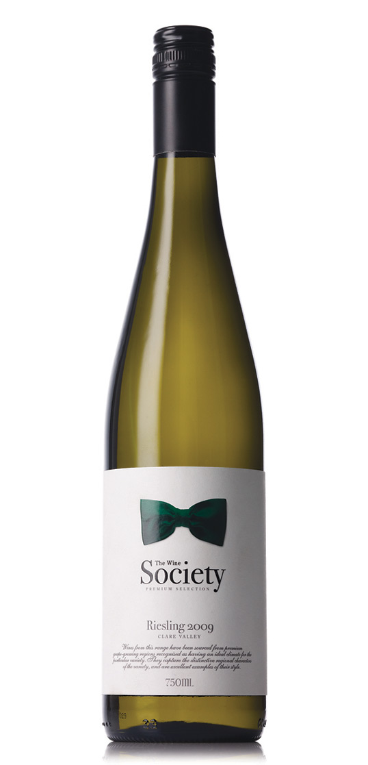
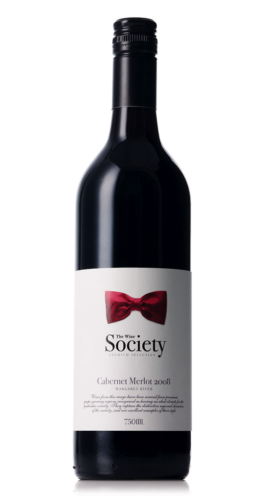
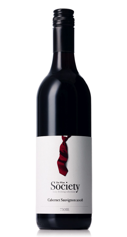
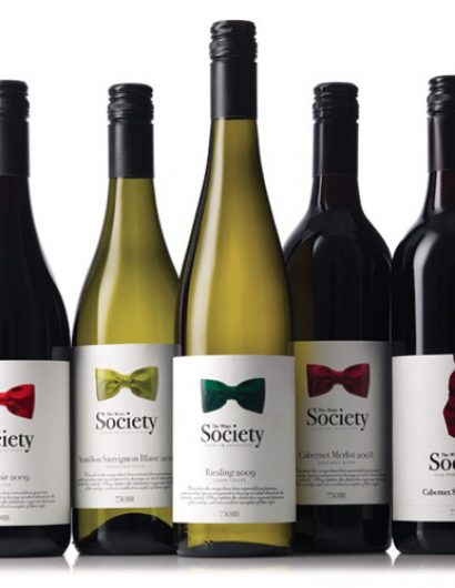
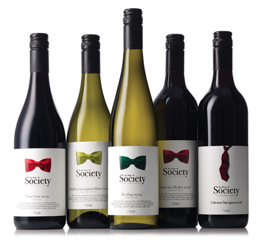
Brief: The Wine Society wanted to upgrade it’s labels from something that was quite generic to something that added a little more value. The Society is competing against many different wineries and it was important that the labels had good standout, reflected the quality and helped beginning to tell the WS story. The labels needed to work across 3 tiers, a value range, a mid range and a more premium high end range. There were over 30 different labels in the whole series so they needed to feel like a group but also stand alone in their tier.

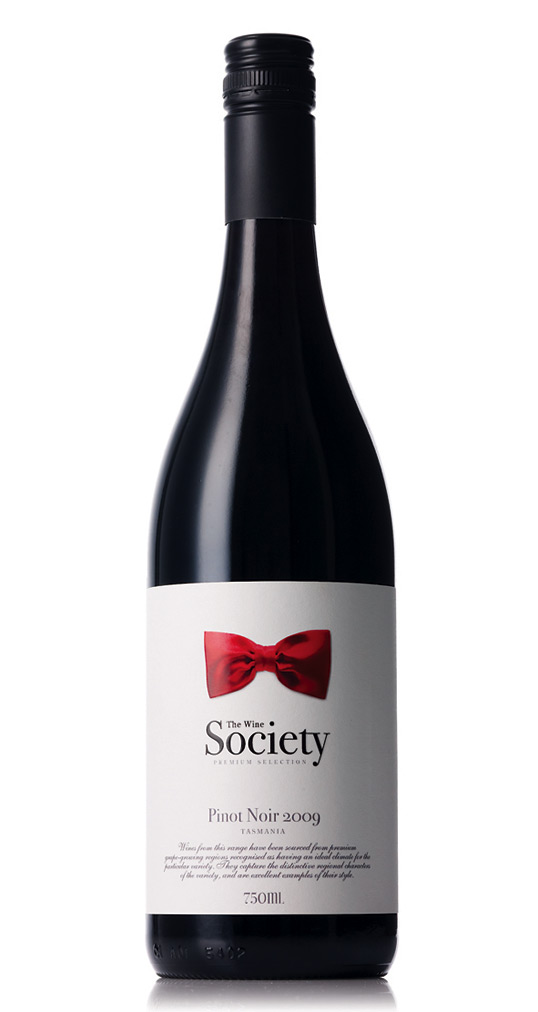
Solution: One of the most telling aspects of our society is how we dress and what we wear. These labels have been designed to firstly reflect and re-enforce the idea of ‘Society’ but also create individual personality and style for each wine. The tie was chosen as the main visual link as it talked to the idea of a society or a group and a standard. A full neck tie is used for the value tier and a bow tie is used for the premium and reserve tier. Each tie has a change of colour and image for each wine.”

The Wine Society

The Wine SocietyThe Wine Society

The Wine Society

The Wine Society

Get the latest packaging design inspiration in your inbox:

Popular designs

The Port Vodka Lemon Water

Overview: In response to my client’s vision for a Cape Cod themed beverage brand, I embarked on the journey to create The Port

Burma Love Rebrand

Love at First BiteAs an extension of the Burma Superstar restaurant in San Francisco, Burma Love Foods gives diners an opportunity to

The Bra Guru

Most women are wearing the wrong size bra and that is a fact. The Bra Guru® is the first and only professional

Designed by: PepsiCo Design & Innovation
Country: United States

The Wine Society

winesociety1

The Wine Society

Designed by The Creative Method | Country: Australia

Brief: The Wine Society wanted to upgrade it’s labels from something that was quite generic to something that added a little more value. The Society is competing against many different wineries and it was important that the labels had good standout, reflected the quality and helped beginning to tell the WS story. The labels needed to work across 3 tiers, a value range, a mid range and a more premium high end range. There were over 30 different labels in the whole series so they needed to feel like a group but also stand alone in their tier.

Solution: One of the most telling aspects of our society is how we dress and what we wear. These labels have been designed to firstly reflect and re-enforce the idea of ‘Society’ but also create individual personality and style for each wine. The tie was chosen as the main visual link as it talked to the idea of a society or a group and a standard. A full neck tie is used for the value tier and a bow tie is used for the premium and reserve tier. Each tie has a change of colour and image for each wine.”
The Wine Society

The Wine SocietyThe Wine Society

The Wine Society

The Wine Society

Previous slide
Next slide

Explore more great package design

Get the latest on packaging design in your inbox: