Designed by: PepsiCo Design & Innovation
Country: United States

The Stallion Wine

The Stallion Wine

Designed by Jordan Jelev | Country: Bulgaria

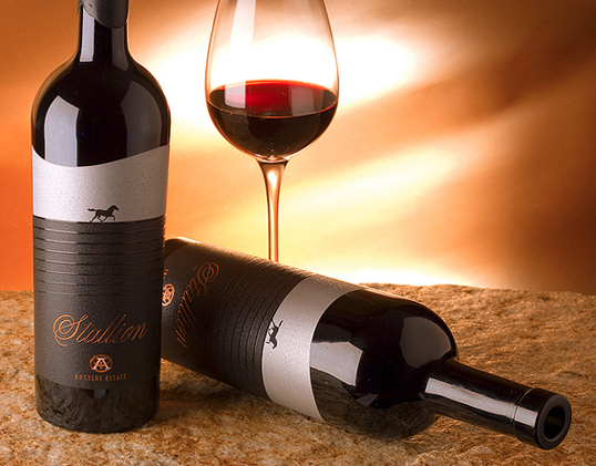
“The Stallion Wine of Angelus Estate is positioned in exclusive super-premium class – an amazing wine that can impress every connoisseur. The brand name Stallion comes from the area of the vineyards but also reminds of the spirit and free energy of a young stallion – characteristics that communicate perfectly with the wine itself.

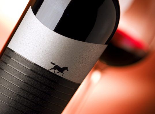
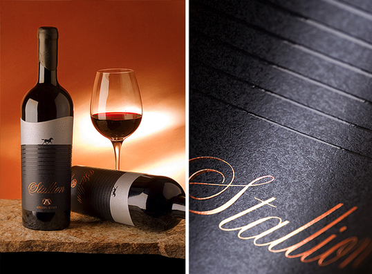
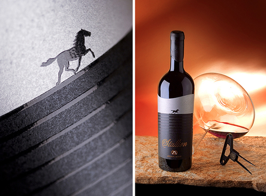
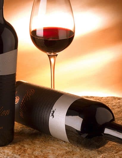
I designed a luxurious wine label based on an image of a running horse. I used gloss puff-up varnish that creates an outstanding contrast to the black matte finish of the paper surface producing a premium feel to the brand. I also designed the Angelus Estate logotype. It is printed with matte copper hot-foil. The wavy top end of the label symbolizes the mountains and the sky, the radial glossy lines are equal to the soil’s layers.”

The Stallion Wine

The Stallion Wine

The Stallion Wine

The Stallion Wine

The Stallion Wine

Get the latest packaging design inspiration in your inbox:

Popular designs

The Bra Guru

Most women are wearing the wrong size bra and that is a fact. The Bra Guru® is the first and only professional

Burma Love Rebrand

Love at First BiteAs an extension of the Burma Superstar restaurant in San Francisco, Burma Love Foods gives diners an opportunity to

Designed by: PepsiCo Design & Innovation
Country: United States

The Stallion Wine

stallion1

The Stallion Wine

Designed by Jordan Jelev | Country: Bulgaria

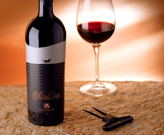
“The Stallion Wine of Angelus Estate is positioned in exclusive super-premium class – an amazing wine that can impress every connoisseur. The brand name Stallion comes from the area of the vineyards but also reminds of the spirit and free energy of a young stallion – characteristics that communicate perfectly with the wine itself.

I designed a luxurious wine label based on an image of a running horse. I used gloss puff-up varnish that creates an outstanding contrast to the black matte finish of the paper surface producing a premium feel to the brand. I also designed the Angelus Estate logotype. It is printed with matte copper hot-foil. The wavy top end of the label symbolizes the mountains and the sky, the radial glossy lines are equal to the soil’s layers.”
The Stallion Wine

The Stallion Wine

The Stallion Wine

The Stallion Wine

The Stallion Wine

Previous slide
Next slide

Explore more great package design

Get the latest on packaging design in your inbox: