Designed by: PepsiCo Design & Innovation
Country: United States

Soy Mamelle

Soy Mamelle

Designed by KIAN | Country: Russia

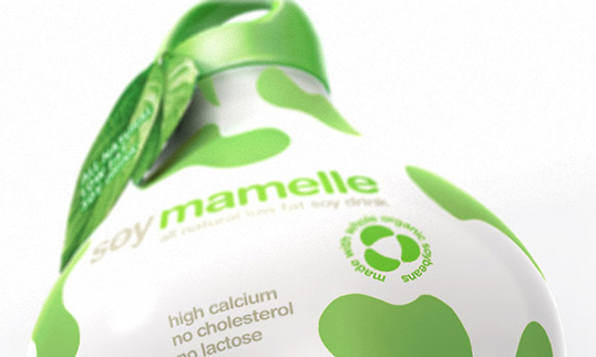
“The KIAN brand agency took on the process of naming, formulating a creative brand concept, and creating the package shape. Soy milk “Soy mamelle” is a 100% vegetative product. It is a source of high grade fiber and calcium, containing no cholesterol and a proven ability to actually lower cholesterol levels in the human body.

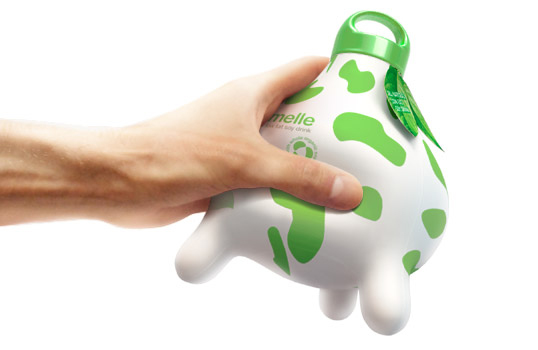
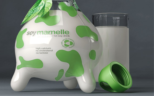
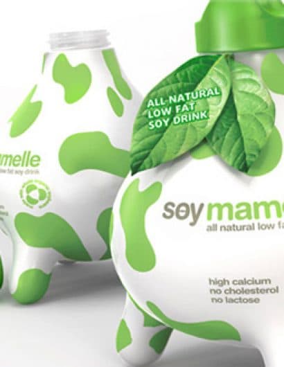
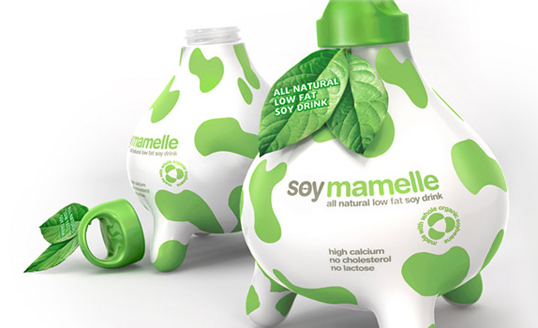
The developed concept of the package shape resembled an udder, which presents the first half of the message in that soy milk is identical to that of a cow. The second part of the message is delivered via the colour score and décor of the packaging, which concentrate on the phytogenesis of the product, creating an image of nature and health.

The package can be made of a PET or a glass. It has convenient lid and leans on a 3 legs. This finding has tremendous potential for improvement of brand identity in POS-materials and nonstandard equipment trading.”

Soy Mamelle

Soy Mamelle

Soy Mamelle

Get the latest packaging design inspiration in your inbox:

Popular designs

Over the wave

This Kombucha originates in Lombok, Indonesia, where its paradise beaches attract hundreds of surfers eager to ride the waves. When you surf,

The Bra Guru

Most women are wearing the wrong size bra and that is a fact. The Bra Guru® is the first and only professional

The Port Vodka Lemon Water

Overview: In response to my client’s vision for a Cape Cod themed beverage brand, I embarked on the journey to create The Port

Designed by: PepsiCo Design & Innovation
Country: United States

Soy Mamelle

soy1

Soy Mamelle

Designed by KIAN | Country: Russia

“The KIAN brand agency took on the process of naming, formulating a creative brand concept, and creating the package shape. Soy milk “Soy mamelle” is a 100% vegetative product. It is a source of high grade fiber and calcium, containing no cholesterol and a proven ability to actually lower cholesterol levels in the human body.

The developed concept of the package shape resembled an udder, which presents the first half of the message in that soy milk is identical to that of a cow. The second part of the message is delivered via the colour score and décor of the packaging, which concentrate on the phytogenesis of the product, creating an image of nature and health.

The package can be made of a PET or a glass. It has convenient lid and leans on a 3 legs. This finding has tremendous potential for improvement of brand identity in POS-materials and nonstandard equipment trading.”
Soy Mamelle

Soy Mamelle

Soy Mamelle

Previous slide
Next slide

Explore more great package design

Get the latest on packaging design in your inbox: