Designed by: PepsiCo Design & Innovation
Country: United States

Student Work – Sara Böttiger

Student Work - Sara Böttiger

Designed by Sara Böttiger | Country: Sweden

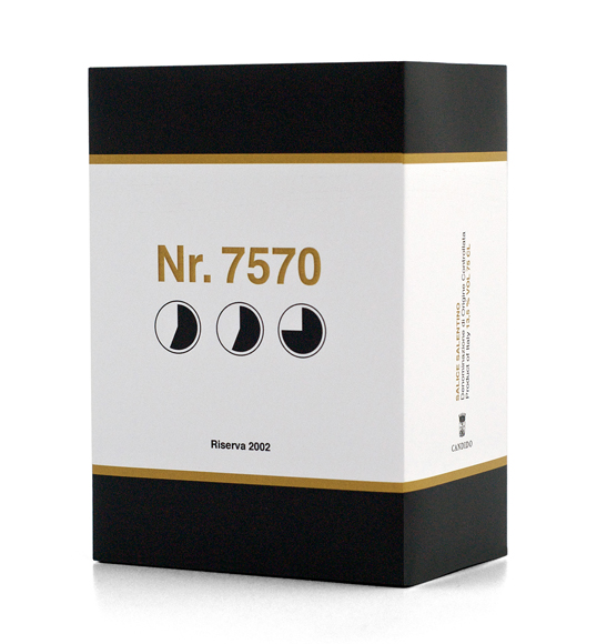
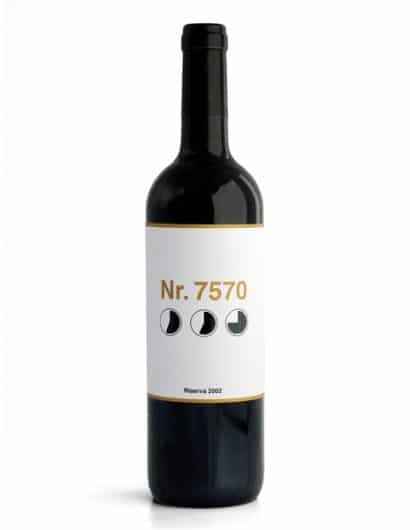
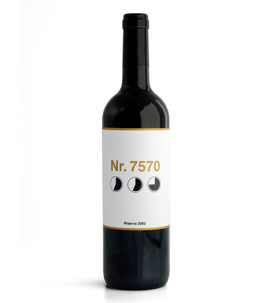
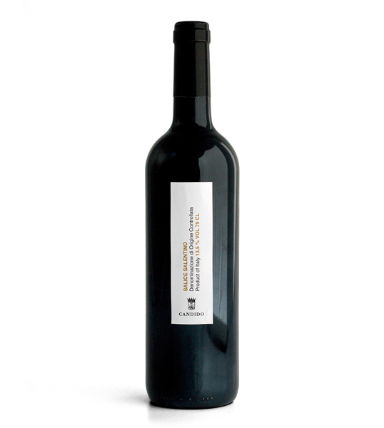
“Redesign of an Italian wine called Salice Salentino. In Sweden it costs approximately 7€, which is fairly cheap. When I did the research I realized that many people don’t always remember the name of the wine. They remember the taste, the design of the label, etc, but not the name. In Sweden you can only buy alcohol in places called ‘Systembolaget’. Systembolaget uses numbers on all of their bottles to identify different wines. Sometimes it easier to remember numbers than names. I wanted to use that in my design and I wanted the design to be simple and clean. The three circles are symbols that ‘Systembolaget’ uses to tell customers how the wines taste, if it’s round, rough, etc. The symbols on the label are diecut.”

Student Work - Sara Böttiger

Student Work - Sara Böttiger

Get the latest packaging design inspiration in your inbox:

Popular designs

The Port Vodka Lemon Water

Overview: In response to my client’s vision for a Cape Cod themed beverage brand, I embarked on the journey to create The Port

Far Out Bar

Description: Far Out Bar is a cutting-edge packaging design project created for High Life Farms’ macrodose THC chocolate bars. This project involved

Over the wave

This Kombucha originates in Lombok, Indonesia, where its paradise beaches attract hundreds of surfers eager to ride the waves. When you surf,

Designed by: PepsiCo Design & Innovation
Country: United States

Student Work – Sara Böttiger

nr7570_1

Student Work - Sara Böttiger

Designed by Sara Böttiger | Country: Sweden

“Redesign of an Italian wine called Salice Salentino. In Sweden it costs approximately 7€, which is fairly cheap. When I did the research I realized that many people don’t always remember the name of the wine. They remember the taste, the design of the label, etc, but not the name. In Sweden you can only buy alcohol in places called ‘Systembolaget’. Systembolaget uses numbers on all of their bottles to identify different wines. Sometimes it easier to remember numbers than names. I wanted to use that in my design and I wanted the design to be simple and clean. The three circles are symbols that ‘Systembolaget’ uses to tell customers how the wines taste, if it’s round, rough, etc. The symbols on the label are diecut.”
Student Work - Sara Böttiger

Student Work - Sara Böttiger

Previous slide
Next slide

Explore more great package design

Get the latest on packaging design in your inbox: