Designed by: PepsiCo Design & Innovation
Country: United States

Glace Artisan Ice Cream

Glace Artisan Ice Cream

Designed by Nathaniel Cooper & Brent Anderson | Country: United States

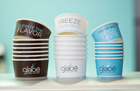
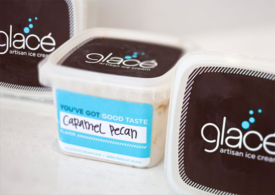
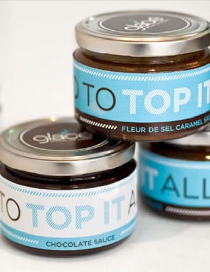
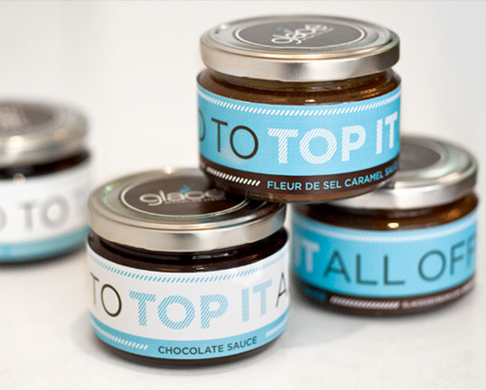
“Kansas City-based Glace (say it this way, “Gla-say”) Artisan Ice Cream is a more grown-up sweet treat expression, rich in texture and inventive flavors like Venezuelan dark chocolate, fleur de sel caramel and pineapple-cilantro sorbet. The corresponding brand expression is clean, sophisticated and a nod to the owner’s love of modern minimalism. At the same time, copy and color palette make it feel fun and approachable. The logo also incorporates a sly tie to ice cream with circles that look like melting “drips” hitting the floor, while tailored graphic elements make the identity feel fashionable and unexpected in the category.”

Glace Artisan Ice Cream

Glace Artisan Ice Cream

Glace Artisan Ice Cream

Get the latest packaging design inspiration in your inbox:

Popular designs

Burma Love Rebrand

Love at First BiteAs an extension of the Burma Superstar restaurant in San Francisco, Burma Love Foods gives diners an opportunity to

The Bra Guru

Most women are wearing the wrong size bra and that is a fact. The Bra Guru® is the first and only professional

Pure Persian Honey

When we look closely at honey packaging, they are almost all in the usual format, and the ultimate in creativity is that

The Port Vodka Lemon Water

Overview: In response to my client’s vision for a Cape Cod themed beverage brand, I embarked on the journey to create The Port

Designed by: PepsiCo Design & Innovation
Country: United States

Glace Artisan Ice Cream

glace

Glace Artisan Ice Cream

Designed by Nathaniel Cooper & Brent Anderson | Country: United States

“Kansas City-based Glace (say it this way, “Gla-say”) Artisan Ice Cream is a more grown-up sweet treat expression, rich in texture and inventive flavors like Venezuelan dark chocolate, fleur de sel caramel and pineapple-cilantro sorbet. The corresponding brand expression is clean, sophisticated and a nod to the owner’s love of modern minimalism. At the same time, copy and color palette make it feel fun and approachable. The logo also incorporates a sly tie to ice cream with circles that look like melting “drips” hitting the floor, while tailored graphic elements make the identity feel fashionable and unexpected in the category.”
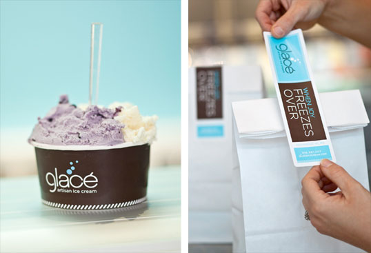
Glace Artisan Ice Cream

Glace Artisan Ice Cream

Glace Artisan Ice Cream

Previous slide
Next slide

Explore more great package design

Get the latest on packaging design in your inbox: