Designed by: PepsiCo Design & Innovation
Country: United States

Mollydooker Wine

Mollydooker Wine

Designed by Mash | Country: Australia

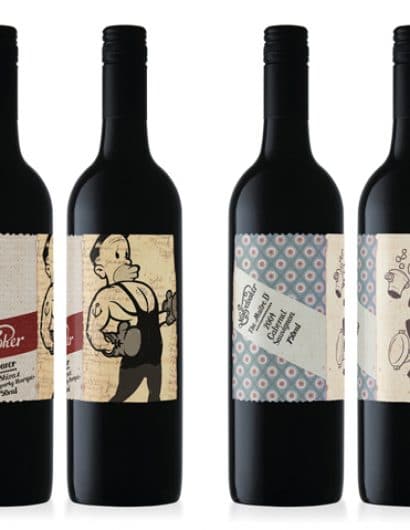
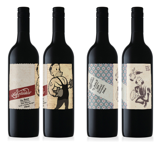
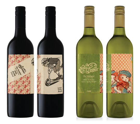
“Mollydooker, slang for left handed. Both proprietors of the Mollydooker Wines brand are left handed, hence the brand name. The brand identity has been created to go against the grain of the ‘same old’ wine branding approach. The aim was to create visual communication for a brand with its own personality, not just another player in the wine industry.

Reinforcing the brand identity. The aim; to create packaging that in no way reflected any of their competitors, stood out from the crowd and communicated the hands on approach that the wine makers take in producing their wines. The labels were created entirely from hand drawn illustrations, even down to the use of the hand drawn typeface. Not a single font in sight! Inspiration came from antique book patterns and 1930’ish advertising and cartoon illustrations.”
Mollydooker Wine

Get the latest packaging design inspiration in your inbox:

Popular designs

Studio La Regina Designs Zafferano del Re

The “Zafferano del Re” logo features a contemporary depiction of King Alaric’s face framed within an irregular circle, evoking the design of ancient gold coins. Each package enhances this historical connection with a treasure map included inside, tying back to the legend of Alaric’s buried treasure.

Designed by: PepsiCo Design & Innovation
Country: United States

Mollydooker Wine

mollydooker1

Mollydooker Wine

Designed by Mash | Country: Australia

“Mollydooker, slang for left handed. Both proprietors of the Mollydooker Wines brand are left handed, hence the brand name. The brand identity has been created to go against the grain of the ‘same old’ wine branding approach. The aim was to create visual communication for a brand with its own personality, not just another player in the wine industry.

Reinforcing the brand identity. The aim; to create packaging that in no way reflected any of their competitors, stood out from the crowd and communicated the hands on approach that the wine makers take in producing their wines. The labels were created entirely from hand drawn illustrations, even down to the use of the hand drawn typeface. Not a single font in sight! Inspiration came from antique book patterns and 1930’ish advertising and cartoon illustrations.”

Mollydooker Wine

Previous slide
Next slide
Get the latest on packaging design in your inbox: