Designed by: PepsiCo Design & Innovation
Country: United States

&Co

&Co

Designed by Inhouse Design | Country: New Zealand

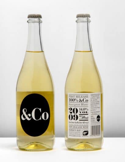
“&Co represents simplicity – of purpose, provenance and production. The winery produces a single exceptional estate wine each season. To emphasise this we’ve pared the identity back to a black and white palette. We’ve made a feature of the type, letting it ‘speak’ to the customer. &Co breaks convention with more traditional looking wine brands, topped off with the uniquely cool closure of a crown seal, we’re not at all upset that once opened we have to drink the whole bottle.”

&Co

Get the latest packaging design inspiration in your inbox:

Popular designs

The Port Vodka Lemon Water

Overview: In response to my client’s vision for a Cape Cod themed beverage brand, I embarked on the journey to create The Port

The Bra Guru

Most women are wearing the wrong size bra and that is a fact. The Bra Guru® is the first and only professional

Over the wave

This Kombucha originates in Lombok, Indonesia, where its paradise beaches attract hundreds of surfers eager to ride the waves. When you surf,

Designed by: PepsiCo Design & Innovation
Country: United States

&Co

co1

&Co

Designed by Inhouse Design | Country: New Zealand

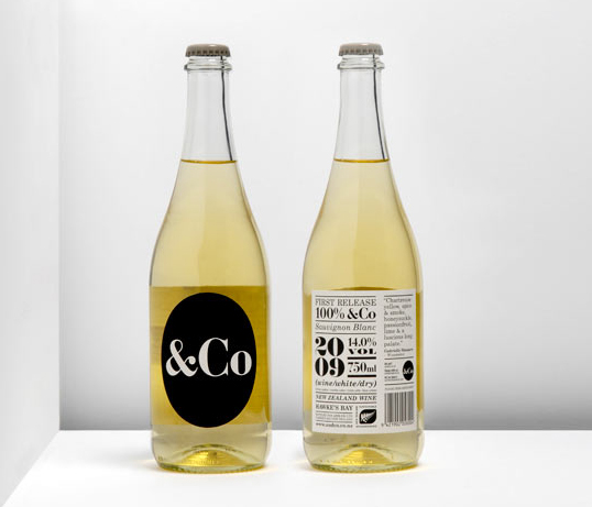
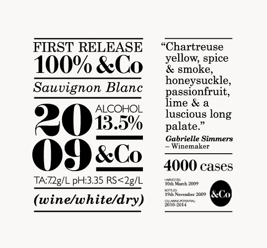
“&Co represents simplicity – of purpose, provenance and production. The winery produces a single exceptional estate wine each season. To emphasise this we’ve pared the identity back to a black and white palette. We’ve made a feature of the type, letting it ‘speak’ to the customer. &Co breaks convention with more traditional looking wine brands, topped off with the uniquely cool closure of a crown seal, we’re not at all upset that once opened we have to drink the whole bottle.”
&Co

Previous slide
Next slide

Explore more great package design

Get the latest on packaging design in your inbox: