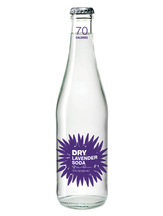
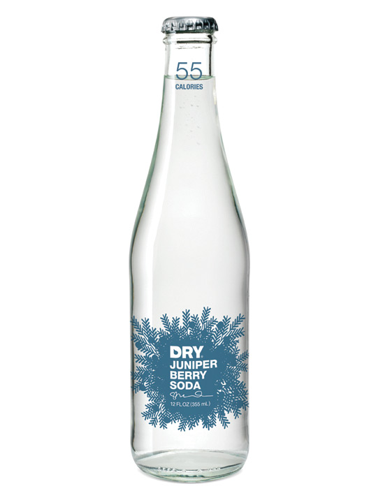
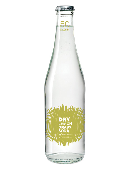
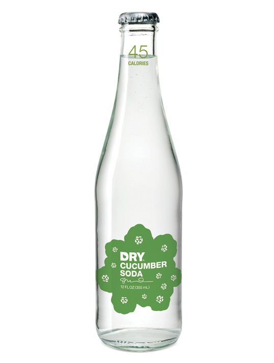
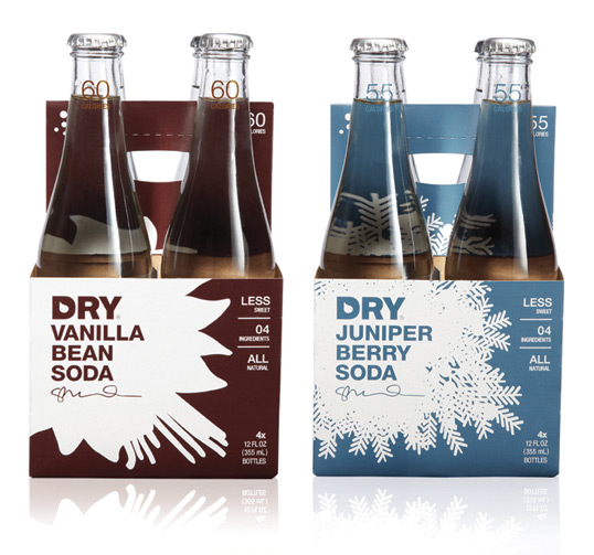
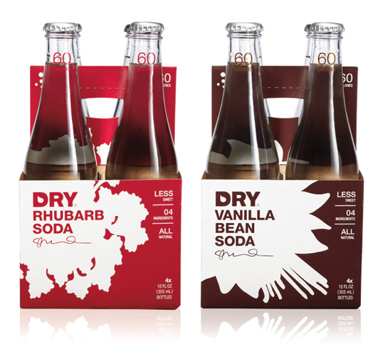
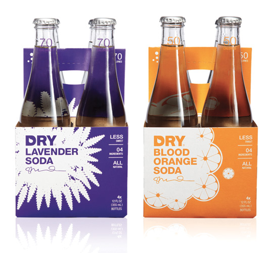
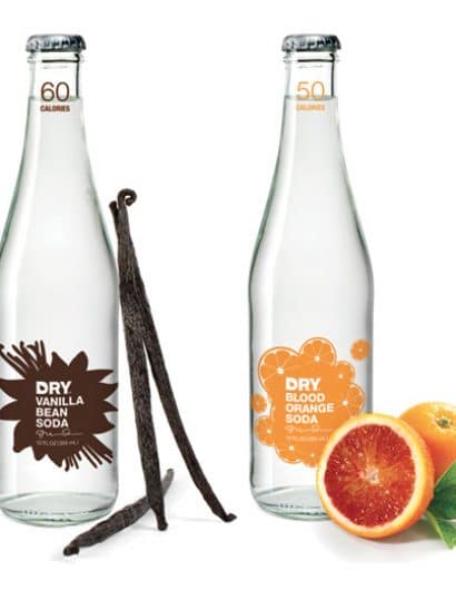
Designed by Turnstyle | Country: United States
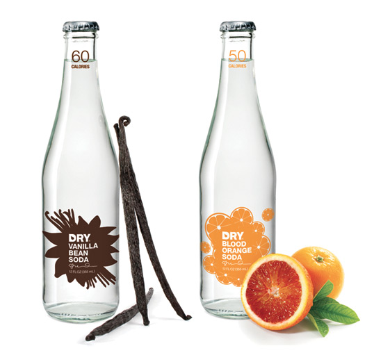
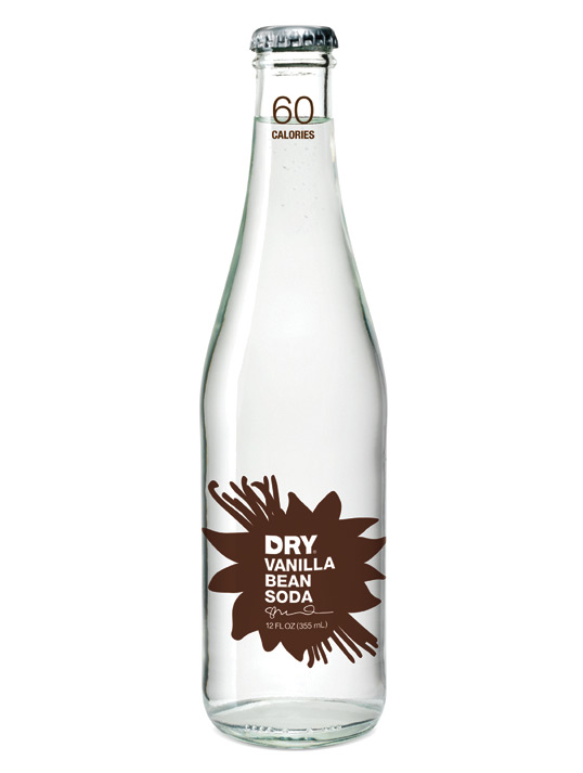
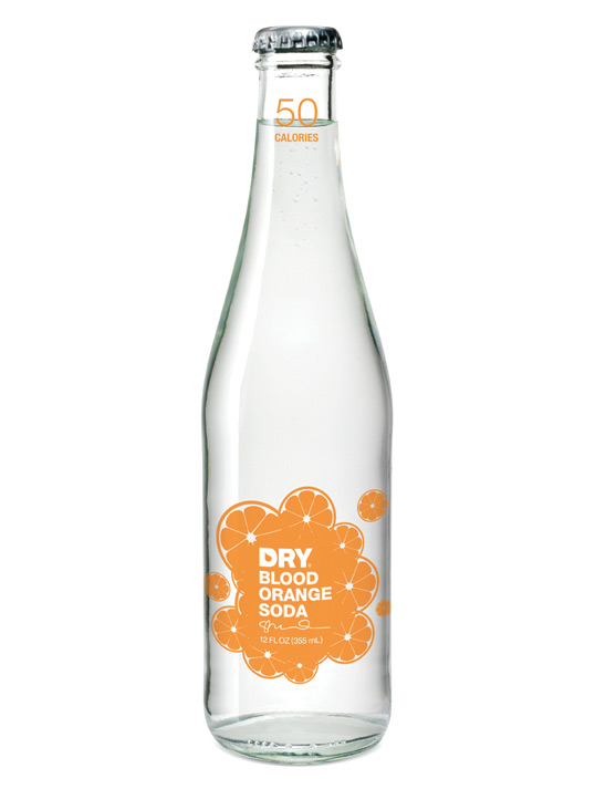
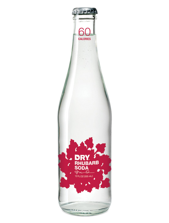
“DRY Soda has introduced a fresh new packaging look with bold, graphic illustrations that pop the flavor on each bottle and 4-pack carrier. Clear bottles allow the purity of the product to show through and the founder’s signature still on each bottle connotes a sense of craft behind each flavor’s recipe.”
From DRY Soda Co.:
“So why the change? DRY Soda launched in 2005. In that time DRY has evolved from its beginnings on the white tablecloths of the country’s finest restaurants, to finding huge success in grocery stores, cafés, and other retail locations across the US and Canada. Every day we hear from DRY customers about how they love DRY’s flavors and we’re continually inspired by the ways people are pairing and mixing DRY with their favorite foods and spirits. We wanted DRY’s design to emphasize the flavors that make DRY Soda so unique. So DRY’s new design helps communicate the best parts of DRY Soda—its distinctive flavors and its uniqueness as a less sweet, four ingredients, all natural soda. And while it was hard to let the old design go, we think this new design fits DRY perfectly.
DRY’s new look was designed by Seattle-based Turnstyle. I started working with these great guys back when DRY was just an idea in my head. These incredibly talented designers took my vision for DRY and created a beautiful bottle worthy of the best restaurants in the US and now they have done it again—taking all that is great about DRY and reflecting that on the bottle in a way that will help us continue to reach new consumers.”
—Sharelle Klaus, Founder and CEO

