Designed by: PepsiCo Design & Innovation
Country: United States

Student Work – Clara Cabral de Sousa

Student Work - Clara Cabral de Sousa

Designed by Clara Cabral de Sousa | Country: Spain

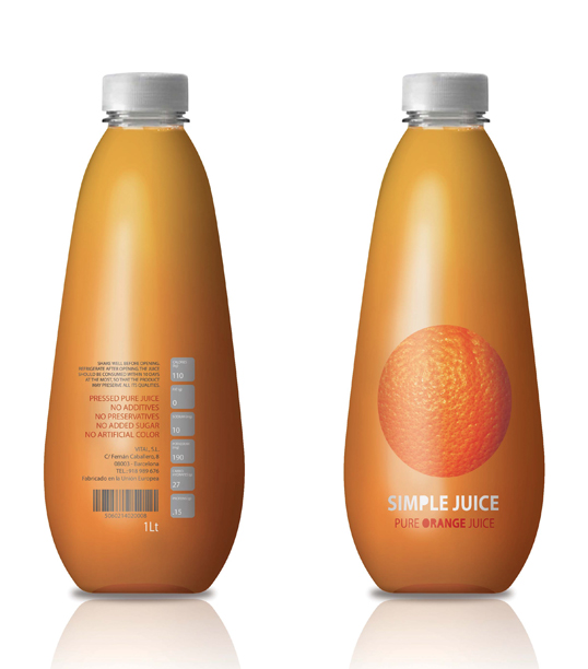
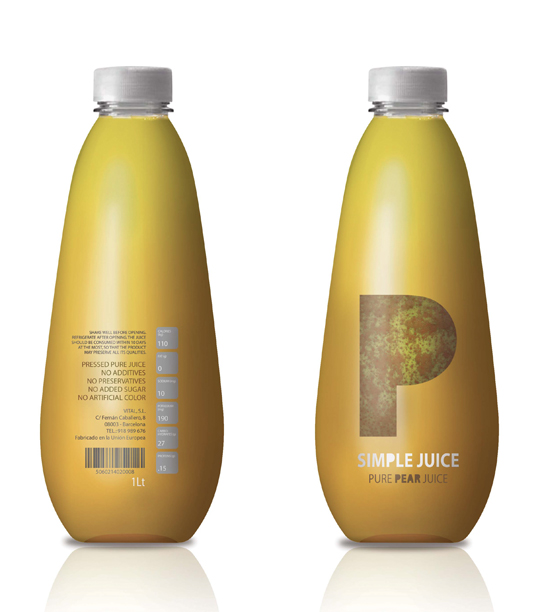
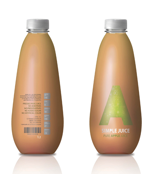
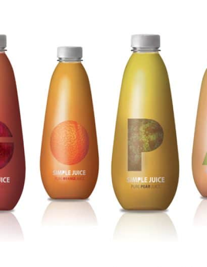
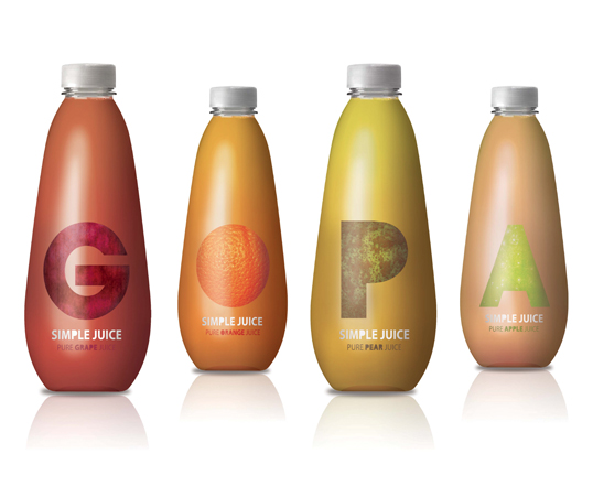
“The Simple Juice derives from the main idea of a pure pressed natural juice. In this particular project we developed the industrial and graphic design of the product. The softness and friendly form of the bottle versus the simplicity of the graphic aesthetics live in perfect harmony, leading the customer to a unique experience. You can differentiate each juice by the color of the fruits and the texture applied to the first letter of the fruit. This product line can be expanded and once you have enough packages (and therefore letters) you can create words with the bottles.”

Student Work - Clara Cabral de Sousa

Student Work - Clara Cabral de Sousa

Student Work - Clara Cabral de Sousa

Student Work - Clara Cabral de Sousa

Get the latest packaging design inspiration in your inbox:

Popular designs

The Port Vodka Lemon Water

Overview: In response to my client’s vision for a Cape Cod themed beverage brand, I embarked on the journey to create The Port

Over the wave

This Kombucha originates in Lombok, Indonesia, where its paradise beaches attract hundreds of surfers eager to ride the waves. When you surf,

Far Out Bar

Description: Far Out Bar is a cutting-edge packaging design project created for High Life Farms’ macrodose THC chocolate bars. This project involved

The Bra Guru

Most women are wearing the wrong size bra and that is a fact. The Bra Guru® is the first and only professional

Designed by: PepsiCo Design & Innovation
Country: United States

Student Work – Clara Cabral de Sousa

simple1

Student Work - Clara Cabral de Sousa

Designed by Clara Cabral de Sousa | Country: Spain

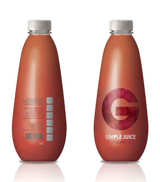
“The Simple Juice derives from the main idea of a pure pressed natural juice. In this particular project we developed the industrial and graphic design of the product. The softness and friendly form of the bottle versus the simplicity of the graphic aesthetics live in perfect harmony, leading the customer to a unique experience. You can differentiate each juice by the color of the fruits and the texture applied to the first letter of the fruit. This product line can be expanded and once you have enough packages (and therefore letters) you can create words with the bottles.”
Student Work - Clara Cabral de Sousa

Student Work - Clara Cabral de Sousa

Student Work - Clara Cabral de Sousa

Student Work - Clara Cabral de Sousa

Previous slide
Next slide

Explore more great package design

Get the latest on packaging design in your inbox: