Designed by Up Inc. | Country: Canada
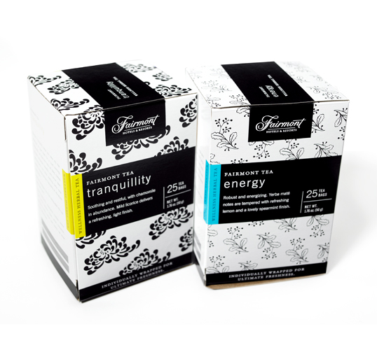
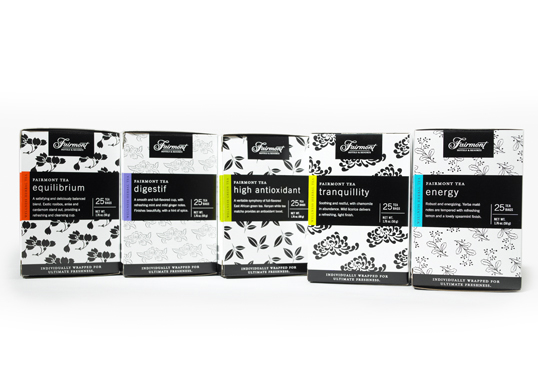
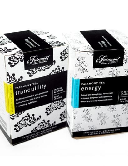
“Packaging for Fairmont’s signature teas had to communicate the luxury messaging of the brand, as well as the health-promoting ingredients of the teas. Bursts of colour were added to Fairmont’s corporate black to differentiate the flavours and to add an element of cheerfulness. A sparse, illustrated pattern allows for bilingual copy (French and English) and adds welcome texture.”


