Designed by: PepsiCo Design & Innovation
Country: United States

Vitamin Well

Vitamin Well

Designed by Neumeister | Country: Sweden | Font used: ITC Avant Garde Gothic

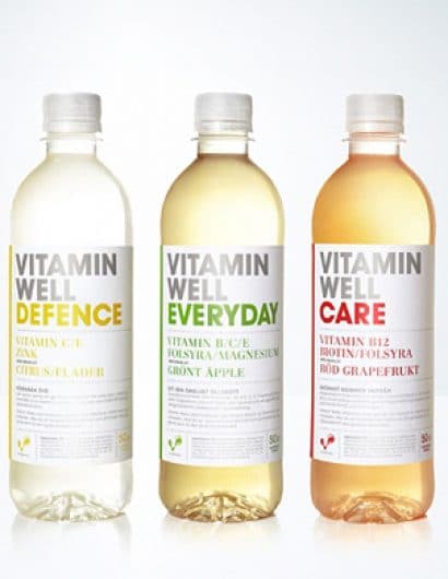
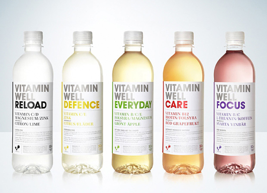
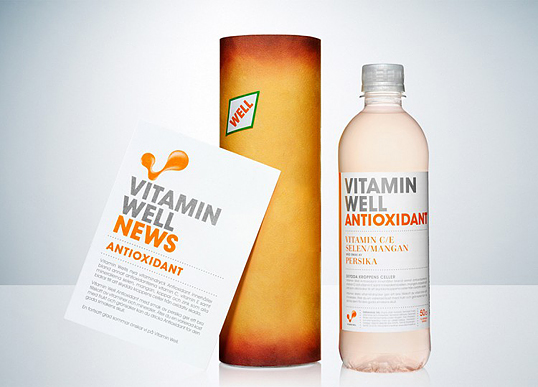
Vitamin Well, launched last year, has been given a revamp by Neumeister. “Vitamin Well was launched as ‘the tasty, healthy drink filled with minerals’. Its success was far greater than anyone could imagine. But was the existing design sufficiently clear?  Neumeister were contracted to add an even greater clarity to the design and give the brand a new lease of life. The design was revamped and developed. The labelling and the packaging – everything got a new clear structure, which nevertheless kept the original idea clearly in focus. We gave Vitamin Well the very vitamin injections that it gives you. The bottle alone conveys the message in all the advertising. No copy, no other visual impressions. A great success has become even greater.”

Vitamin Well

Vitamin Well

Vitamin Well

Vitamin Well

Get the latest packaging design inspiration in your inbox:

Popular designs

Pure Persian Honey

When we look closely at honey packaging, they are almost all in the usual format, and the ultimate in creativity is that

Far Out Bar

Description: Far Out Bar is a cutting-edge packaging design project created for High Life Farms’ macrodose THC chocolate bars. This project involved

Burma Love Rebrand

Love at First BiteAs an extension of the Burma Superstar restaurant in San Francisco, Burma Love Foods gives diners an opportunity to

Designed by: PepsiCo Design & Innovation
Country: United States

Vitamin Well

Vitamin Well

Vitamin Well

Designed by Neumeister | Country: Sweden | Font used: ITC Avant Garde Gothic

Vitamin Well, launched last year, has been given a revamp by Neumeister. “Vitamin Well was launched as ‘the tasty, healthy drink filled with minerals’. Its success was far greater than anyone could imagine. But was the existing design sufficiently clear?  Neumeister were contracted to add an even greater clarity to the design and give the brand a new lease of life. The design was revamped and developed. The labelling and the packaging – everything got a new clear structure, which nevertheless kept the original idea clearly in focus. We gave Vitamin Well the very vitamin injections that it gives you. The bottle alone conveys the message in all the advertising. No copy, no other visual impressions. A great success has become even greater.”

Vitamin Well

Vitamin Well

Vitamin Well

Previous slide
Next slide

Explore more great package design

Get the latest on packaging design in your inbox: