Designed by: PepsiCo Design & Innovation
Country: United States

Jacob’s Creek

Jacob's Creek

Designed by Mash | Country: Australia

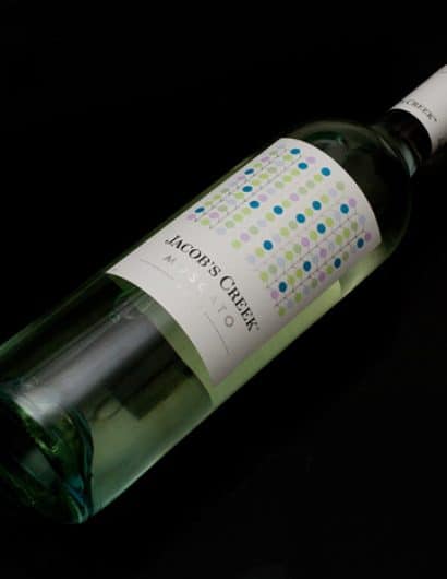
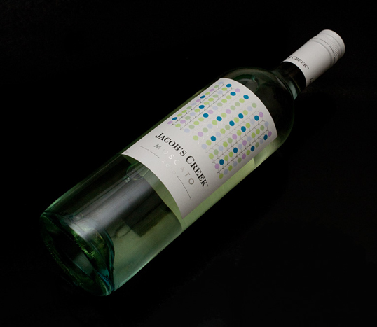
“Jacobs Creek, a major player in the world of wine. A highly successful volume brand that wanted to expand it’s repertoire and make sure the fringes of their target market were being catered for. Market research uncovered the opportunity to provide a new wine for the sweet wine drinker (a predominantly over 27’s female  market). Mash was approached to design the packaging for 2 Moscato’s, a white and a rosé. While the Jacob’s Creek branding remains, a new direction for packaging was created. A link is made to the brand heritage, while the abstract pattern with silver foiling adds a new dimension to the Jacob’s Creek brand.”

Jacob's Creek

Get the latest packaging design inspiration in your inbox:

Popular designs

Rebranding Mayawell: A Blend of Mexican Heritage and Healthy Living

Discover Mayawell, a Mexican-owned beverage company that celebrates its heritage with natural, organic, and prebiotic drinks. The rebranding strikes a balance between traditional elements and contemporary design, offering a unique, healthy alternative to traditional sodas.

Laphroaig’s Wellington Boot-Inspired Gift Packaging Design

Laphroaig leverages story-telling to engage new drinkers, transforming the iconic green wellies into a giftable, reusable packaging for their single malt whisky. The wellie-inspired design disrupts traditional Scotch packaging, adding a playful touch to the brand’s history.

Innovative Design and Packaging of Teeling Whiskey Crystal Malt

Explore the innovative packaging design of Teeling Whiskey Crystal Malt. A dark screen printed bottle with a Marque™ aluminum label, textural dimension, and a seamless diamond pattern, embodies the brand’s commitment to unconventional expressions.

Designed by: PepsiCo Design & Innovation
Country: United States

Jacob’s Creek

jacobs1

Jacob's Creek

Designed by Mash | Country: Australia

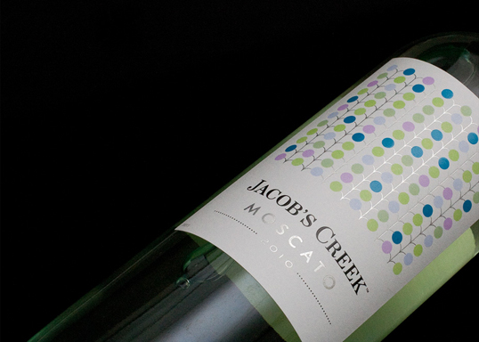
“Jacobs Creek, a major player in the world of wine. A highly successful volume brand that wanted to expand it’s repertoire and make sure the fringes of their target market were being catered for. Market research uncovered the opportunity to provide a new wine for the sweet wine drinker (a predominantly over 27’s female  market). Mash was approached to design the packaging for 2 Moscato’s, a white and a rosé. While the Jacob’s Creek branding remains, a new direction for packaging was created. A link is made to the brand heritage, while the abstract pattern with silver foiling adds a new dimension to the Jacob’s Creek brand.”
Jacob's Creek

Previous slide
Next slide
Get the latest on packaging design in your inbox: