Designed by: PepsiCo Design & Innovation
Country: United States

Student Work – Christopher Vicente

Student Work - Christopher Vicente

Designed by Christopher Vicente | Country: United States

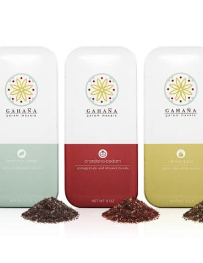
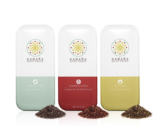
“Gahaña is a line of Indian spice mixtures (masala) created for a branding and packaging project. This lines of spices consist of three mixed flavors: mango/ginger, pomegranate/almond and garlic/onion. In this project I tried to focus on designing something that’s normally very traditional looking and giving it a more contemporary feel. Flavor identification was also very important when it came to the branding of this product. The colors as well as the flavor symbols were the two main things that I used to set the three flavors apart while making sure that there’s continuity within the line of products.”

Get the latest packaging design inspiration in your inbox:

Popular designs

Far Out Bar

Description: Far Out Bar is a cutting-edge packaging design project created for High Life Farms’ macrodose THC chocolate bars. This project involved

The Bra Guru

Most women are wearing the wrong size bra and that is a fact. The Bra Guru® is the first and only professional

Pure Persian Honey

When we look closely at honey packaging, they are almost all in the usual format, and the ultimate in creativity is that

Over the wave

This Kombucha originates in Lombok, Indonesia, where its paradise beaches attract hundreds of surfers eager to ride the waves. When you surf,

Designed by: PepsiCo Design & Innovation
Country: United States

Student Work – Christopher Vicente

gahana

Student Work - Christopher Vicente

Designed by Christopher Vicente | Country: United States

“Gahaña is a line of Indian spice mixtures (masala) created for a branding and packaging project. This lines of spices consist of three mixed flavors: mango/ginger, pomegranate/almond and garlic/onion. In this project I tried to focus on designing something that’s normally very traditional looking and giving it a more contemporary feel. Flavor identification was also very important when it came to the branding of this product. The colors as well as the flavor symbols were the two main things that I used to set the three flavors apart while making sure that there’s continuity within the line of products.”

Previous slide
Next slide

Explore more great package design

Get the latest on packaging design in your inbox: