Designed by Mark Johnson | Country: United States
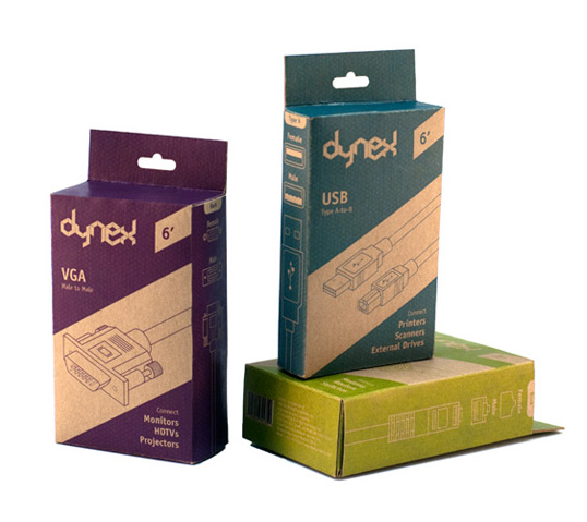
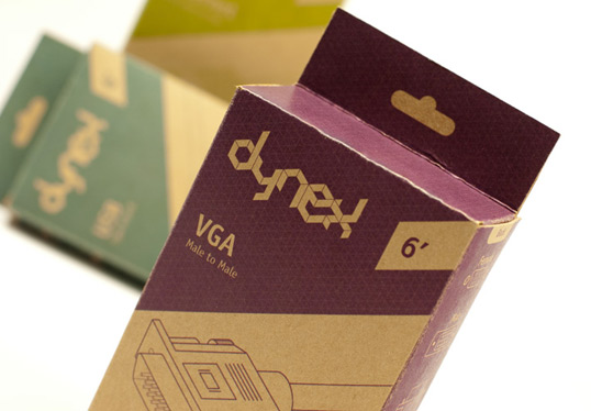
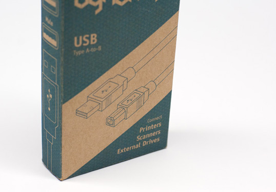
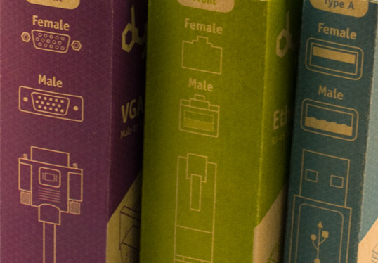
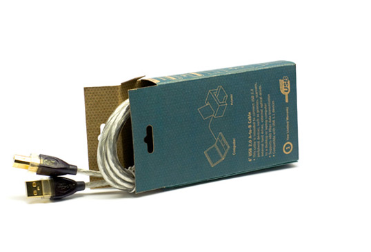
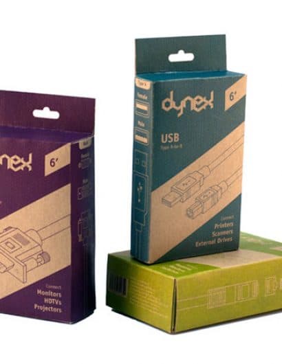
“One of the five in-store brands living inside of Best Buy, Dynex has had an aesthetic following that looks like it fell out of 1989. Looking to revitalize the Dynex brand, I decided to start from the ground up, using an iso-grid as a foundation. In order to revitalize the brand I introduced a new logo as well as new reduced packaging, which contains large and easily identifiable technical drawings.”

