Designed by: PepsiCo Design & Innovation
Country: United States

Student Work – Kristin Agnarsdóttir

Student Work - Kristin Agnarsdóttir

Designed by Kristin Agnarsdóttir | Country: United States

Kristin recently graduated with an M.F.A. in Graphic Design from the Academy of Art University in San Francisco, California. The program emphasized conceptual and critical thinking alongside typographic excellence, visual storytelling and solid craft skills.

Student Work - Kristin Agnarsdóttir

Student Work - Kristin Agnarsdóttir

Student Work - Kristin Agnarsdóttir

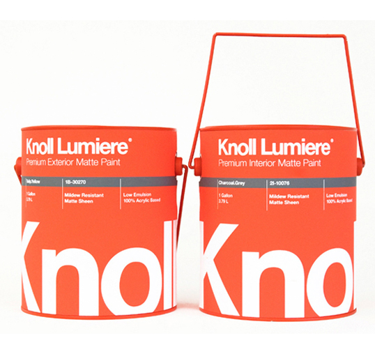
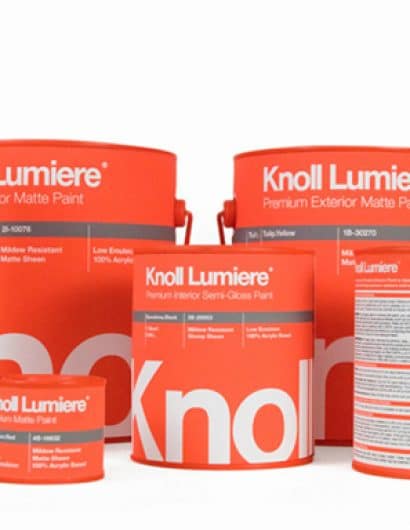
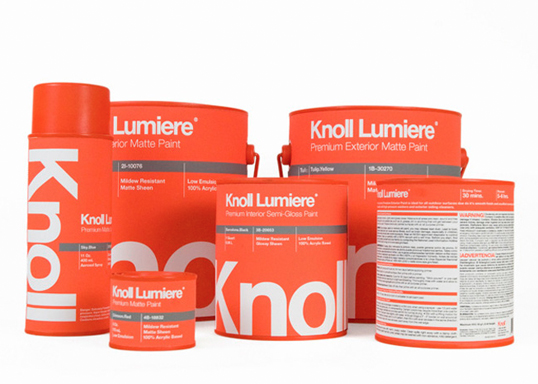
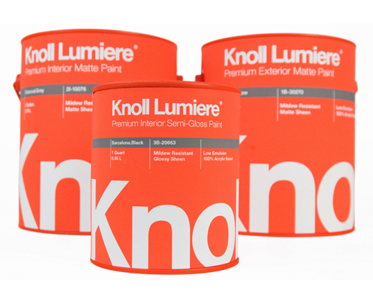
“In this packaging class students were instructed to either redesign an existing architectural paint line or choose a brand or designer and invent a paint line for them.

Based on my love for strong simple mid century designs, I chose Knoll as my inspiration and maker of a new line of paint colors. The name is french and means “light”. The idea is that they only make a very selected line of colors inspired by their textiles and color choices through the decades. The tapered square handles are based on Harry Bertoia’s 1952 Diamond Chair Base.”

Student Work - Kristin Agnarsdóttir

Student Work - Kristin Agnarsdóttir

Student Work - Kristin Agnarsdóttir

Student Work - Kristin Agnarsdóttir

Student Work - Kristin Agnarsdóttir

Student Work - Kristin Agnarsdóttir

Student Work - Kristin Agnarsdóttir

Student Work - Kristin Agnarsdóttir

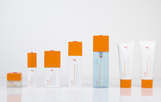
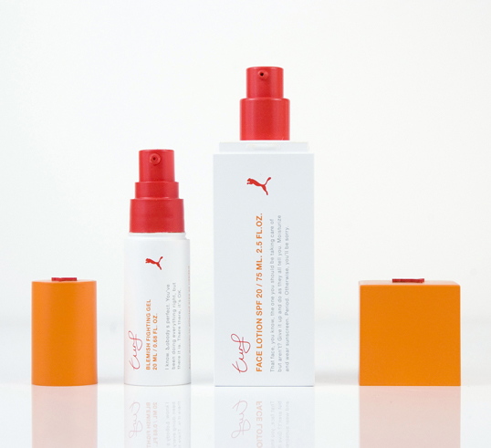
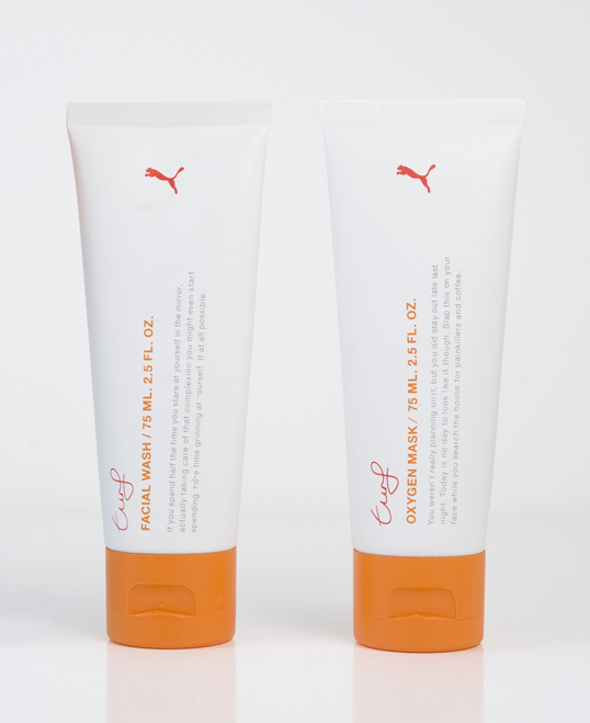
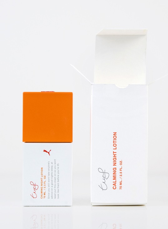
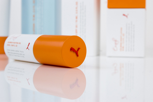
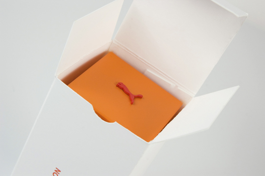
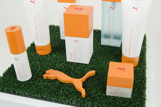
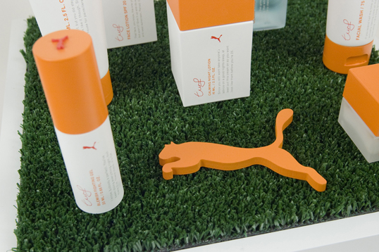
“Students were instructed to conceptualize a cohesive skin-care line for an existing brand currently not on the skin-care market. Furthermore students were to be mindful of the chosen brand’s target-audience, presence and over-all aesthetics. The line was to consist of seven products and part of the challenge was to seek out or design the bottle shapes and create suitable prototypes for the product line. Finally a fitting display was designed and made.

Puma Turf targets active urbanites. Not fuzzy people, energetic wich a modern, simple sense of aesthetics. The square design of the bottles is for stacking purposes in toiletry bags.The display design references urban athletic fields with the synthetic turf featured.”

Student Work - Kristin Agnarsdóttir

Student Work - Kristin Agnarsdóttir

Student Work - Kristin Agnarsdóttir

Student Work - Kristin Agnarsdóttir

Student Work - Kristin Agnarsdóttir

Student Work - Kristin Agnarsdóttir

Student Work - Kristin Agnarsdóttir

Student Work - Kristin Agnarsdóttir

Student Work - Kristin Agnarsdóttir

Student Work - Kristin Agnarsdóttir

Student Work - Kristin Agnarsdóttir

Student Work - Kristin Agnarsdóttir

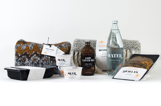
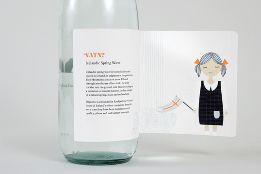
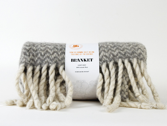
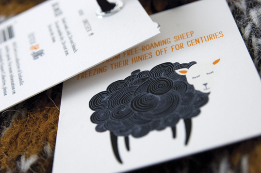
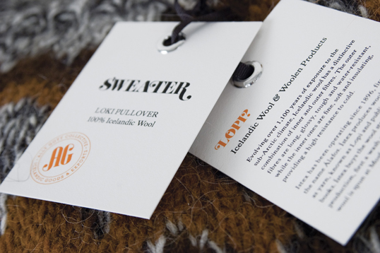
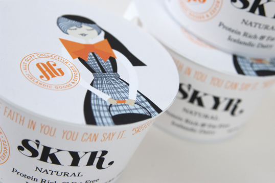
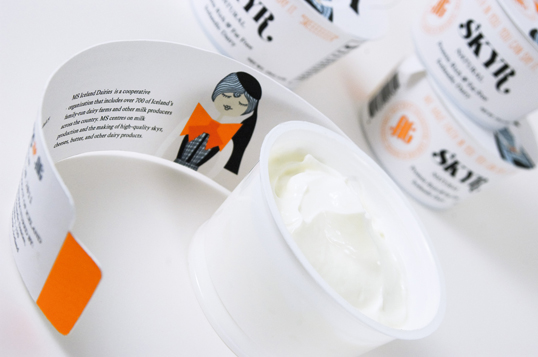
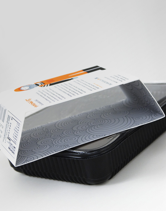
“Allt Gott (e. All Good) is my MFA Graphic Design thesis. Allt Gott is a collective of Icelandic products and manufacturers. Part economic and part packaging and branding, the collective functions as an aid to nurture the Icelandic manufacturing industry. Through cohesive visuals, marketing placement, pooled logistical costs, etc., manufacturers operate in a better economical climate and have a better chance at developing their products and expanding their customer base. More information, including promotional materials, business plan, process and more can be found at alltgott.org

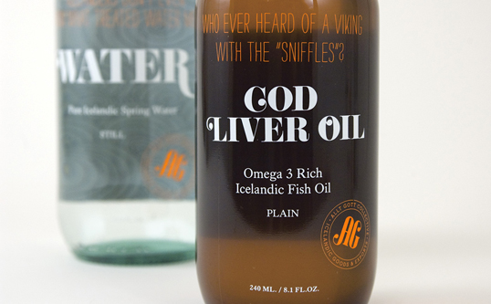
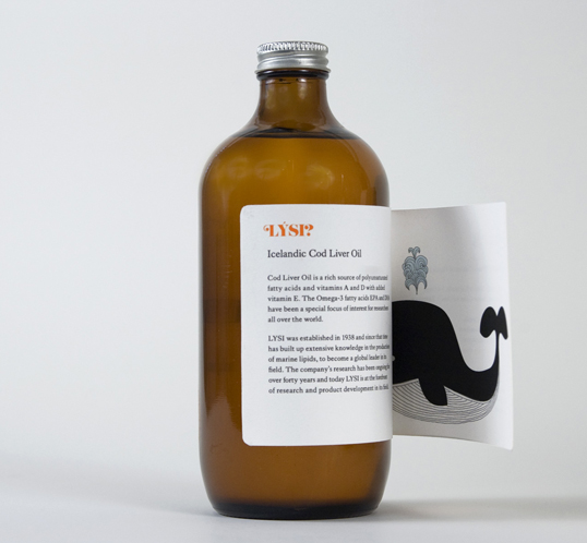
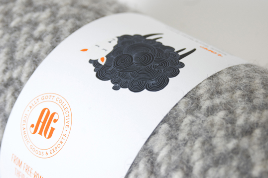
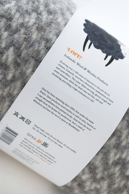
A big purpose of the Allt Gott collective is strengthening the Icelandic ‘country-of-origin’ brand. Aside from promotional materials, such as environmental graphics, the products are the strongest line of communication to the consumer. It is therefore integral to the package design to keep a strong focus on the background of the product. This is implemented on all Allt Gott products in the form of a ‘reveal.’ Labels are opened, tags are flipped, and bands are unwrapped. This interactive packaging is used to educate. First to tell the story of the company or the place of origin. Secondly to tell the story of the product, and it’s historical context within Icelandic culture. By putting into narrative the background of the product, a bond or friendship is created between the consumer and the manufacturers. The consumer learns where this is from, and most importantly, what the company behind it stands for. As the consumer has contact with additional Allt Gott products and narratives, a deeper understanding of the ‘country-of-origin’ develops. The illustrations of the Allt Gott brand come into play within the packaging as representations of various elements. They can represent the actual manufacturer–a milkmaid, a fisherman; or as the product itself–sheep, fish.”

Get the latest packaging design inspiration in your inbox:

Popular designs

Over the wave

This Kombucha originates in Lombok, Indonesia, where its paradise beaches attract hundreds of surfers eager to ride the waves. When you surf,

The Bra Guru

Most women are wearing the wrong size bra and that is a fact. The Bra Guru® is the first and only professional

Pure Persian Honey

When we look closely at honey packaging, they are almost all in the usual format, and the ultimate in creativity is that

Designed by: PepsiCo Design & Innovation
Country: United States

Student Work – Kristin Agnarsdóttir

knoll1

Student Work - Kristin Agnarsdóttir

Designed by Kristin Agnarsdóttir | Country: United States

Kristin recently graduated with an M.F.A. in Graphic Design from the Academy of Art University in San Francisco, California. The program emphasized conceptual and critical thinking alongside typographic excellence, visual storytelling and solid craft skills.

Student Work - Kristin Agnarsdóttir

Student Work - Kristin Agnarsdóttir

Student Work - Kristin Agnarsdóttir

“In this packaging class students were instructed to either redesign an existing architectural paint line or choose a brand or designer and invent a paint line for them.

Based on my love for strong simple mid century designs, I chose Knoll as my inspiration and maker of a new line of paint colors. The name is french and means “light”. The idea is that they only make a very selected line of colors inspired by their textiles and color choices through the decades. The tapered square handles are based on Harry Bertoia’s 1952 Diamond Chair Base.”

Student Work - Kristin Agnarsdóttir

Student Work - Kristin Agnarsdóttir

Student Work - Kristin Agnarsdóttir

Student Work - Kristin Agnarsdóttir

Student Work - Kristin Agnarsdóttir

Student Work - Kristin Agnarsdóttir

Student Work - Kristin Agnarsdóttir

Student Work - Kristin Agnarsdóttir

“Students were instructed to conceptualize a cohesive skin-care line for an existing brand currently not on the skin-care market. Furthermore students were to be mindful of the chosen brand’s target-audience, presence and over-all aesthetics. The line was to consist of seven products and part of the challenge was to seek out or design the bottle shapes and create suitable prototypes for the product line. Finally a fitting display was designed and made.

Puma Turf targets active urbanites. Not fuzzy people, energetic wich a modern, simple sense of aesthetics. The square design of the bottles is for stacking purposes in toiletry bags.The display design references urban athletic fields with the synthetic turf featured.”

Student Work - Kristin Agnarsdóttir

Student Work - Kristin Agnarsdóttir

Student Work - Kristin Agnarsdóttir

Student Work - Kristin Agnarsdóttir

Student Work - Kristin Agnarsdóttir

Student Work - Kristin Agnarsdóttir

Student Work - Kristin Agnarsdóttir

Student Work - Kristin Agnarsdóttir

Student Work - Kristin Agnarsdóttir

Student Work - Kristin Agnarsdóttir

Student Work - Kristin Agnarsdóttir

Student Work - Kristin Agnarsdóttir

“Allt Gott (e. All Good) is my MFA Graphic Design thesis. Allt Gott is a collective of Icelandic products and manufacturers. Part economic and part packaging and branding, the collective functions as an aid to nurture the Icelandic manufacturing industry. Through cohesive visuals, marketing placement, pooled logistical costs, etc., manufacturers operate in a better economical climate and have a better chance at developing their products and expanding their customer base. More information, including promotional materials, business plan, process and more can be found at alltgott.org

A big purpose of the Allt Gott collective is strengthening the Icelandic ‘country-of-origin’ brand. Aside from promotional materials, such as environmental graphics, the products are the strongest line of communication to the consumer. It is therefore integral to the package design to keep a strong focus on the background of the product. This is implemented on all Allt Gott products in the form of a ‘reveal.’ Labels are opened, tags are flipped, and bands are unwrapped. This interactive packaging is used to educate. First to tell the story of the company or the place of origin. Secondly to tell the story of the product, and it’s historical context within Icelandic culture. By putting into narrative the background of the product, a bond or friendship is created between the consumer and the manufacturers. The consumer learns where this is from, and most importantly, what the company behind it stands for. As the consumer has contact with additional Allt Gott products and narratives, a deeper understanding of the ‘country-of-origin’ develops. The illustrations of the Allt Gott brand come into play within the packaging as representations of various elements. They can represent the actual manufacturer–a milkmaid, a fisherman; or as the product itself–sheep, fish.”
Previous slide
Next slide

Explore more great package design

Get the latest on packaging design in your inbox: