Designed by: PepsiCo Design & Innovation
Country: United States

The Food Doctor

The Food Doctor

Designed by Pearlfisher | Country: United Kingdom

“Pearlfisher has created a new brand identity – and redesigned the packaging across the entire range – for the UK’s leading nutrition consultancy The Food Doctor.

Co-founded in 1999 by Ian Marber, a leading nutritionist and acknowledged expert in his field, The Food Doctor is a unique concept that provides sensible advice for achieving a healthier plan for life. From the start it established itself as a visible brand in the field of healthier eating with a range of food products from seed mixes to ready meals.

The new identity needed to embrace the ‘Eat better forever’ strapline and move the brand focus from a functional product to more of a lifestyle proposition.

Pearlfisher Creative Director, Natalie Chung, explains, “We have created a memorable symbol which bonds food & health together in a wholesome, tasty icon – the apple. The apple reflects the brand journey from seed to life and provides an inspirational identity for future celebration and growth to communicate the core truth of The Food Doctor philosophy – that this is a way of life and not a fad, nor a diet.”

Natalie continues, “The language throughout is both simple and informative, empowering consumers with the knowledge they need to understand their food and truly love their bodies. The use of colour across the range builds this message by injecting the brand with a sense of continuous energy and positivity.”

Michael da Costa, Managing Director of The Food Doctor, says “We looked at what is happening in the health food aisles and the changes in consumer behaviour and had a think about how to grow the brand and communicate The Food Doctor’s key messages to shoppers. This has successfully been achieved by Pearlfisher, who have really captured the essence of the brand in terms of consumers’ priorities for health, and by our licensing partners with exciting NPD and flavourful foods that fit in with everyday lifestyle”.

Launched end of 2010 with The Food Doctor bread products, the entire new-look brand portfolio will roll-out in the coming months across the UK.”

Get the latest packaging design inspiration in your inbox:

Popular designs

Over the wave

This Kombucha originates in Lombok, Indonesia, where its paradise beaches attract hundreds of surfers eager to ride the waves. When you surf,

The Port Vodka Lemon Water

Overview: In response to my client’s vision for a Cape Cod themed beverage brand, I embarked on the journey to create The Port

The Bra Guru

Most women are wearing the wrong size bra and that is a fact. The Bra Guru® is the first and only professional

Far Out Bar

Description: Far Out Bar is a cutting-edge packaging design project created for High Life Farms’ macrodose THC chocolate bars. This project involved

Designed by: PepsiCo Design & Innovation
Country: United States

The Food Doctor

food

The Food Doctor

Designed by Pearlfisher | Country: United Kingdom

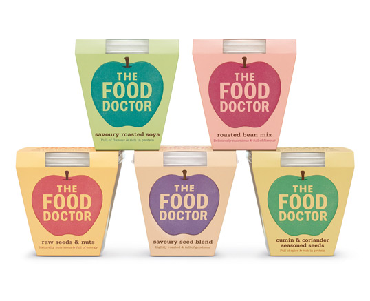
“Pearlfisher has created a new brand identity – and redesigned the packaging across the entire range – for the UK’s leading nutrition consultancy The Food Doctor.

Co-founded in 1999 by Ian Marber, a leading nutritionist and acknowledged expert in his field, The Food Doctor is a unique concept that provides sensible advice for achieving a healthier plan for life. From the start it established itself as a visible brand in the field of healthier eating with a range of food products from seed mixes to ready meals.

The new identity needed to embrace the ‘Eat better forever’ strapline and move the brand focus from a functional product to more of a lifestyle proposition.

Pearlfisher Creative Director, Natalie Chung, explains, “We have created a memorable symbol which bonds food & health together in a wholesome, tasty icon – the apple. The apple reflects the brand journey from seed to life and provides an inspirational identity for future celebration and growth to communicate the core truth of The Food Doctor philosophy – that this is a way of life and not a fad, nor a diet.”

Natalie continues, “The language throughout is both simple and informative, empowering consumers with the knowledge they need to understand their food and truly love their bodies. The use of colour across the range builds this message by injecting the brand with a sense of continuous energy and positivity.”

Michael da Costa, Managing Director of The Food Doctor, says “We looked at what is happening in the health food aisles and the changes in consumer behaviour and had a think about how to grow the brand and communicate The Food Doctor’s key messages to shoppers. This has successfully been achieved by Pearlfisher, who have really captured the essence of the brand in terms of consumers’ priorities for health, and by our licensing partners with exciting NPD and flavourful foods that fit in with everyday lifestyle”.

Launched end of 2010 with The Food Doctor bread products, the entire new-look brand portfolio will roll-out in the coming months across the UK.”
Previous slide
Next slide

Explore more great package design

Get the latest on packaging design in your inbox: