Designed by Michael Dibblee | Country: Canada
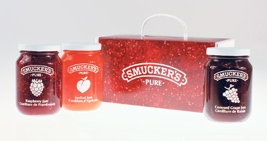
Description: Smucker’s is a North American manufacturer of fruit spreads, ice cream toppings, health and natural foods, beverages, shortening, and natural peanut butter, dating back to 1897. When redesigning a number of products from the Smucker’s Pure Jam line, I intended for the design to truly and uniquely portray the essence of quality and traditions based on the company’s ideals in a new and innovative way.
Ideally, customers should be persuaded to purchase a product by its essence, and not simply by its label. This especially matters when it comes to a company that prides itself on excellent quality. Many consumers have experienced the growing, picking and preparation of fruit for spreads; in remembering the ease at which one can recognize the colours, textures and smells associated with the cooking process of jam, I created a design that emphasizes the jam itself.
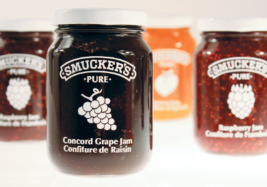
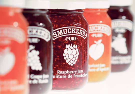
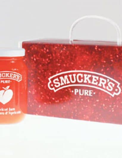
After experimenting with die-cuts and windows that exposed the natural colours of the jam, I discovered that reversing this effect actually exposed more of the jam to the consumer. I recreated a silkscreen effect to contrast the rich natural colours of the jam and moved away from traditional label systems used by many competitors. Many rival companies and products embrace the use of photographic and illustrative images of fruits to give the consumer a taste of what the product offers. To break away from this conventional style and allow Smucker’s to stand out when positioned on a grocery shelf, I depicted the fruits as icons. These white icons stand out clearly on the background colours of the jam, yet do not take away from the distinct colours and textures seen through the glass jars.
Overall, the design portrays a rich and elegant aesthetic that stands out from competitors and retains the quality that is associated with the Smucker’s brand.


