Designed by: PepsiCo Design & Innovation
Country: United States

Hollows

Hollows

Designed by Sell! Sell! | Country: United Kingdom

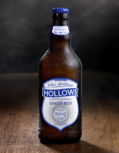
“Last year our good friends at Fentimans came to us with the idea of launching an alcoholic ginger beer. They are the masters of the genuine ginger beer, and were pretty unimpressed by the fake, wine-based or flavoured lager ginger beers that were on the market. They knew that they could make a proper alcoholic ginger beer, the traditional way, slow-brewed with ginger from scratch.

They asked us to help them bring it to life. We were all quite wary about calling it Fentimans, because they didn’t want to cause any confusion between an alcoholic brand and non-alcoholic. So we set about making a new brand for this new drink. We found the story of John Hollows. John was a son-in-law of Thomas Fentiman, the company founder. He was given his own ginger beer factory to run, and produced the drink under the name Hollows and Fentimans. We also found out that they used to sell their ginger beers in the famous grey hens (stout stone jars) but with a signature blue stopper.
Hollows

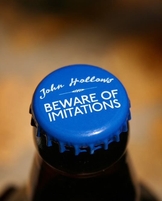
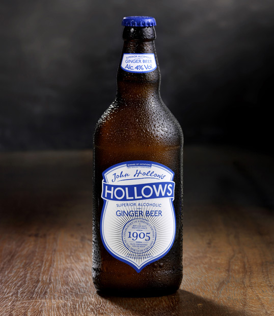
We designed the blue caps for the Hollows bottles as a nod to the old blue stoppers used in the grey hens. We made Beware Of Imitations our Hollows call to arms, an old-school line warning drinkers of the fake gingers that pretend to be the real thing. In our research, we came across all kinds of interesting old touches. Established in a perfect factory in the north of England was imprinted into one of the old jars, we thought it was worth resurrecting for the seal of quality on the Hollows bottle.

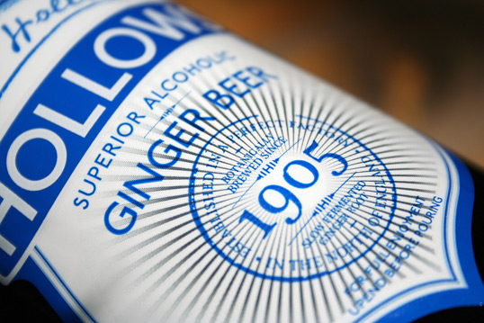
We wanted to give the label a detailed quality like the original jars often had, they contained lots of information and description. At the same time, to compete in the modern world, the name on the bottle needs to stand out on the shelf, or in the pub fridge.
Hollows

We wanted to do something interesting with the process on the label to reflect the superior quality of the drink. We devised this starburst device that is produced by leaving the metallic label to ‘show through’ the ink. We used an increasing dot-screen to fade it in.

It’s been an interesting project so far, building a brand from scratch. Hollows is now on sale, keep your eye out for it in a shop or pub near you.”


Get the latest packaging design inspiration in your inbox:

Popular designs

Far Out Bar

Description: Far Out Bar is a cutting-edge packaging design project created for High Life Farms’ macrodose THC chocolate bars. This project involved

Pure Persian Honey

When we look closely at honey packaging, they are almost all in the usual format, and the ultimate in creativity is that

The Bra Guru

Most women are wearing the wrong size bra and that is a fact. The Bra Guru® is the first and only professional

Designed by: PepsiCo Design & Innovation
Country: United States

Hollows

hollows1

Hollows

Designed by Sell! Sell! | Country: United Kingdom

“Last year our good friends at Fentimans came to us with the idea of launching an alcoholic ginger beer. They are the masters of the genuine ginger beer, and were pretty unimpressed by the fake, wine-based or flavoured lager ginger beers that were on the market. They knew that they could make a proper alcoholic ginger beer, the traditional way, slow-brewed with ginger from scratch.

They asked us to help them bring it to life. We were all quite wary about calling it Fentimans, because they didn’t want to cause any confusion between an alcoholic brand and non-alcoholic. So we set about making a new brand for this new drink. We found the story of John Hollows. John was a son-in-law of Thomas Fentiman, the company founder. He was given his own ginger beer factory to run, and produced the drink under the name Hollows and Fentimans. We also found out that they used to sell their ginger beers in the famous grey hens (stout stone jars) but with a signature blue stopper.

Hollows

We designed the blue caps for the Hollows bottles as a nod to the old blue stoppers used in the grey hens. We made Beware Of Imitations our Hollows call to arms, an old-school line warning drinkers of the fake gingers that pretend to be the real thing. In our research, we came across all kinds of interesting old touches. Established in a perfect factory in the north of England was imprinted into one of the old jars, we thought it was worth resurrecting for the seal of quality on the Hollows bottle.

We wanted to give the label a detailed quality like the original jars often had, they contained lots of information and description. At the same time, to compete in the modern world, the name on the bottle needs to stand out on the shelf, or in the pub fridge.

Hollows

We wanted to do something interesting with the process on the label to reflect the superior quality of the drink. We devised this starburst device that is produced by leaving the metallic label to ‘show through’ the ink. We used an increasing dot-screen to fade it in.

It’s been an interesting project so far, building a brand from scratch. Hollows is now on sale, keep your eye out for it in a shop or pub near you.”


Previous slide
Next slide

Explore more great package design

Get the latest on packaging design in your inbox: