Designed by: PepsiCo Design & Innovation
Country: United States

Tk:aro

Tk:aro

Designed by Monnet Design | Country: Canada

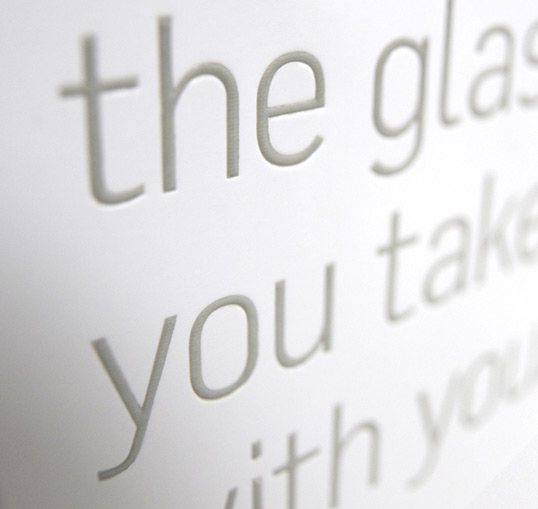
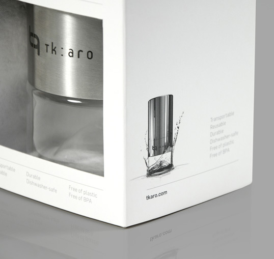
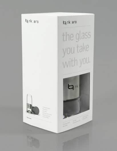
“To match the elegance of the product itself, we kept the design and copy to a minimum – focusing on creating a clean, bright package with hints of luxury (embossed logos on all sides, a foil-stamped message on the front and multi-level embossed photographs on the sides).

One package had to be created that could be used for all of the colours tk:aro will soon be offering. An added requirement was the need to showcase custom engraving on the front of the bottle – for example if a company had the lower metal rim of the bottles emblazoned with their logo, it would need to be visible. To address those concerns we added a custom die-cut window to the front of the packaging which reveals the color of the product as well as the engraved logo. We made a conscious decision not to have a larger PVC-covered front window, as the point of the reusable bottle is to eliminate the unnecessary use of plastics. The printed front was instead used to list some of its biggest selling features and to boldly proclaim what the product is: “the glass you take with you.”

The packaging was printed on FSC-certified paper and the inner tray in which the product sits is molded from pulp which is made of 100% post-consumer fibers and is 100% compostable.

The tk:aro bottle is a reddot design award winner, 2010.”

Tk:aro

Tk:aro

Get the latest packaging design inspiration in your inbox:

Popular designs

Innovative Design and Packaging of Teeling Whiskey Crystal Malt

Explore the innovative packaging design of Teeling Whiskey Crystal Malt. A dark screen printed bottle with a Marque™ aluminum label, textural dimension, and a seamless diamond pattern, embodies the brand’s commitment to unconventional expressions.

Dama Blanca: Packaging Design for Salt of Cádiz

Discover the artisanal salt packaging design for Dama Blanca, a family project from Salinas of Cádiz. The design reflects the brand’s 3000-year history, authenticity and love for the sea, using natural materials and a sea-inspired palette.

Designed by: PepsiCo Design & Innovation
Country: United States

Tk:aro

tkaro1

Tk:aro

Designed by Monnet Design | Country: Canada

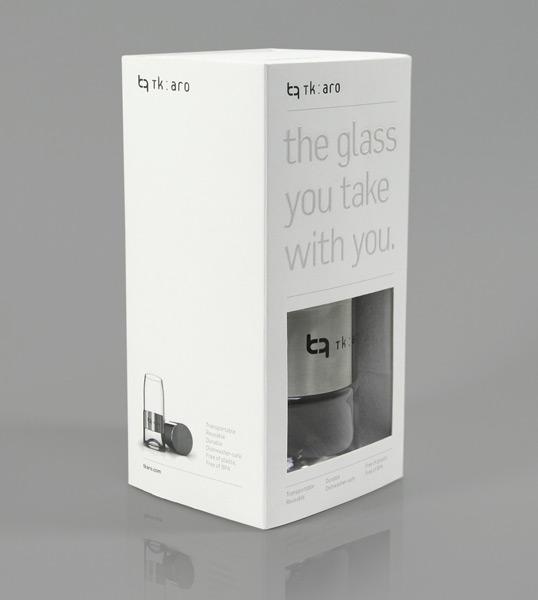
“To match the elegance of the product itself, we kept the design and copy to a minimum – focusing on creating a clean, bright package with hints of luxury (embossed logos on all sides, a foil-stamped message on the front and multi-level embossed photographs on the sides).

One package had to be created that could be used for all of the colours tk:aro will soon be offering. An added requirement was the need to showcase custom engraving on the front of the bottle – for example if a company had the lower metal rim of the bottles emblazoned with their logo, it would need to be visible. To address those concerns we added a custom die-cut window to the front of the packaging which reveals the color of the product as well as the engraved logo. We made a conscious decision not to have a larger PVC-covered front window, as the point of the reusable bottle is to eliminate the unnecessary use of plastics. The printed front was instead used to list some of its biggest selling features and to boldly proclaim what the product is: “the glass you take with you.”

The packaging was printed on FSC-certified paper and the inner tray in which the product sits is molded from pulp which is made of 100% post-consumer fibers and is 100% compostable.

The tk:aro bottle is a reddot design award winner, 2010.”
Tk:aro

Tk:aro

Previous slide
Next slide
Get the latest on packaging design in your inbox: