Designed by: PepsiCo Design & Innovation
Country: United States

Good Co.

Good Co.

Designed by Landor | Country: Australia

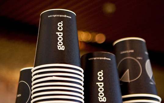
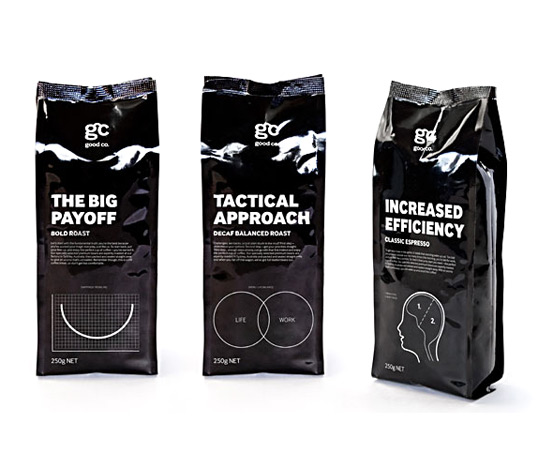
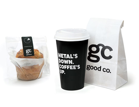
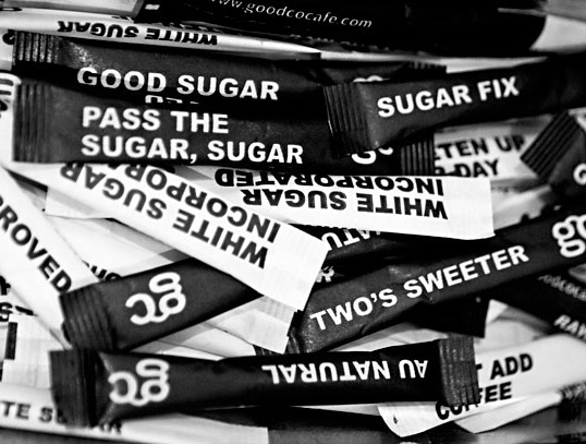
“o give the brand its voice, we took inspiration from the shops’ office-lobby locations and borrowed the corporate speak that a professional endures daily. The name we chose, Good Company Coffee, or Good Co. for short, is a dual play on the ideas of “being in good company” and “enjoying good coffee.” Language plays an important role in the expression of the Good Co. brand, and through the use of double meanings and wordplay, we turned business jargon into dryly comedic, relevant commentary that also describes the varieties of coffee. The brand voice works in tandem with a black-and-white illustration–based visual style that similarly draws from corporate culture with infographics, iconography, stylized charts, and graphs. From the store environment, menus, packaging, and barista behavior—it all adds up to a strong and entertaining experience.”

Good Co.

Good Co.

Good Co.

Get the latest packaging design inspiration in your inbox:

Popular designs

Burma Love Rebrand

Love at First BiteAs an extension of the Burma Superstar restaurant in San Francisco, Burma Love Foods gives diners an opportunity to

The Port Vodka Lemon Water

Overview: In response to my client’s vision for a Cape Cod themed beverage brand, I embarked on the journey to create The Port

Pure Persian Honey

When we look closely at honey packaging, they are almost all in the usual format, and the ultimate in creativity is that

Designed by: PepsiCo Design & Innovation
Country: United States

Good Co.

good1

Good Co.

Designed by Landor | Country: Australia

“o give the brand its voice, we took inspiration from the shops’ office-lobby locations and borrowed the corporate speak that a professional endures daily. The name we chose, Good Company Coffee, or Good Co. for short, is a dual play on the ideas of “being in good company” and “enjoying good coffee.” Language plays an important role in the expression of the Good Co. brand, and through the use of double meanings and wordplay, we turned business jargon into dryly comedic, relevant commentary that also describes the varieties of coffee. The brand voice works in tandem with a black-and-white illustration–based visual style that similarly draws from corporate culture with infographics, iconography, stylized charts, and graphs. From the store environment, menus, packaging, and barista behavior—it all adds up to a strong and entertaining experience.”
Good Co.

Good Co.

Good Co.

Previous slide
Next slide

Explore more great package design

Get the latest on packaging design in your inbox: