Designed by: PepsiCo Design & Innovation
Country: United States

The Pizza Makers

The Pizza Makers

Designed by Smith & Milton | Country: United Kingdom

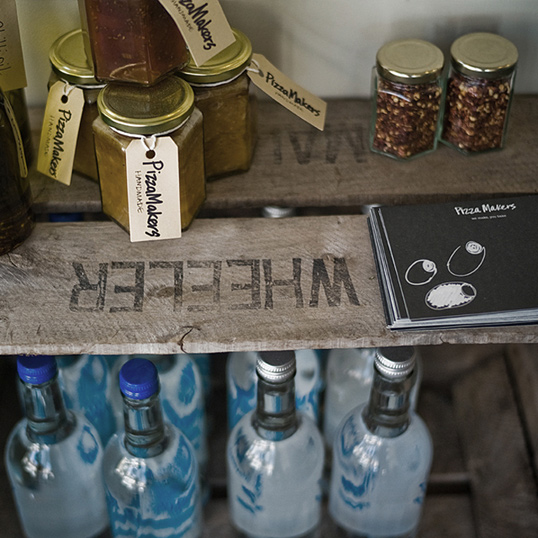
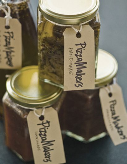
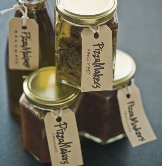
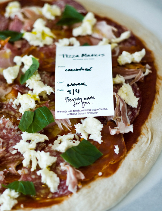
“How do you communicate ‘just made’ fresh pizza? Everyone thinks a ‘pizza to go’ is going to arrive as a hot, rich cheesy feast (reality: warm, greasy, disappointment). The Pizza Makers have turned the problem on its head and only MAKE pizza. It’s fresh from their kitchens, so it can be delivered (or you pick up) to bake at your convenience.

They needed a brand idea to set the tone for all their communications. First a name that tells the story. And a strapline that completes it. Second, a store refit to bring the kitchen upstairs and into the shop window – people making pizzas is a great advertisement. Thirdly, a blackboard black and white, fresh everyday style to reflect it with the handmade quality of the process. The only colour online is the photography, and instore, of the excellent product itself.”

The Pizza Makers

The Pizza Makers

Get the latest packaging design inspiration in your inbox:

Popular designs

Pure Persian Honey

When we look closely at honey packaging, they are almost all in the usual format, and the ultimate in creativity is that

Far Out Bar

Description: Far Out Bar is a cutting-edge packaging design project created for High Life Farms’ macrodose THC chocolate bars. This project involved

Over the wave

This Kombucha originates in Lombok, Indonesia, where its paradise beaches attract hundreds of surfers eager to ride the waves. When you surf,

Designed by: PepsiCo Design & Innovation
Country: United States

The Pizza Makers

pizza1

The Pizza Makers

Designed by Smith & Milton | Country: United Kingdom

“How do you communicate ‘just made’ fresh pizza? Everyone thinks a ‘pizza to go’ is going to arrive as a hot, rich cheesy feast (reality: warm, greasy, disappointment). The Pizza Makers have turned the problem on its head and only MAKE pizza. It’s fresh from their kitchens, so it can be delivered (or you pick up) to bake at your convenience.

They needed a brand idea to set the tone for all their communications. First a name that tells the story. And a strapline that completes it. Second, a store refit to bring the kitchen upstairs and into the shop window – people making pizzas is a great advertisement. Thirdly, a blackboard black and white, fresh everyday style to reflect it with the handmade quality of the process. The only colour online is the photography, and instore, of the excellent product itself.”
The Pizza Makers

The Pizza Makers

Previous slide
Next slide

Explore more great package design

Get the latest on packaging design in your inbox: