Designed by TDA | Country: United States
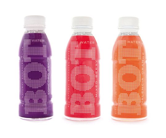
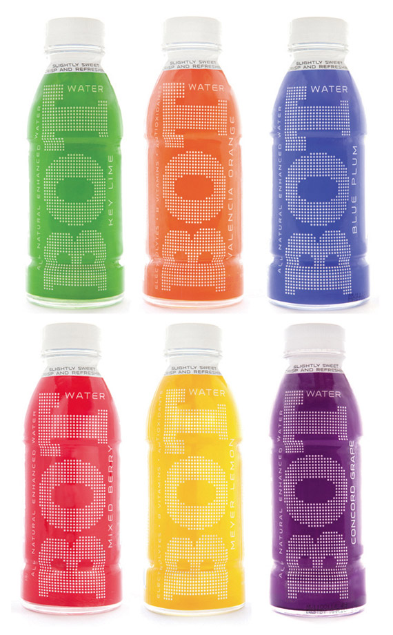
“New packaging for enhanced water Bot marks the brand’s relaunch as an adult-targeted beverage. The new look is by advertising/design agency TDA.
The new brand identity is characterized by a prominent, white dot pattern, intended to appear modern, friendly and light. Super-primary color blocking (green, orange, blue, red, yellow, purple) across the different flavors aims to create a strong shelf presence. In their previous design format, the bottles shared a common white background, with different colored type and different kids’ characters for the different flavors.
Bot was introduced in 2007 as a kids’ beverage, with marketing targeted to moms. It is a slightly sweet, low calorie, flavored water with all-natural ingredients (no HFCS, no dyes) and enhanced with vitamins and minerals. The drink proved popular with adults and will now be targeted to health-minded adults, 18 – 34. The formula is unchanged.”


