Designed by: PepsiCo Design & Innovation
Country: United States

Thomas Haas Chocolate Sparkle Cookies


Thomas Haas Chocolate Sparkle Cookies

Designed by Cameron Snelgar | Country: Canada

“What started as a label replacement project, gained momentum and we soon found ourselves responsible for delivering two packages for the “The World’s Best Cookie” (Vancouver Sun, Feb 2003).

Initially, Thomas Haas’ freshly baked Chocolate Sparkle Cookies were presented in a cellophane wrapping with a sticky label attached. The refrigerated home bake cookies were in stock paper with a sticky label attached.

I knew that the Chocolate Sparkle Cookies as with most of Thomas’ creations were innovative and unique. The challenge was to communicate the “Sparkle” within, while simultaneously preserving the carefully crafted Thomas Haas brand.

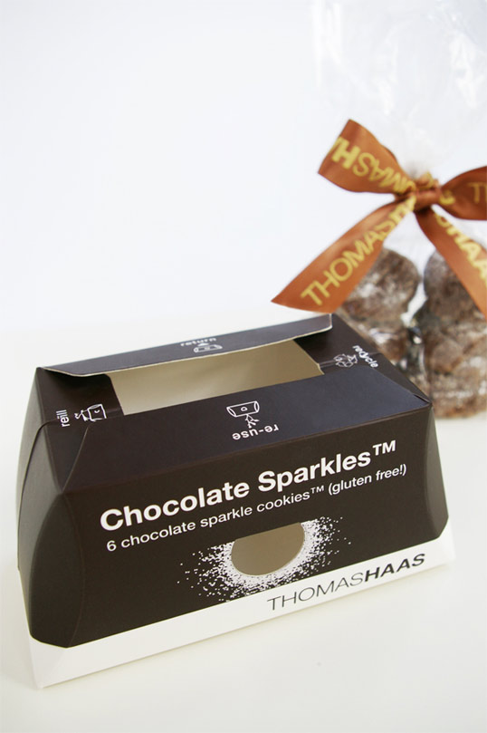
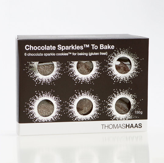
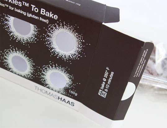
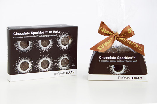
The package for the home bake set of six Chocolate Sparkle Cookies came first. Wrapped in Thomas’ signature ribbon branding and logo, it includes angled sides. Earlier in the design process all of the sides were angled, naturally conforming to the spacer tray within. However, the option for additional front display and stacking was needed, hence the flat top and bottom.

Thomas’ signature dark brown was chosen for the flood colour and silver foil applied. The flood brown was knocked out to reveal the ribbon, thereby eliminating the need for a third colour. This proved cost effective, reduced ink usage and worked nicely as a contrast to his brightly coloured chocolate bar and confectionery line. The most important feature was the message “Sparkle”. Splashes of “sparkly” silver on each of the round windows allude to the Chocolate Sparkle Cookie within.

As for the freshly baked Chocolate Sparkle Cookies, the package evolved from a mix of fabrication challenges with earlier concepts and vital feedback from Thomas Haas staff. Eventually, Thomas suggested a tray style package. We agreed that it was a good idea.

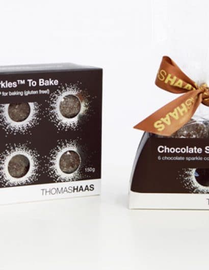
Despite the differences between the tray and the home bake box, it was important that the two packages interrelated. That provided good reason for including the angled sides on the tray. It was very important the tray fold flat for shipping; efficiently open and assemble for the delicate process of hand filling and anchor the cookies even when lifted by the cellophane. The folding tabs ensure a finished top edge and the anchoring of the cookies…they also prevent one from eating all of the cookies at once.”

Thomas Haas Chocolate Sparkle Cookies

Thomas Haas Chocolate Sparkle Cookies

Thomas Haas Chocolate Sparkle Cookies

Thomas Haas Chocolate Sparkle Cookies

Get the latest packaging design inspiration in your inbox:

Popular designs

Far Out Bar

Description: Far Out Bar is a cutting-edge packaging design project created for High Life Farms’ macrodose THC chocolate bars. This project involved

Pure Persian Honey

When we look closely at honey packaging, they are almost all in the usual format, and the ultimate in creativity is that

Over the wave

This Kombucha originates in Lombok, Indonesia, where its paradise beaches attract hundreds of surfers eager to ride the waves. When you surf,

Designed by: PepsiCo Design & Innovation
Country: United States

Thomas Haas Chocolate Sparkle Cookies

lovely-package-thomas-haas


Thomas Haas Chocolate Sparkle Cookies

Designed by Cameron Snelgar | Country: Canada

“What started as a label replacement project, gained momentum and we soon found ourselves responsible for delivering two packages for the “The World’s Best Cookie” (Vancouver Sun, Feb 2003).

Initially, Thomas Haas’ freshly baked Chocolate Sparkle Cookies were presented in a cellophane wrapping with a sticky label attached. The refrigerated home bake cookies were in stock paper with a sticky label attached.

I knew that the Chocolate Sparkle Cookies as with most of Thomas’ creations were innovative and unique. The challenge was to communicate the “Sparkle” within, while simultaneously preserving the carefully crafted Thomas Haas brand.

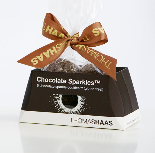
The package for the home bake set of six Chocolate Sparkle Cookies came first. Wrapped in Thomas’ signature ribbon branding and logo, it includes angled sides. Earlier in the design process all of the sides were angled, naturally conforming to the spacer tray within. However, the option for additional front display and stacking was needed, hence the flat top and bottom.

Thomas’ signature dark brown was chosen for the flood colour and silver foil applied. The flood brown was knocked out to reveal the ribbon, thereby eliminating the need for a third colour. This proved cost effective, reduced ink usage and worked nicely as a contrast to his brightly coloured chocolate bar and confectionery line. The most important feature was the message “Sparkle”. Splashes of “sparkly” silver on each of the round windows allude to the Chocolate Sparkle Cookie within.

As for the freshly baked Chocolate Sparkle Cookies, the package evolved from a mix of fabrication challenges with earlier concepts and vital feedback from Thomas Haas staff. Eventually, Thomas suggested a tray style package. We agreed that it was a good idea.

Despite the differences between the tray and the home bake box, it was important that the two packages interrelated. That provided good reason for including the angled sides on the tray. It was very important the tray fold flat for shipping; efficiently open and assemble for the delicate process of hand filling and anchor the cookies even when lifted by the cellophane. The folding tabs ensure a finished top edge and the anchoring of the cookies…they also prevent one from eating all of the cookies at once.”
Thomas Haas Chocolate Sparkle Cookies

Thomas Haas Chocolate Sparkle Cookies

Thomas Haas Chocolate Sparkle Cookies

Thomas Haas Chocolate Sparkle Cookies

Previous slide
Next slide

Explore more great package design

Get the latest on packaging design in your inbox: