Designed by: PepsiCo Design & Innovation
Country: United States

Student Work – Miguel Molina

Student Work - Miguel Molina

Designed by Miguel Molina | Country: Canada

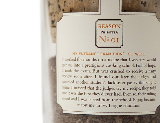
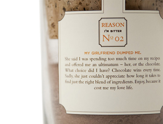
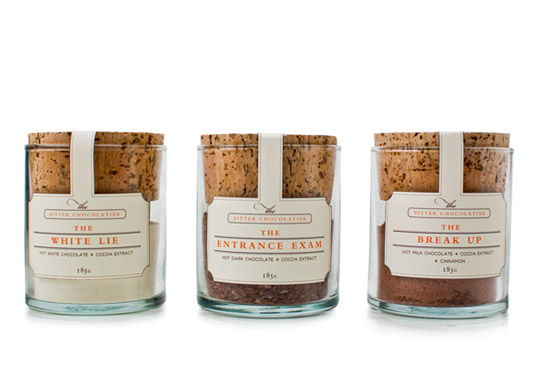
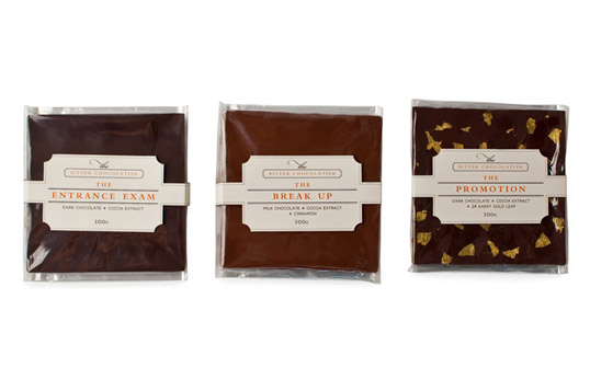
Brief: Create a sophisticated identity and packaging that reflect The Bitter Chocolatier’s luxury offering and ironic humour.

Solution: The brand has an edge. The elegant look contrasts sharply with its ironic humour. Poking fun at himself, The Bitter Chocolatier tells his tales of misfortune throughout his life through the different flavours. The product differentiates itself from other brands while entertaining the consumer.”

Student Work - Miguel Molina

Student Work - Miguel Molina

Student Work - Miguel Molina

Student Work - Miguel Molina

Student Work - Miguel Molina

Student Work - Miguel Molina

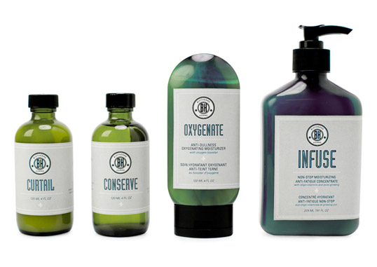
Brief: Create a modern, masculine identity and packaging that express the unique mix of traditional and 21st century technologies.

Solution: The logo is based on traditional circular military emblems. Old-fashioned men’s shaving products inspired the packaging’s strong colour and sturdy materials. The contemporary aesthetic expressed in typography and layout brings the time-honored tradition of shaving products to the 21st century.”

Student Work - Miguel Molina

Student Work - Miguel Molina

Student Work - Miguel Molina

Student Work - Miguel Molina

Student Work - Miguel Molina

Student Work - Miguel Molina

Student Work - Miguel Molina

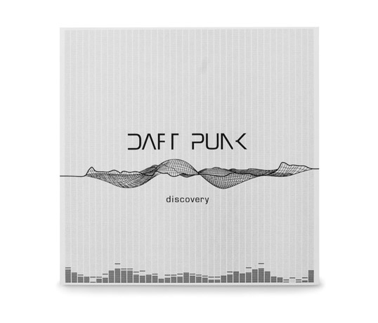
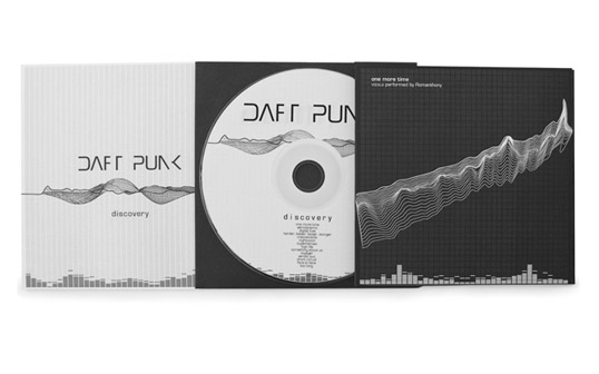
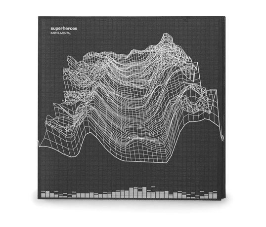
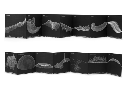
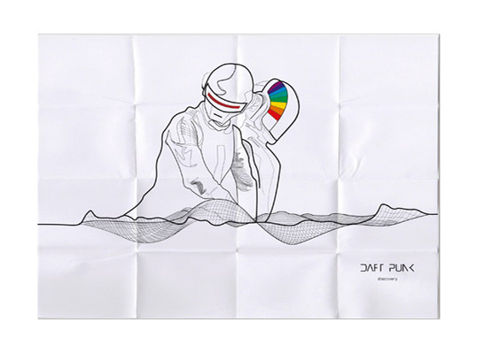
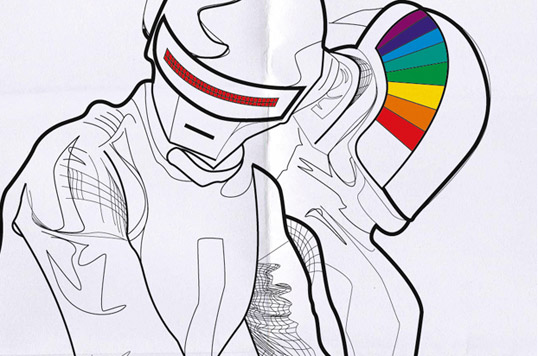
Brief: Design a sleek, modern CD cover for the group’s album, Discovery.

Solution: The wireframe images reference mixers and visualizers that represent each individual song. The entire album can be considered one long song that spikes fourteen times. Each spike is styled to a wireframe that represents the tempo and feel of the song.”

 

Get the latest packaging design inspiration in your inbox:

Popular designs

Pure Persian Honey

When we look closely at honey packaging, they are almost all in the usual format, and the ultimate in creativity is that

The Port Vodka Lemon Water

Overview: In response to my client’s vision for a Cape Cod themed beverage brand, I embarked on the journey to create The Port

Burma Love Rebrand

Love at First BiteAs an extension of the Burma Superstar restaurant in San Francisco, Burma Love Foods gives diners an opportunity to

The Bra Guru

Most women are wearing the wrong size bra and that is a fact. The Bra Guru® is the first and only professional

Designed by: PepsiCo Design & Innovation
Country: United States

Student Work – Miguel Molina

lovely-package-miguel-molina1

Student Work - Miguel Molina

Designed by Miguel Molina | Country: Canada

Brief: Create a sophisticated identity and packaging that reflect The Bitter Chocolatier’s luxury offering and ironic humour.

Solution: The brand has an edge. The elegant look contrasts sharply with its ironic humour. Poking fun at himself, The Bitter Chocolatier tells his tales of misfortune throughout his life through the different flavours. The product differentiates itself from other brands while entertaining the consumer.”

Student Work - Miguel Molina

Student Work - Miguel Molina

Student Work - Miguel Molina

Student Work - Miguel Molina

Student Work - Miguel Molina

Student Work - Miguel Molina

Brief: Create a modern, masculine identity and packaging that express the unique mix of traditional and 21st century technologies.

Solution: The logo is based on traditional circular military emblems. Old-fashioned men’s shaving products inspired the packaging’s strong colour and sturdy materials. The contemporary aesthetic expressed in typography and layout brings the time-honored tradition of shaving products to the 21st century.”

Student Work - Miguel Molina

Student Work - Miguel Molina

Student Work - Miguel Molina

Student Work - Miguel Molina

Student Work - Miguel Molina

Student Work - Miguel Molina

Student Work - Miguel Molina

Brief: Design a sleek, modern CD cover for the group’s album, Discovery.

Solution: The wireframe images reference mixers and visualizers that represent each individual song. The entire album can be considered one long song that spikes fourteen times. Each spike is styled to a wireframe that represents the tempo and feel of the song.”
 

Previous slide
Next slide

Explore more great package design

Get the latest on packaging design in your inbox: