Designed by: PepsiCo Design & Innovation
Country: United States

GLORIOUS! Skinny Dip

1

GLORIOUS! Skinny Dip

Designed by Lambie-Nairn | Country: United Kingdom

“GLORIOUS!, the award-winning soup and sauce range, has launched a new range of skinny dips, featuring a brand-new visual identity designed by Lambie-Nairn.

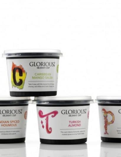
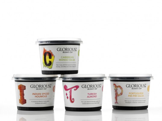
The design includes fresh bespoke lettering to represent the four new dips – Caribbean Mango Salsa, Turkish Almond, Indian Spiced Houmous and Portugese Piri Piri Salsa.

Each letter, for example the T for Turkish Almond, reflects provenance and heritage as well as allowing the product to stand out on shelf. It also communicates how GLORIOUS! continues to ‘Go beyond expectations’ with gutsy and innovative recipes and flavours from around the globe, all with less than 5% fat.

Designed with versatility in mind, the dips also feature new bespoke, sleek packaging that can go straight to the table to be served as a dip, as a condiment in sandwiches and wraps, or an accompaniment to spice up or complement main meals.”

1

Get the latest packaging design inspiration in your inbox:

Popular designs

Far Out Bar

Description: Far Out Bar is a cutting-edge packaging design project created for High Life Farms’ macrodose THC chocolate bars. This project involved

Pure Persian Honey

When we look closely at honey packaging, they are almost all in the usual format, and the ultimate in creativity is that

The Port Vodka Lemon Water

Overview: In response to my client’s vision for a Cape Cod themed beverage brand, I embarked on the journey to create The Port

Burma Love Rebrand

Love at First BiteAs an extension of the Burma Superstar restaurant in San Francisco, Burma Love Foods gives diners an opportunity to

Designed by: PepsiCo Design & Innovation
Country: United States

GLORIOUS! Skinny Dip

1
lovely-package-glorius

GLORIOUS! Skinny Dip

Designed by Lambie-Nairn | Country: United Kingdom

“GLORIOUS!, the award-winning soup and sauce range, has launched a new range of skinny dips, featuring a brand-new visual identity designed by Lambie-Nairn.

The design includes fresh bespoke lettering to represent the four new dips – Caribbean Mango Salsa, Turkish Almond, Indian Spiced Houmous and Portugese Piri Piri Salsa.

Each letter, for example the T for Turkish Almond, reflects provenance and heritage as well as allowing the product to stand out on shelf. It also communicates how GLORIOUS! continues to ‘Go beyond expectations’ with gutsy and innovative recipes and flavours from around the globe, all with less than 5% fat.

Designed with versatility in mind, the dips also feature new bespoke, sleek packaging that can go straight to the table to be served as a dip, as a condiment in sandwiches and wraps, or an accompaniment to spice up or complement main meals.”
1
Previous slide
Next slide

Explore more great package design

Get the latest on packaging design in your inbox: