Designed by: PepsiCo Design & Innovation
Country: United States

Maldon Salt

Maldon Salt

Designed by Pearlfisher | Country: United Kingdom

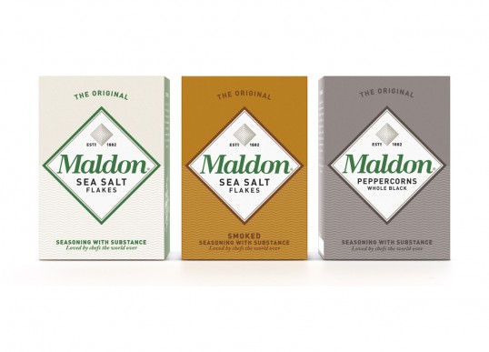
Pearlfisher has created the new brand identity and packaging for iconic UK salt brand – Maldon Salt.

Based in Essex, UK, the Maldon Crystal Salt Company is a family business run by the fourth generation of the Osborne family. The salt is still hand harvested using traditional and natural methods which gives it its famous superior quality, loved and recommended by an impressive number of celebrity chefs the world over.

The new brand identity for Maldon celebrates the natural elements of Maldon salt, celebrating its flavor and long-standing commitment to making only the best quality products. The design is simple but strong so that it can embrace Maldon’s other products – Maldon Smoked sea salt and Maldon organic black pepper.

Natalie Chung, Pearlfisher Creative Director, says, ‘We moved away from the generic world of salt on salad to create an iconic, proud marque inspired by Maldon’s unique texture and shape. The packaging celebrates the depth and quality of the product with confidence and character allowing us to tell the story of Maldon from its heritage to its modern relevance in a way that was tasty, bold and natural – just like the salt.”

Get the latest packaging design inspiration in your inbox:

Popular designs

Far Out Bar

Description: Far Out Bar is a cutting-edge packaging design project created for High Life Farms’ macrodose THC chocolate bars. This project involved

Burma Love Rebrand

Love at First BiteAs an extension of the Burma Superstar restaurant in San Francisco, Burma Love Foods gives diners an opportunity to

Pure Persian Honey

When we look closely at honey packaging, they are almost all in the usual format, and the ultimate in creativity is that

Designed by: PepsiCo Design & Innovation
Country: United States

Maldon Salt

lovely-package-maldon-salts

Maldon Salt

Designed by Pearlfisher | Country: United Kingdom

Pearlfisher has created the new brand identity and packaging for iconic UK salt brand – Maldon Salt.

Based in Essex, UK, the Maldon Crystal Salt Company is a family business run by the fourth generation of the Osborne family. The salt is still hand harvested using traditional and natural methods which gives it its famous superior quality, loved and recommended by an impressive number of celebrity chefs the world over.

The new brand identity for Maldon celebrates the natural elements of Maldon salt, celebrating its flavor and long-standing commitment to making only the best quality products. The design is simple but strong so that it can embrace Maldon’s other products – Maldon Smoked sea salt and Maldon organic black pepper.

Natalie Chung, Pearlfisher Creative Director, says, ‘We moved away from the generic world of salt on salad to create an iconic, proud marque inspired by Maldon’s unique texture and shape. The packaging celebrates the depth and quality of the product with confidence and character allowing us to tell the story of Maldon from its heritage to its modern relevance in a way that was tasty, bold and natural – just like the salt.”
Previous slide
Next slide

Explore more great package design

Get the latest on packaging design in your inbox: