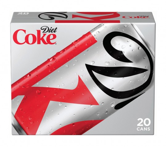
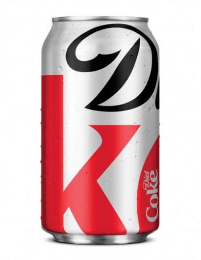
Designed by Turner Duckworth | Country: United States
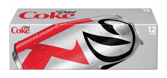
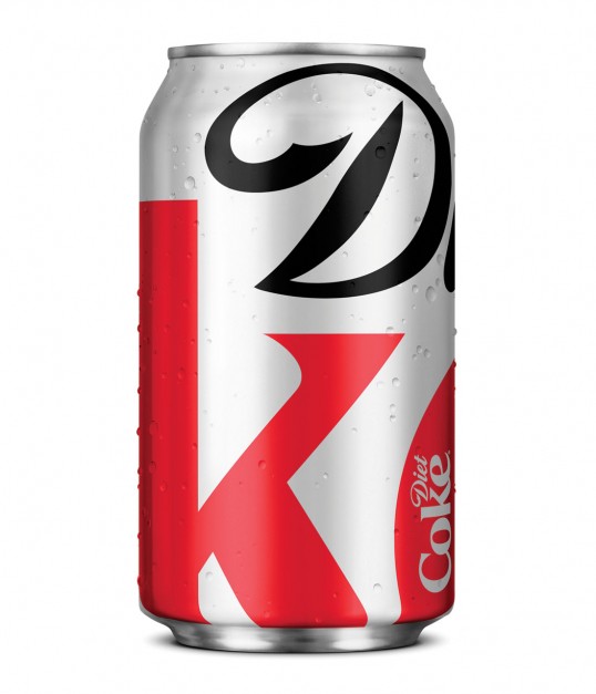
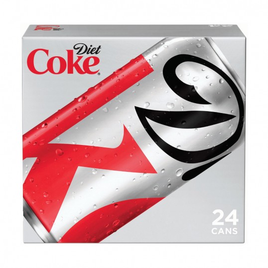
“The latest evolution in Diet Coke’s iconic “Stay Extraordinary” campaign features a modern new look for fall on the Diet Coke aluminum can and a series of new ads on television and out-of-home. The ads connect with consumers using the witty and smart tone that marks the unique voice of Diet Coke.
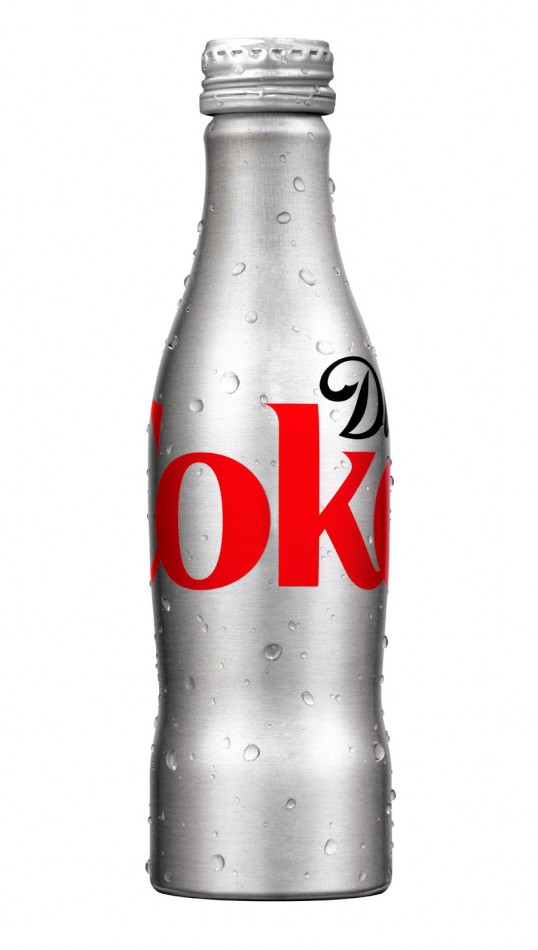
The can design, created by San Francisco-based design agency Turner Duckworth, features a section of the Diet Coke logo, cropped to feature the “D” and the “k,” set against the brand’s signature silver backdrop, creating a bold look for fall. Despite the change, the great taste remains the same and the can will still be easy to recognize as the number two beverage brand and number one zero-calorie brand in the nation.
“The new Diet Coke design is at once understated and overstated,” said David Turner, partner Turner Duckworth. “The understatement of a monogram, rather than the full name, and the overstatement of the extremely enlarged logo, both demonstrate the brand’s renewed self-confidence.”
The new package design has inspired the overall visual identity of Diet Coke, and has been featured in recent digital and out-of-home activations. In a Twitter promotion in July, Diet Coke designed mini-fridges stocked with Diet Coke that were delivered to the brands most loyal followers. In the outdoor campaign, the cropped-logo design is featured in placements around the country.”
