Designed by: PepsiCo Design & Innovation
Country: United States

Waitrose Fresh Herbs

1

Waitrose Fresh Herbs

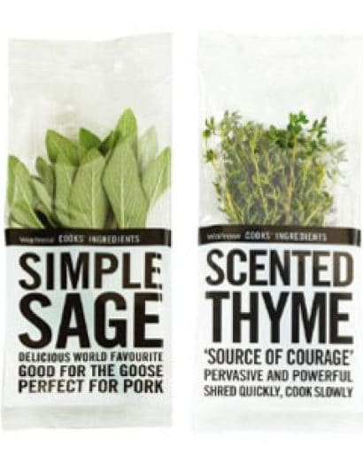
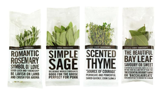
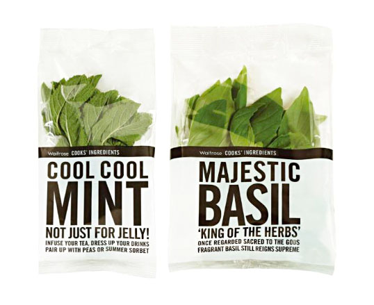
“Waitrose Herbs have a lot to say for themselves. Each minimally packaged pot carries bold tabloid style text, telling you everything you may not already know about the contents. Guest herbs make an exclusive and seasonal appearance with a splash of red in the headline. Herbs are as rich in myth and magic as they are in flavour and nutrition. This was a great opportunity to spread the word and present some real shelf talkers.”

Designed by Lewis Moberly.
Waitrose Fresh Herbs

1

Get the latest packaging design inspiration in your inbox:

Popular designs

Pure Persian Honey

When we look closely at honey packaging, they are almost all in the usual format, and the ultimate in creativity is that

Far Out Bar

Description: Far Out Bar is a cutting-edge packaging design project created for High Life Farms’ macrodose THC chocolate bars. This project involved

Burma Love Rebrand

Love at First BiteAs an extension of the Burma Superstar restaurant in San Francisco, Burma Love Foods gives diners an opportunity to

Designed by: PepsiCo Design & Innovation
Country: United States

Waitrose Fresh Herbs

1
waitrose1

Waitrose Fresh Herbs

“Waitrose Herbs have a lot to say for themselves. Each minimally packaged pot carries bold tabloid style text, telling you everything you may not already know about the contents. Guest herbs make an exclusive and seasonal appearance with a splash of red in the headline. Herbs are as rich in myth and magic as they are in flavour and nutrition. This was a great opportunity to spread the word and present some real shelf talkers.”

Designed by Lewis Moberly.

Waitrose Fresh Herbs

1
Previous slide
Next slide

Explore more great package design

Get the latest on packaging design in your inbox: