Designed by: PepsiCo Design & Innovation
Country: United States

Origin Dietary Supplements

origin1

Designed by Wink | Country: United States | Font used: Adobe Garamond

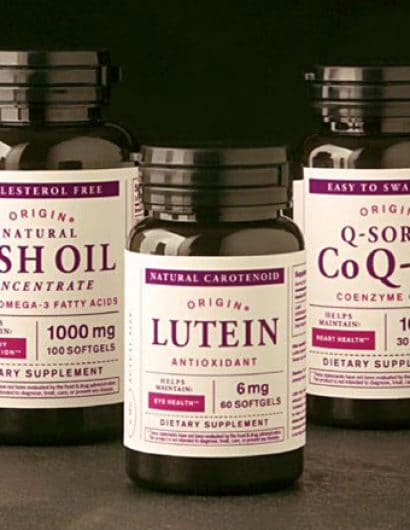
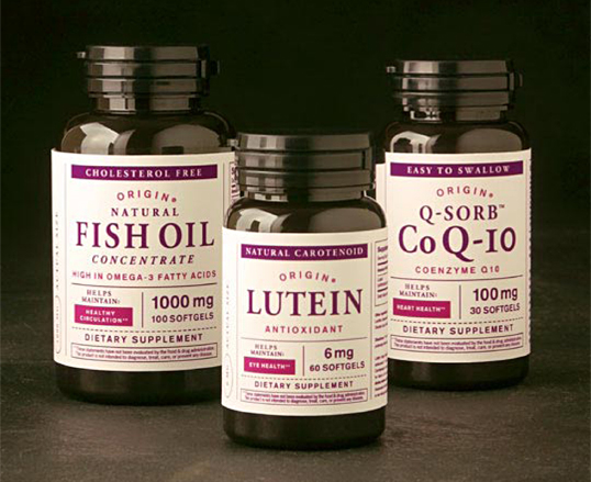
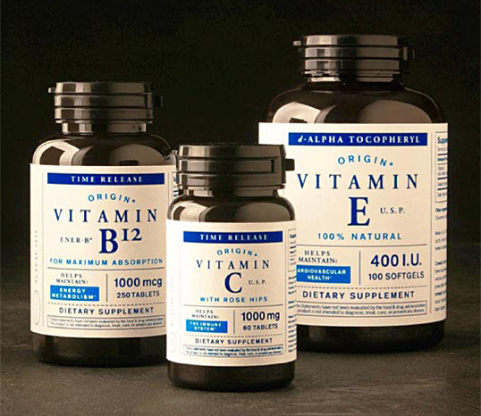
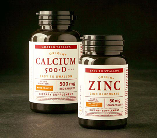
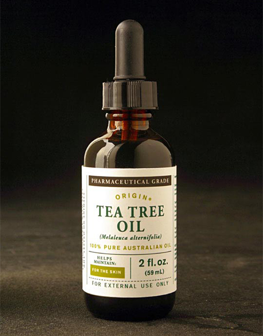
“A packaging system for a Target owned-brand product line of dietary supplements. The tone and feel needed to reflect the current big-picture direction of the Target pharmacy (in which the supplements are sold) which was leaning more towards an organic/holistic approach to pharmaceuticals and health maintenance. By nature, the vitamins need to communicate a lot of information (and in multiple layers) with very limited real estate. The solution, was to strip away any and all pretense (decoration) in favor of a straightforward organizational structure. With the emphasis isolated on content and hierarchy, the typography is therefore forced to carry the load evoking a sense of traditional apothecary mixed with a hint of modernity via its relatively bright (retail) color palette of accents.”
origin2

origin3

origin4

origin5

Get the latest packaging design inspiration in your inbox:

Popular designs

Burma Love Rebrand

Love at First BiteAs an extension of the Burma Superstar restaurant in San Francisco, Burma Love Foods gives diners an opportunity to

Pure Persian Honey

When we look closely at honey packaging, they are almost all in the usual format, and the ultimate in creativity is that

Far Out Bar

Description: Far Out Bar is a cutting-edge packaging design project created for High Life Farms’ macrodose THC chocolate bars. This project involved

Over the wave

This Kombucha originates in Lombok, Indonesia, where its paradise beaches attract hundreds of surfers eager to ride the waves. When you surf,

Designed by: PepsiCo Design & Innovation
Country: United States

Origin Dietary Supplements

origin1

origin1

Designed by Wink | Country: United States | Font used: Adobe Garamond

“A packaging system for a Target owned-brand product line of dietary supplements. The tone and feel needed to reflect the current big-picture direction of the Target pharmacy (in which the supplements are sold) which was leaning more towards an organic/holistic approach to pharmaceuticals and health maintenance. By nature, the vitamins need to communicate a lot of information (and in multiple layers) with very limited real estate. The solution, was to strip away any and all pretense (decoration) in favor of a straightforward organizational structure. With the emphasis isolated on content and hierarchy, the typography is therefore forced to carry the load evoking a sense of traditional apothecary mixed with a hint of modernity via its relatively bright (retail) color palette of accents.”
origin2

origin3

origin4

origin5

Previous slide
Next slide

Explore more great package design

Get the latest on packaging design in your inbox: