Designed by Uniform | Country: Norway
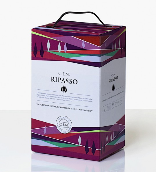
“Arcus Wine Brands has recently completed a redesign of its Collection Frithjof Nicolaysen wine series. The wine series consists of 5 different wines, 3 white and 2 red bag-in-box. Two of the white wines are also available on bottle. The first product in the series was launched in 2002 and has since then been popular with the Norwegian consumer, with several good reviews from wine writers. The concept is based on quality wines from classic wine areas in Europe, marketed to consumers looking for an exciting quality product at a reasonable price.
The overall design-task was to give the series a more distinct family feel, and give each box a strong identity.

We developed a concept with illustrations similar on all the wines, but with slightly different terms, details and colors. The illustrations are inspired by the landscape with references to modern art. The origin of the wine grapes gave inspiration to the different landscapes and colors. The Sauvignon Blanc wine has shades of blue representing the maritime environment the grape is grown in.

From the abstract landscape illustration came the creation of a figurative and recognizable symbol. For example, we created a sailboat symbol to be associated with the coastal landscape of Languedoc-Roussillon in France. The mountains give references to the Austrian Alps and cypresses communicate the landscape of the Veneto in Italy. These symbols make it easier for consumers to recognize their favorite. In addition, a set of symbols was designed to help consumers choose their wine appropriate to the purpose of use.