Designed by Pearlfisher | Country: United Kingdom
“Designers at Pearlfisher worked closely with the Cutty Sark Global Brand Team assessing all aspects of the old branding, focusing on the key points of difference: the Clipper, the yellow and the Cutty Sark typestyle.
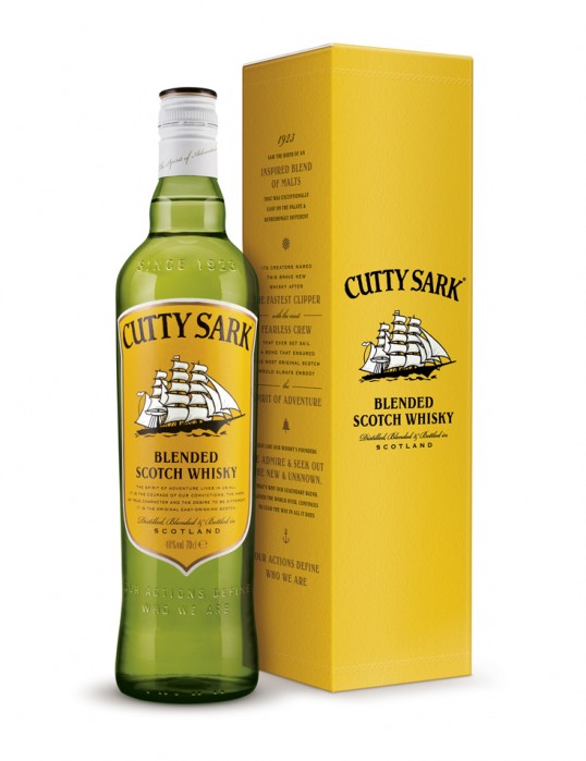
The original Clipper ship, drawn in 1923 and updated only once in the last 88 years has now been revised. The team took the opportunity to enhance the icon, putting more momentum and dynamism into the Clipper, effectively putting some wind back into the brand sails. It was vital, however, to maintain the brand’s identity which evokes thoughts of ‘adventure’ and ‘excitement’ amongst the global consumer audience.
The bold yellow colour has been brought back onto the larger front label creating a higher degree of visibility. It echoes the classic Cutty imagery of the mid 1960’s and 1970’s. The green glass has been retained but has been premiumised with key brand messages embossed onto the bottle.
The front of the bottle has the call to action, ‘Our actions define who we are’ which will be the rallying cry for the brand going into the next few years. The back is dominated by a compass image surrounded by ‘The Spirit of Adventure’ which is the new core message for the brand. The bottle cap also has this message, as well as Glasgow, Scotland, printed onto it.”