Designed by: PepsiCo Design & Innovation
Country: United States

Student Work – Chris Ferrante

Student Work - Chris Ferrante

Designed by Chris Ferrante | Country: United States

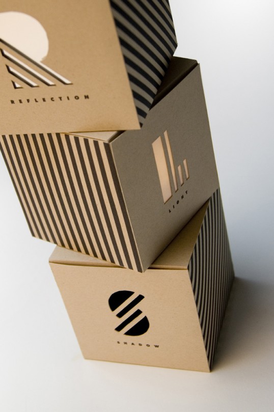
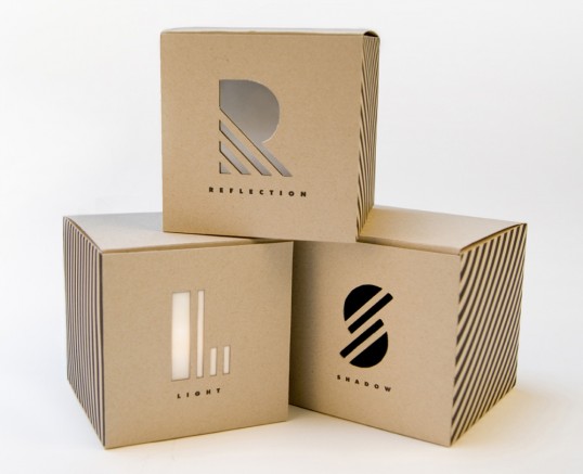
“This project was for my packaging design course in which we were tasked with creating a conceptual series of consistent packages for intangible things. I decided to package light, reflection, and shadow. After brainstorming how to visually suggest that these “unpackagable” things were in fact packagable, I came to the concept of creating the effect of them as though they were trapped inside a box.”

Student Work - Chris Ferrante

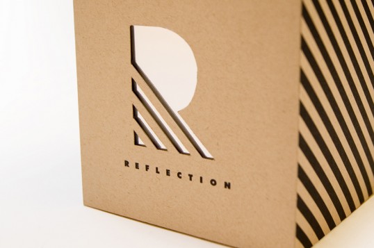
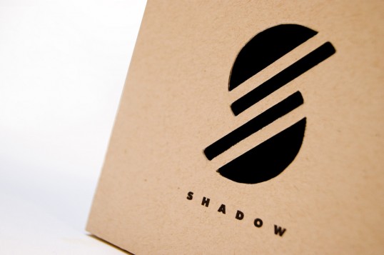
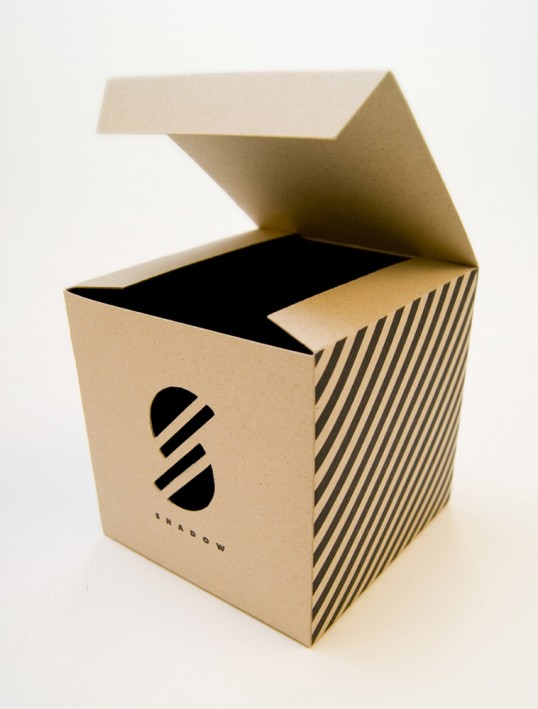
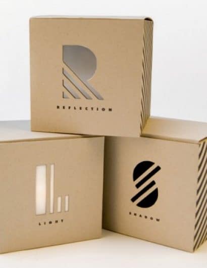
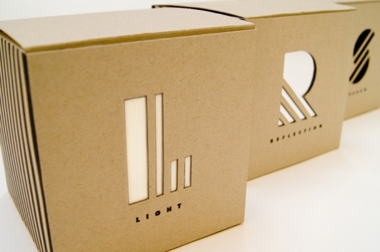
Since light, reflection, and shadow are the basic elements that give form to the three-dimensional world in which we live, I decided to keep the form of my packages extremely simple and minimalistic by using simple cube boxes made of natural sand-colored paper with printed black ink. I developed an identity system or symbol set of the first letter of each word (L, R, and S) to be used as diecuts on the front panel of each box.

Student Work - Chris Ferrante

Student Work - Chris Ferrante

Each letter is divided in different directions, but their geometric forms make them consistent. Under each diecut is the full word in small and generously tracked Futura Extra-Bold. The Light box has a piece of vellum and a touch light inside so it acts as a luminary, the Reflection box has a piece of mirror inside behind the diecut, and the Shadow box is printed with black ink on the inside of the box with an open diecut so all that is seen is darkness. These boxes are not intended to be opened, but instead are conceptual pieces.

Student Work - Chris Ferrante

Student Work - Chris Ferrante

Student Work - Chris Ferrante

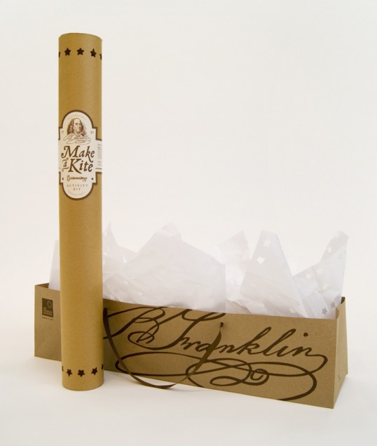
This project was for my packaging design course in which we were tasked with creating a fictional gift shop product for a Philadelphia museum. We were required to design both the product and a carrying component. I chose The Franklin Institute as my museum, and decided to create a product that would appeal to all ages from kids to adults.

Student Work - Chris Ferrante

Student Work - Chris Ferrante

Student Work - Chris Ferrante

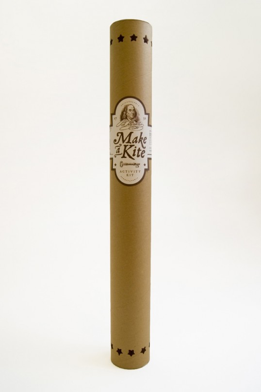
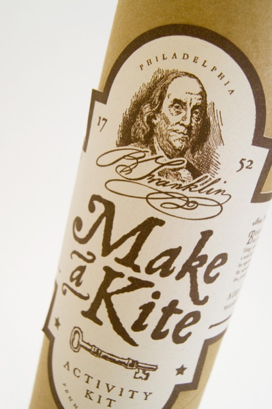
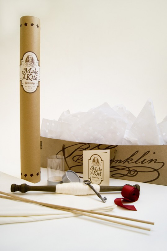
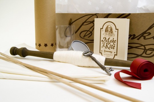
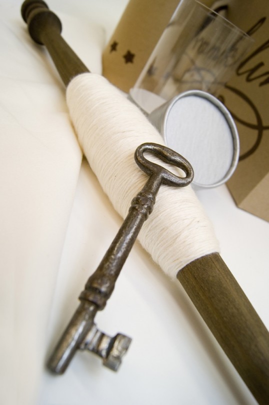
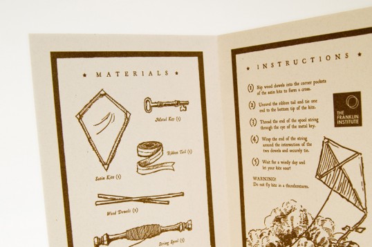
Using Benjamin Franklin’s famous electricity kite experiment as my inspiration, I developed the concept for a make your own kite activity kit, calling it Make A Kite. The design is monochromatic, using only a single color (brown) printed on organic cream and kraft papers which were picked to create an eco-friendly, organic, and recyclable look.

Student Work - Chris Ferrante

Student Work - Chris Ferrante

Student Work - Chris Ferrante

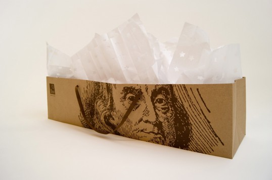
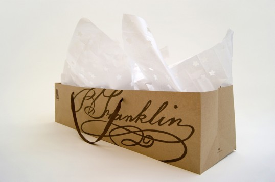
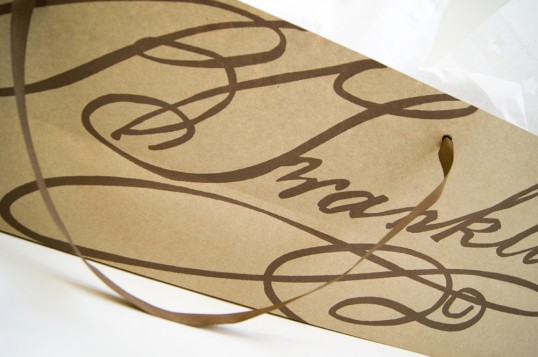
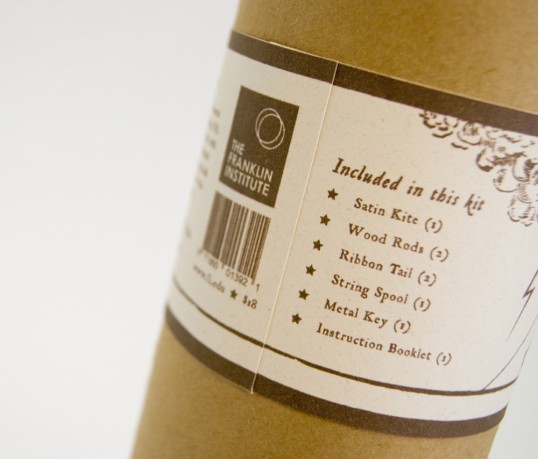
I used a cardboard mailing tube with metal end plugs as the container for the pieces of the kit, and customized it by stenciling a star pattern around the top and bottom, and with a paper label that wraps around explaining a breif history of Benjamin Franklin and a list of kit parts. I designed an instruction booklet as well to be placed in the tube with the kite pieces. The bag is made of brown kraft paper with printed artwork (Franklin’s signature and portrait), matching brown ribbon handles, and white tissue paper that I diecut with the same star pattern used on the tube.

Student Work - Chris Ferrante

Student Work - Chris Ferrante

Student Work - Chris Ferrante

Student Work - Chris Ferrante

Get the latest packaging design inspiration in your inbox:

Popular designs

Over the wave

This Kombucha originates in Lombok, Indonesia, where its paradise beaches attract hundreds of surfers eager to ride the waves. When you surf,

Pure Persian Honey

When we look closely at honey packaging, they are almost all in the usual format, and the ultimate in creativity is that

The Bra Guru

Most women are wearing the wrong size bra and that is a fact. The Bra Guru® is the first and only professional

Designed by: PepsiCo Design & Innovation
Country: United States

Student Work – Chris Ferrante

lovely-package-chris-ferrante1

Student Work - Chris Ferrante

Designed by Chris Ferrante | Country: United States

“This project was for my packaging design course in which we were tasked with creating a conceptual series of consistent packages for intangible things. I decided to package light, reflection, and shadow. After brainstorming how to visually suggest that these “unpackagable” things were in fact packagable, I came to the concept of creating the effect of them as though they were trapped inside a box.”

Student Work - Chris Ferrante

Since light, reflection, and shadow are the basic elements that give form to the three-dimensional world in which we live, I decided to keep the form of my packages extremely simple and minimalistic by using simple cube boxes made of natural sand-colored paper with printed black ink. I developed an identity system or symbol set of the first letter of each word (L, R, and S) to be used as diecuts on the front panel of each box.

Student Work - Chris Ferrante

Student Work - Chris Ferrante

Each letter is divided in different directions, but their geometric forms make them consistent. Under each diecut is the full word in small and generously tracked Futura Extra-Bold. The Light box has a piece of vellum and a touch light inside so it acts as a luminary, the Reflection box has a piece of mirror inside behind the diecut, and the Shadow box is printed with black ink on the inside of the box with an open diecut so all that is seen is darkness. These boxes are not intended to be opened, but instead are conceptual pieces.

Student Work - Chris Ferrante

Student Work - Chris Ferrante

Student Work - Chris Ferrante

This project was for my packaging design course in which we were tasked with creating a fictional gift shop product for a Philadelphia museum. We were required to design both the product and a carrying component. I chose The Franklin Institute as my museum, and decided to create a product that would appeal to all ages from kids to adults.

Student Work - Chris Ferrante

Student Work - Chris Ferrante

Student Work - Chris Ferrante

Using Benjamin Franklin’s famous electricity kite experiment as my inspiration, I developed the concept for a make your own kite activity kit, calling it Make A Kite. The design is monochromatic, using only a single color (brown) printed on organic cream and kraft papers which were picked to create an eco-friendly, organic, and recyclable look.

Student Work - Chris Ferrante

Student Work - Chris Ferrante

Student Work - Chris Ferrante

I used a cardboard mailing tube with metal end plugs as the container for the pieces of the kit, and customized it by stenciling a star pattern around the top and bottom, and with a paper label that wraps around explaining a breif history of Benjamin Franklin and a list of kit parts. I designed an instruction booklet as well to be placed in the tube with the kite pieces. The bag is made of brown kraft paper with printed artwork (Franklin’s signature and portrait), matching brown ribbon handles, and white tissue paper that I diecut with the same star pattern used on the tube.
Student Work - Chris Ferrante

Student Work - Chris Ferrante

Student Work - Chris Ferrante

Student Work - Chris Ferrante

Previous slide
Next slide

Explore more great package design

Get the latest on packaging design in your inbox: