Designed by: PepsiCo Design & Innovation
Country: United States

1805

1805

Designed by Voicebox | Country: United States

Rooted in the same spirit of discovery as celebrated explorers, Lewis & Clark – and named for the year they first discovered Washington’s Columbia Valley – 1805 is an outstanding new wine from Washington’s Columbia Valley.

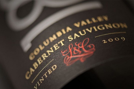
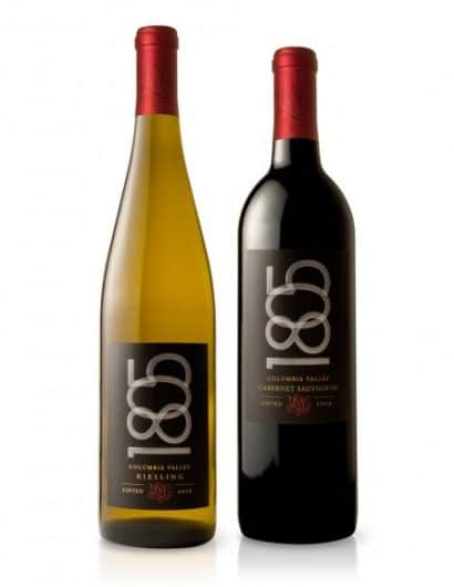
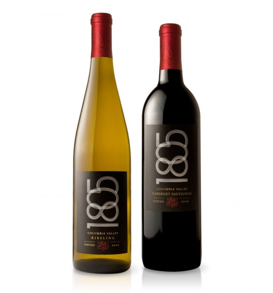
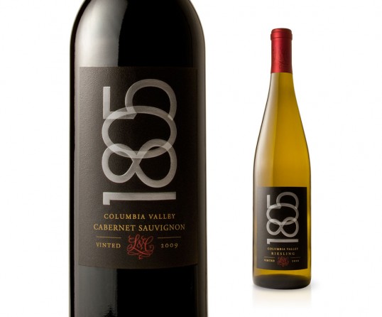
Drawing on the region’s rich heritage, the label design presents this significant date in a simple, elegant, yet contemporary manner, so as to connect with today’s consumers. The overlapping silver foil numerals are distinctively staged on a rich matte black background punctuated by the hand-drawn L&C monogram, honoring the two noteworthy explorers. It is also featured proudly on the capsules.

Recently launched at retail, the design is consistently presented across four varietals, including both red and white wines, so as to help build recognition for this newly innovated brand.

1805

1805

Get the latest packaging design inspiration in your inbox:

Popular designs

Burma Love Rebrand

Love at First BiteAs an extension of the Burma Superstar restaurant in San Francisco, Burma Love Foods gives diners an opportunity to

The Port Vodka Lemon Water

Overview: In response to my client’s vision for a Cape Cod themed beverage brand, I embarked on the journey to create The Port

Pure Persian Honey

When we look closely at honey packaging, they are almost all in the usual format, and the ultimate in creativity is that

Designed by: PepsiCo Design & Innovation
Country: United States

1805

lovely-package-1805-1

1805

Designed by Voicebox | Country: United States

Rooted in the same spirit of discovery as celebrated explorers, Lewis & Clark – and named for the year they first discovered Washington’s Columbia Valley – 1805 is an outstanding new wine from Washington’s Columbia Valley.

Drawing on the region’s rich heritage, the label design presents this significant date in a simple, elegant, yet contemporary manner, so as to connect with today’s consumers. The overlapping silver foil numerals are distinctively staged on a rich matte black background punctuated by the hand-drawn L&C monogram, honoring the two noteworthy explorers. It is also featured proudly on the capsules.

Recently launched at retail, the design is consistently presented across four varietals, including both red and white wines, so as to help build recognition for this newly innovated brand.
1805

1805

Previous slide
Next slide

Explore more great package design

Get the latest on packaging design in your inbox: