Designed by: PepsiCo Design & Innovation
Country: United States

Masterson’s Rye Whiskey

Masterson's Rye Whiskey

Designed by Studio 32 North | Country: United States

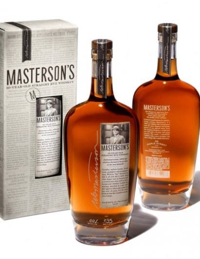
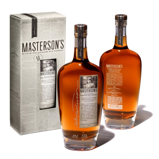
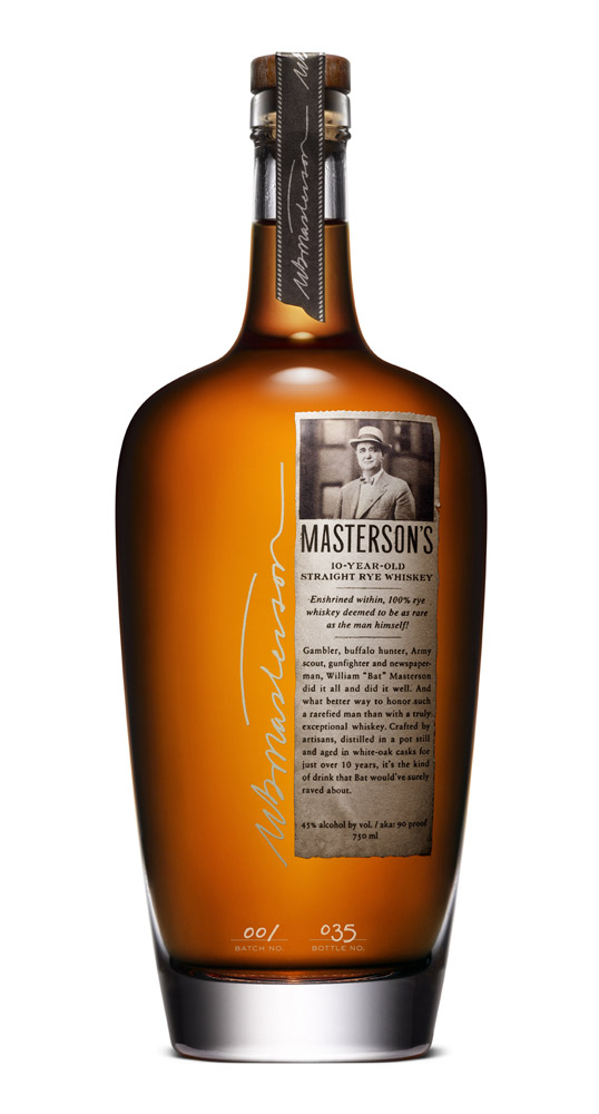
“Drawing inspiration from its namesake, the packaging is imbued with Bat Masterson’s life and lore. The bottle has a strikingly graceful shoulder that’s reminiscent of 19th century whiskey flasks, while the small front label lets the whiskey’s glorious amber hue do most of the talking. Serving as a tribute to Masterson’s days as a renowned journalist, the die-cut label resembles a clipped-out newspaper column, complete with torn edges like a real newspaper. The exterior box features a die-cut window, allowing the label to stand out-yet fit in seamlessly with newspaper articles printed over the surface of the box. The articles delve deeper into Masterson’s life and were custom written in the distinctively verbose and dramatic turn-of-the-century tone.”

Masterson's Rye Whiskey

Get the latest packaging design inspiration in your inbox:

Popular designs

Far Out Bar

Description: Far Out Bar is a cutting-edge packaging design project created for High Life Farms’ macrodose THC chocolate bars. This project involved

The Port Vodka Lemon Water

Overview: In response to my client’s vision for a Cape Cod themed beverage brand, I embarked on the journey to create The Port

Over the wave

This Kombucha originates in Lombok, Indonesia, where its paradise beaches attract hundreds of surfers eager to ride the waves. When you surf,

Designed by: PepsiCo Design & Innovation
Country: United States

Masterson’s Rye Whiskey

lovely-package-mastersons1

Masterson's Rye Whiskey

Designed by Studio 32 North | Country: United States

“Drawing inspiration from its namesake, the packaging is imbued with Bat Masterson’s life and lore. The bottle has a strikingly graceful shoulder that’s reminiscent of 19th century whiskey flasks, while the small front label lets the whiskey’s glorious amber hue do most of the talking. Serving as a tribute to Masterson’s days as a renowned journalist, the die-cut label resembles a clipped-out newspaper column, complete with torn edges like a real newspaper. The exterior box features a die-cut window, allowing the label to stand out-yet fit in seamlessly with newspaper articles printed over the surface of the box. The articles delve deeper into Masterson’s life and were custom written in the distinctively verbose and dramatic turn-of-the-century tone.”
Masterson's Rye Whiskey

Previous slide
Next slide

Explore more great package design

Get the latest on packaging design in your inbox: