Designed by Jog Limited | Country: United Kingdom
“Provenance makes high-quality homeware products from recycled, reclaimed and renewable materials.
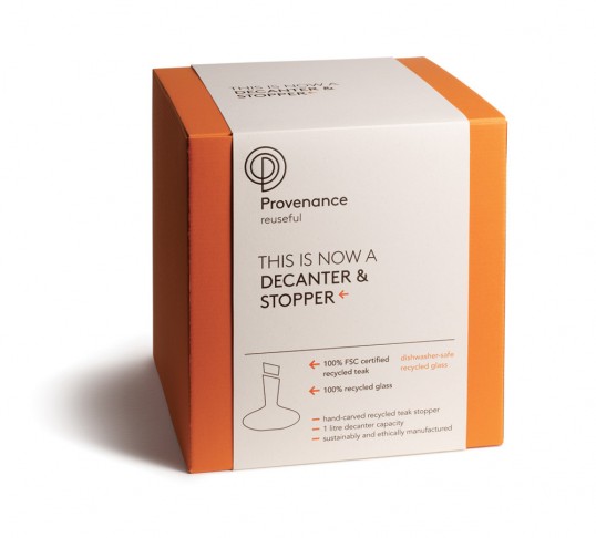
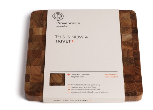
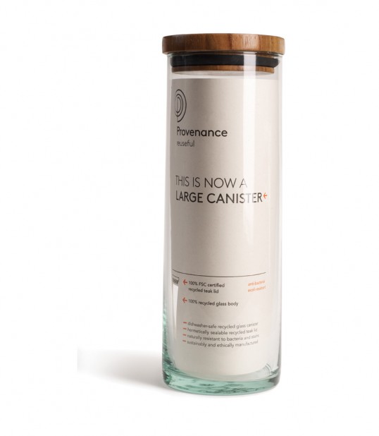
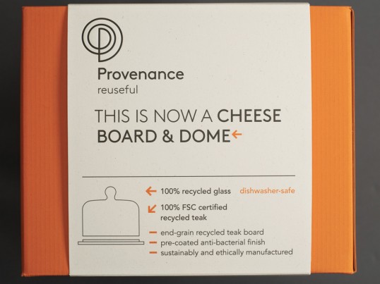
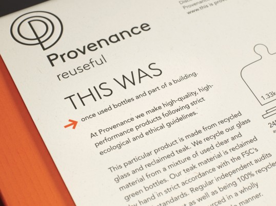
As the packaging has to sell the story of the materials as much as the product, the brand language of ‘this is now’ and ‘this was’ is used across products to introduce the story of each item’s provenance. For example, ‘this was once bottles and part of a building’ to the reverse and ‘this is now an antipasti platter set’ on the front.”
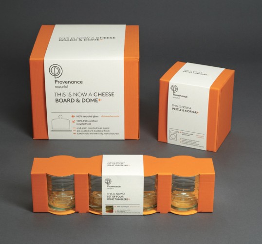
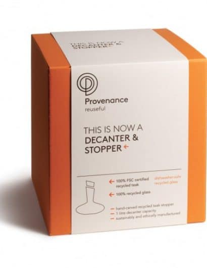
“In keeping with the products, the packaging is designed to achieve high shelf and low environmental impact. Strong orange is used for the boxes to draw attention to the display, the corrugated board for these boxes is 100% recycled (100% post-consumer waste), and is left unbranded to encourage reuse (but can be easily recycled). It is self-coloured to make any in-store damage less visible, reducing the need for re-boxing.”
Branding is restricted to the paper sleeves, which are made from 80% recycled paper (80% post consumer waste with 20% eco-pulp from FSC-certified sources), with minimal ink coverage and no foil blocking to ensure they can be readily recycled. Sleeves minimize waste when adapting packaging to different languages. Where products are boxed, the sleeve carries a simple line drawing to identify the contents instead of photography for a cleaner aesthetic, as the retailer will always display the physical products. Where possible, cut-outs frame the material each product is made from, drawing attention to the material as much as to the completed product, which should only be one form the material takes in a wider journey of recycling.
Like the products themselves, all Provenance packaging is made from materials that are 100% recyclable.

