Designed by: PepsiCo Design & Innovation
Country: United States

Billington’s

Billington’s

Designed by jkr | Country: United Kingdom

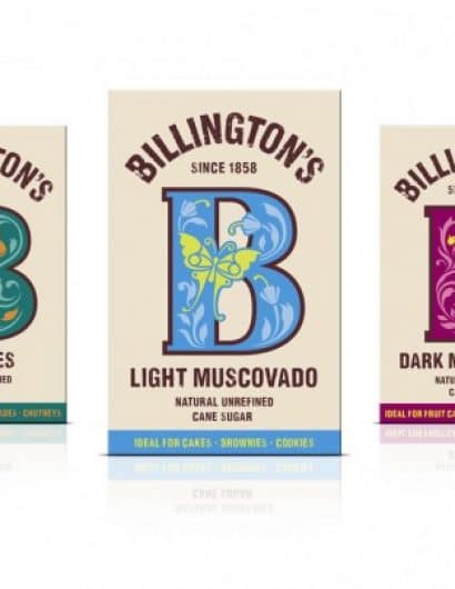
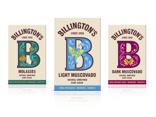
“By developing personality through the Billington’s ‘B’, the new design strives to establish an impactful and memorable visual equity for the brand, giving it standout and charisma on shelf.

Known for its unrefined sugars, the new design celebrates the quality of the product inside the pack, inspired by the vibrancy of its Mauritian origins. The decorative ‘Bs’ then portray the personality of each individual product, in a charming and charismatic way.”

Billington’s

“We chose to focus on the juxtaposition which existed between the refined nature of Billington’s founder Edward Billington and the unrefined nature of the sugar itself. To this end, we used the Billington’s word mark and a bold decorative ‘B’ to play to these twopersonalities. Vibrancy and colour was a key element of the design, replicating the sense of pleasure which baking brings.” Adam Swan, Designer, jkr.

“Our old packs were not distinctive or engaging and did not stand out on the supermarket shelves. This new design gives Billington’s a clear brand identity, making it accessible and contemporary, whilst still keeping traditional elements. I believe we now have a design that truly reflects the quality of the sugar inside the packs.” Louise King, Brand Manager, Billington’s.

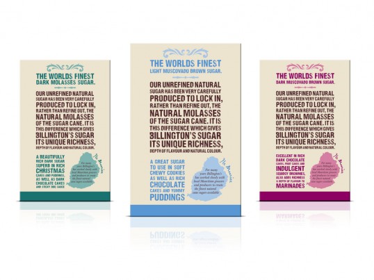
The back of pack allowed us to bring the story of Billington’s to life, while detailing the culinary creations which the sugar can be used for.”

Get the latest packaging design inspiration in your inbox:

Popular designs

The Port Vodka Lemon Water

Overview: In response to my client’s vision for a Cape Cod themed beverage brand, I embarked on the journey to create The Port

Over the wave

This Kombucha originates in Lombok, Indonesia, where its paradise beaches attract hundreds of surfers eager to ride the waves. When you surf,

The Bra Guru

Most women are wearing the wrong size bra and that is a fact. The Bra Guru® is the first and only professional

Burma Love Rebrand

Love at First BiteAs an extension of the Burma Superstar restaurant in San Francisco, Burma Love Foods gives diners an opportunity to

Designed by: PepsiCo Design & Innovation
Country: United States

Billington’s

lovely-package-billingtons1

Billington’s

Designed by jkr | Country: United Kingdom

“By developing personality through the Billington’s ‘B’, the new design strives to establish an impactful and memorable visual equity for the brand, giving it standout and charisma on shelf.

Known for its unrefined sugars, the new design celebrates the quality of the product inside the pack, inspired by the vibrancy of its Mauritian origins. The decorative ‘Bs’ then portray the personality of each individual product, in a charming and charismatic way.”

Billington’s

“We chose to focus on the juxtaposition which existed between the refined nature of Billington’s founder Edward Billington and the unrefined nature of the sugar itself. To this end, we used the Billington’s word mark and a bold decorative ‘B’ to play to these twopersonalities. Vibrancy and colour was a key element of the design, replicating the sense of pleasure which baking brings.” Adam Swan, Designer, jkr.

“Our old packs were not distinctive or engaging and did not stand out on the supermarket shelves. This new design gives Billington’s a clear brand identity, making it accessible and contemporary, whilst still keeping traditional elements. I believe we now have a design that truly reflects the quality of the sugar inside the packs.” Louise King, Brand Manager, Billington’s.

The back of pack allowed us to bring the story of Billington’s to life, while detailing the culinary creations which the sugar can be used for.”
Previous slide
Next slide

Explore more great package design

Get the latest on packaging design in your inbox: