Designed by: PepsiCo Design & Innovation
Country: United States

SEVEN Salon

SEVEN Salon

Designed by Turnstyle | Country: United States

“SEVEN Salon isn’t interested in feeling like a spa, or in making you look like your favorite celebrity. Instead, with music spun by a live DJ, complimentary barista bar, and lights over the cutting stations that provide a feeling a being “on stage,” it exudes a unique atmosphere of energy and vitality. The fashionable salon focuses on providing haircuts that defy trends by suiting a client’s distinctive facial structure and features best. SEVEN believes your hair is the most important thing you wear and that is says who you are as an individual.

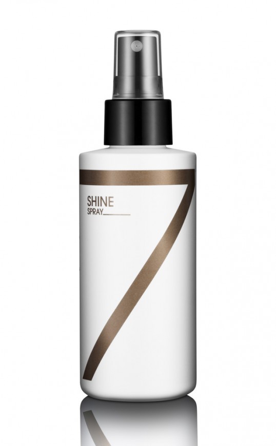
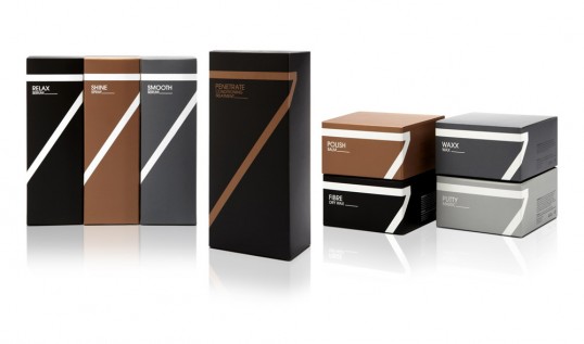
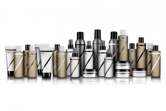
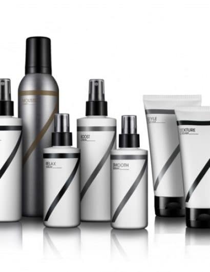
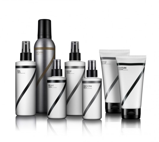
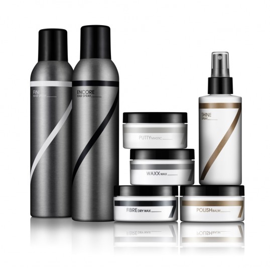
WIth plans to expand its influence by taking its robust line of 25 hair care products national, SEVEN partnered with Turnstyle to reinvigorate their brand identity and product packaging to more closely capture the essence of its stylish salon experience. The large san-serif numeral 7 logo, with its bold diagonal stroke bisecting the package, exudes a sense of confidence. Minimal, modern typographic titling and a limited black, white and metallic color-palette evoke a sense of fashion luxury. Boxes unify and enhance the on-shelf presence and further create a sense of premium sophistication.”

SEVEN Salon

SEVEN Salon

SEVEN Salon

SEVEN Salon

Get the latest packaging design inspiration in your inbox:

Popular designs

Over the wave

This Kombucha originates in Lombok, Indonesia, where its paradise beaches attract hundreds of surfers eager to ride the waves. When you surf,

The Port Vodka Lemon Water

Overview: In response to my client’s vision for a Cape Cod themed beverage brand, I embarked on the journey to create The Port

Far Out Bar

Description: Far Out Bar is a cutting-edge packaging design project created for High Life Farms’ macrodose THC chocolate bars. This project involved

Designed by: PepsiCo Design & Innovation
Country: United States

SEVEN Salon

lovely-package-seven-salon1

SEVEN Salon

Designed by Turnstyle | Country: United States

“SEVEN Salon isn’t interested in feeling like a spa, or in making you look like your favorite celebrity. Instead, with music spun by a live DJ, complimentary barista bar, and lights over the cutting stations that provide a feeling a being “on stage,” it exudes a unique atmosphere of energy and vitality. The fashionable salon focuses on providing haircuts that defy trends by suiting a client’s distinctive facial structure and features best. SEVEN believes your hair is the most important thing you wear and that is says who you are as an individual.

WIth plans to expand its influence by taking its robust line of 25 hair care products national, SEVEN partnered with Turnstyle to reinvigorate their brand identity and product packaging to more closely capture the essence of its stylish salon experience. The large san-serif numeral 7 logo, with its bold diagonal stroke bisecting the package, exudes a sense of confidence. Minimal, modern typographic titling and a limited black, white and metallic color-palette evoke a sense of fashion luxury. Boxes unify and enhance the on-shelf presence and further create a sense of premium sophistication.”
SEVEN Salon

SEVEN Salon

SEVEN Salon

SEVEN Salon

Previous slide
Next slide

Explore more great package design

Get the latest on packaging design in your inbox: