Designed by: PepsiCo Design & Innovation
Country: United States

Grass Flower Shop

grass1

Designed by Nine99Design | Country: Israel | Fonts used: Helvetica

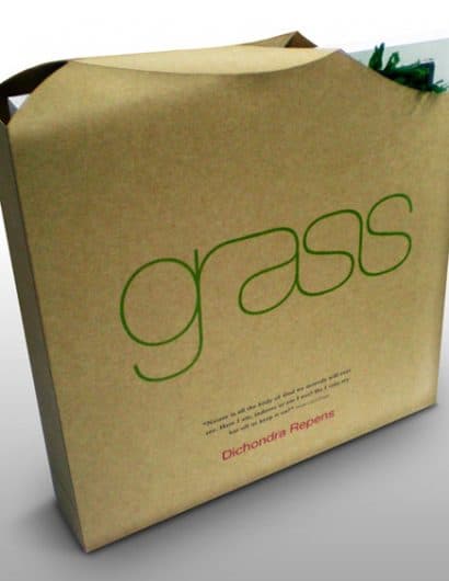
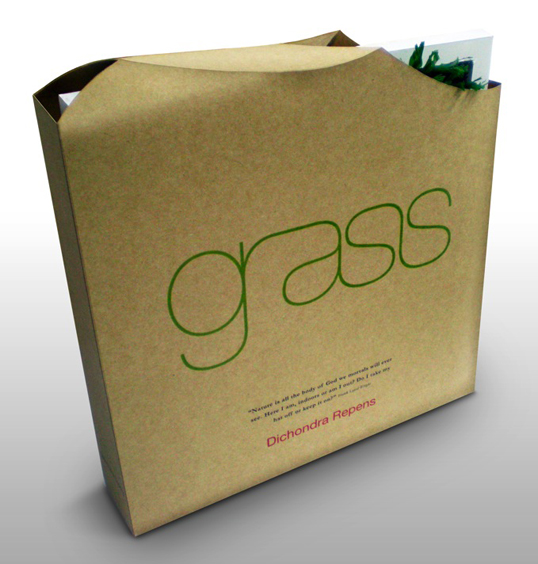
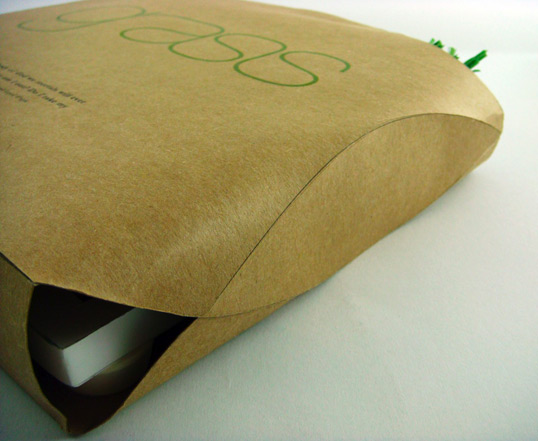
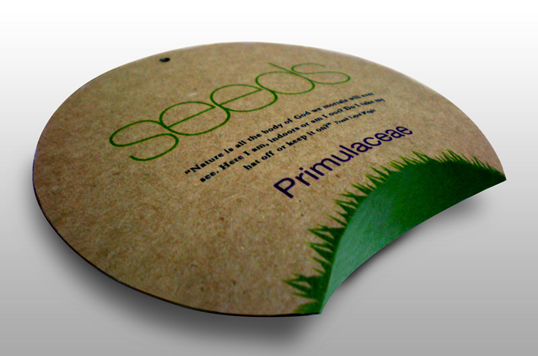
“Grass squares are designed to give a natural touch to the office or home by placing them freely or according to Feng Shui. Unlike ordinary flowers, ‘grass’ is completely natural, a piece of earth, that grows indoors with minimal care. Inspired by Frank Lloyd Wright’s Fallingwater and the attempt to combine architecture and nature, the entire project is made from recycled materials and tries to merge the home with the outdoors. The packages have an air opening to gain longer shelf live for the product. The minimal design and logo is intended to give a flowing, “breathing” feel to it, as well as elegance and life-style.
grass3

grass2

Get the latest packaging design inspiration in your inbox:

Popular designs

Burma Love Rebrand

Love at First BiteAs an extension of the Burma Superstar restaurant in San Francisco, Burma Love Foods gives diners an opportunity to

The Port Vodka Lemon Water

Overview: In response to my client’s vision for a Cape Cod themed beverage brand, I embarked on the journey to create The Port

The Bra Guru

Most women are wearing the wrong size bra and that is a fact. The Bra Guru® is the first and only professional

Far Out Bar

Description: Far Out Bar is a cutting-edge packaging design project created for High Life Farms’ macrodose THC chocolate bars. This project involved

Designed by: PepsiCo Design & Innovation
Country: United States

Grass Flower Shop

grass1

grass1

Designed by Nine99Design | Country: Israel | Fonts used: Helvetica

“Grass squares are designed to give a natural touch to the office or home by placing them freely or according to Feng Shui. Unlike ordinary flowers, ‘grass’ is completely natural, a piece of earth, that grows indoors with minimal care. Inspired by Frank Lloyd Wright’s Fallingwater and the attempt to combine architecture and nature, the entire project is made from recycled materials and tries to merge the home with the outdoors. The packages have an air opening to gain longer shelf live for the product. The minimal design and logo is intended to give a flowing, “breathing” feel to it, as well as elegance and life-style.

grass3

grass2

Previous slide
Next slide

Explore more great package design

Get the latest on packaging design in your inbox: