Designed by: PepsiCo Design & Innovation
Country: United States

Filippo Menna

Filippo Menna

Designed by Angelini Design | Country: Italy

“A package destined for the foreign market, that expresses the taste and spirit of a typical Italian product: Pasta Garofalo arrives in Brazil with Angelini Design.

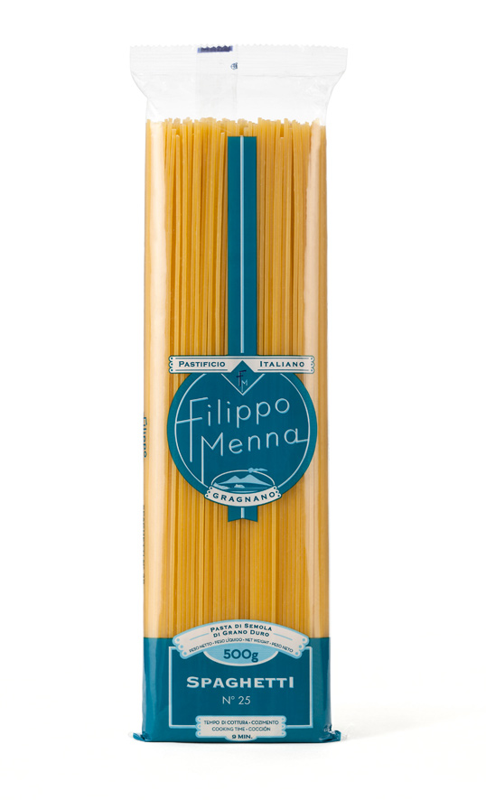
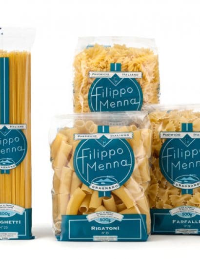
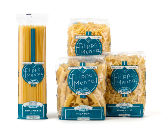
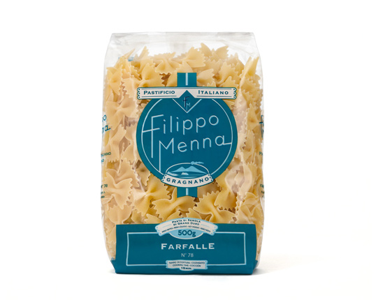
The packaging of pasta Filippo Menna has been studied by Angelini Design to export our good name overseas: the classic transparency of the packages was joined by a symbol of the Vesuvius and the traditional color of the city of Naples, light blue.The Italian touch on this packaging is evident, inside it is the most traditional line of products for Garofalo: this pasta in fact takes its name from the son of the Group’s president, and is prepared according to the classic recipe of Gragnano.”

Filippo Menna

Filippo Menna

Get the latest packaging design inspiration in your inbox:

Popular designs

ZARA SKIN: More Sustainable and Refillable Packaging Design

Discover ZARA SKIN: a revolutionary skincare range reflecting ZARA’s minimalist aesthetic. With refillable, nature-inspired packaging, the line champions conscious consumption and environmental responsibility, offering an inclusive range of products for the 21st-century consumer.

Miller 64 Rebrands & Relaunches as 64 Extra Light

Miller Brewing Company introduces Miller Extra Light, a rebranded version of Miller64, targeting the growing low-alcohol beer market with a focus on balance and moderation. Anne Pando, Director of Activation for Miller brands, highlights the shift, stating, “This isn’t just a packaging refresh – it’s a new opportunity for us,” emphasizing the strategic repositioning away from calories to low ABV content.

Designed by: PepsiCo Design & Innovation
Country: United States

Filippo Menna

lovely-package-filippo-menna-1

Filippo Menna

Designed by Angelini Design | Country: Italy

“A package destined for the foreign market, that expresses the taste and spirit of a typical Italian product: Pasta Garofalo arrives in Brazil with Angelini Design.

The packaging of pasta Filippo Menna has been studied by Angelini Design to export our good name overseas: the classic transparency of the packages was joined by a symbol of the Vesuvius and the traditional color of the city of Naples, light blue.The Italian touch on this packaging is evident, inside it is the most traditional line of products for Garofalo: this pasta in fact takes its name from the son of the Group’s president, and is prepared according to the classic recipe of Gragnano.”
Filippo Menna

Filippo Menna

Previous slide
Next slide
Get the latest on packaging design in your inbox: