Designed by Jonathan Faust | Country: Denmark
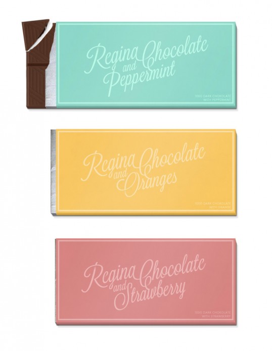
“Regina is a Portuguese chocolate brand founded in 1928. Their products are delicious but their identity really needs some love.
I have focused on the logo and packaging.The logo is combined with the flavour. As you see every flavour has it’s own unique logo. Combined with the colours you get a new product which stands out. Logo and flavour-text is hand drawn. The rounded corners and swashes is a reference to their history and what it’s all about – chocolate.”