Designed by: PepsiCo Design & Innovation
Country: United States

Williams-Sonoma Pasta

Williams-Sonoma Pasta

Designed by Williams-Sonoma Brand Packaging Dept. | Country: United States

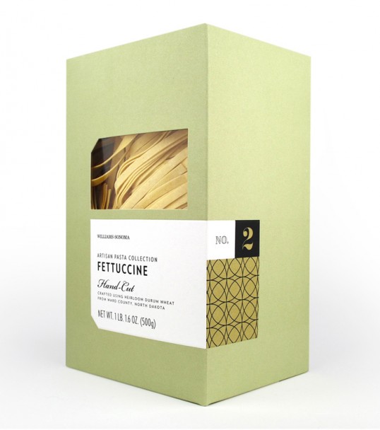
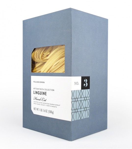
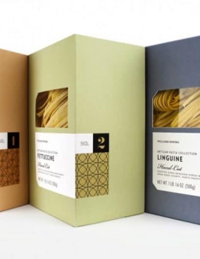
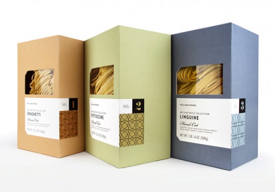
“As part of the new ‘pantry essentials’ line of products within the Williams-Sonoma stores, this package was meant to be a modern interpretation of simple and classic pasta packaging.  The intention was for it to feel high-end and artisanally crafted to highlight the single origin nature of the semolina flour used to made this hand-cut pasta.”

Williams-Sonoma Pasta

Williams-Sonoma Pasta

Williams-Sonoma Pasta

Get the latest packaging design inspiration in your inbox:

Popular designs

Over the wave

This Kombucha originates in Lombok, Indonesia, where its paradise beaches attract hundreds of surfers eager to ride the waves. When you surf,

Burma Love Rebrand

Love at First BiteAs an extension of the Burma Superstar restaurant in San Francisco, Burma Love Foods gives diners an opportunity to

Pure Persian Honey

When we look closely at honey packaging, they are almost all in the usual format, and the ultimate in creativity is that

Designed by: PepsiCo Design & Innovation
Country: United States

Williams-Sonoma Pasta

lovely-package-williams-sonoma-pasta-1

Williams-Sonoma Pasta

Designed by Williams-Sonoma Brand Packaging Dept. | Country: United States

“As part of the new ‘pantry essentials’ line of products within the Williams-Sonoma stores, this package was meant to be a modern interpretation of simple and classic pasta packaging.  The intention was for it to feel high-end and artisanally crafted to highlight the single origin nature of the semolina flour used to made this hand-cut pasta.”
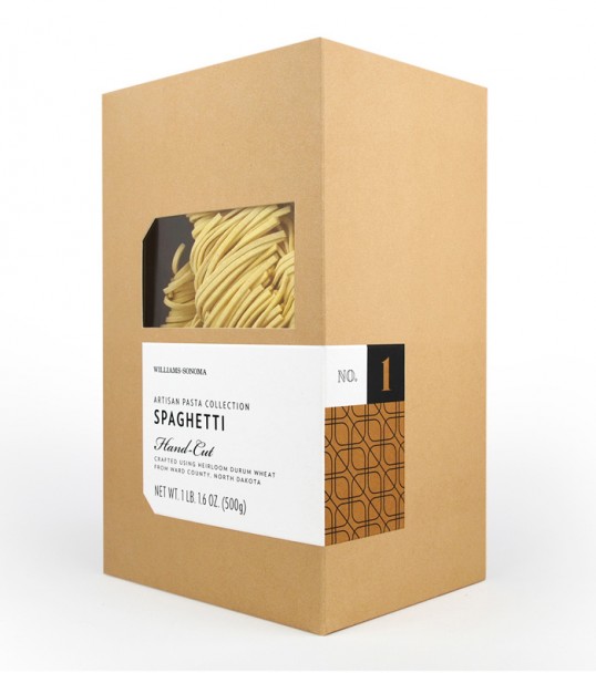
Williams-Sonoma Pasta

Williams-Sonoma Pasta

Williams-Sonoma Pasta

Previous slide
Next slide

Explore more great package design

Get the latest on packaging design in your inbox: