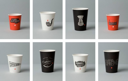
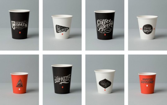
Designed by Hardhat Design | Country: United Kingdom
“Coffee Supreme’s take-out cups were already known in NZ and Australia for being unusual, distinctive and quirky, so while we knew from our re-brand brief that they wanted the brand to ‘grow up’, we felt it was important they didn’t lose their individuality.
Ideally they also needed to convey Coffee Supreme’s love & enthusiasm for the handmade craft of making coffee, that they were confident and quirky, approachable and supportive, and staying true to the good old fashioned standards the company started out with.”
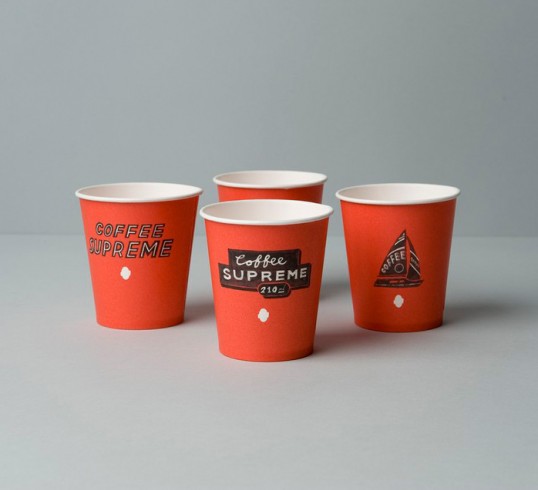
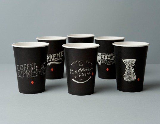
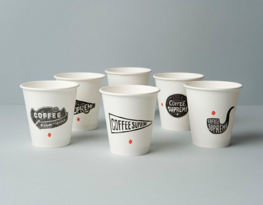
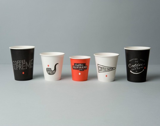
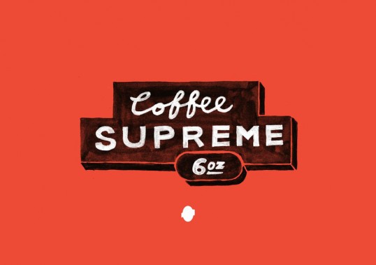
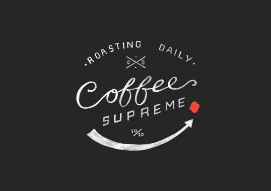
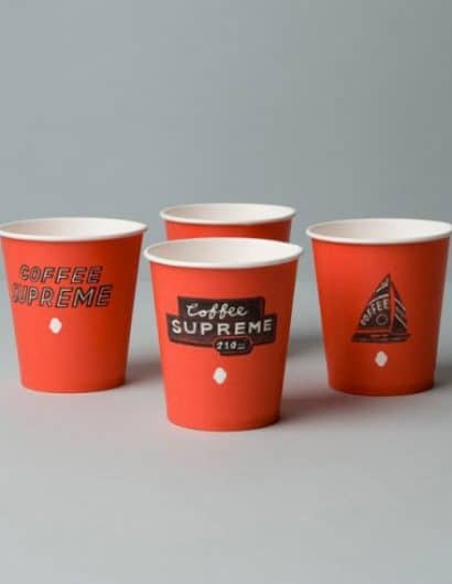
“Hardhat designed 16 individual cups, each with a different hand-drawn illustration, grouped into in 3 different colours to clearly distinguish between sizes.
The designs feel current in their style while also giving a nod to the past, referencing the traditional skill of the hand-crafted. You’ll see, amongst others, hints of 1800s etched signage, 40s movie titling, & 50s neon.”
“In creating this collection of cups, each with their own characterful hand-drawn or painted illustration, Hardhat hoped to replace the somewhat thoughtless routine of buying a take-out coffee with a more unique and personal experience, encouraging you to take a moment to stop & reflect; to look at the detail and humour in the illustrations, to look foward to seeing which cup your coffee might arrive in, having a particular favourite.
Put simply, this was about re-connecting people with the great cup of coffee in their hands.”

