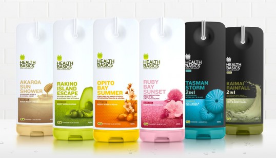
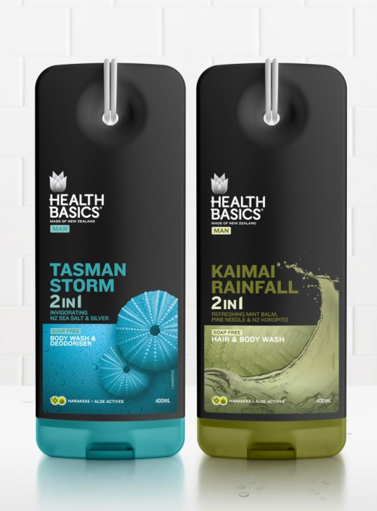
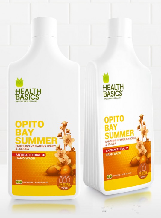
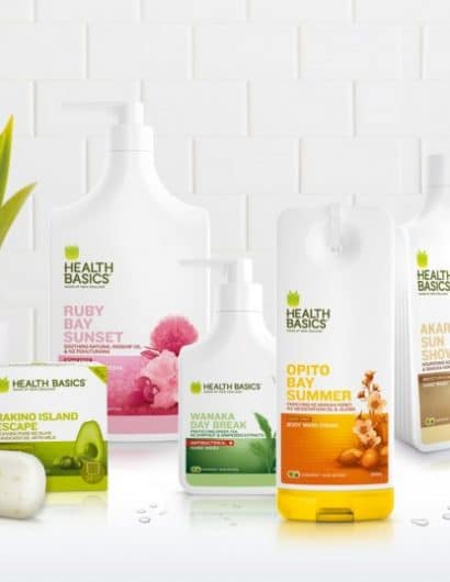
Designed by Milk | Country: New Zealand
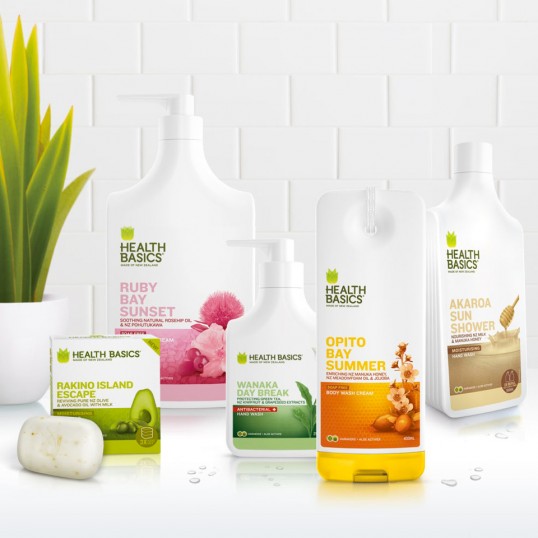
“The New Zealand story is not a new one to consumers, but it’s a compelling and evocative differential in a category heavily crowded by imported brands. Health Basics wanted to own that share of shelf, heart and mind by leveraging their authentically New Zealand made provenance.
We were happy to oblige.”
“Milk started with a new proposition for the brand and overt references to the evocative places and experiences that truly resonate with New Zealand consumers.”
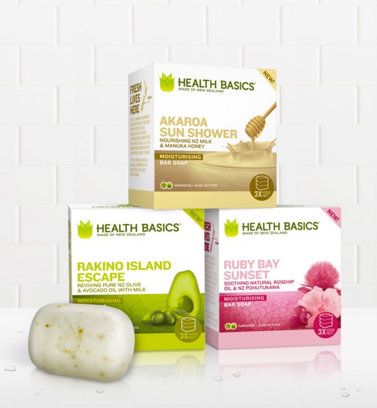
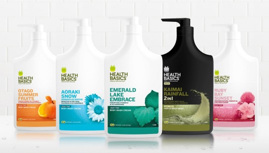
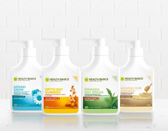
Our recommendations included a move away from exotic Aloe to the use of indigenous Harakeke as a foundation moisturising ingredient. We directed a rockstar industrial design team to produce a strong pack family with a simplified and honest pack aesthetic. We also developed a uniform design and packaging language which included the disruptive re-take on the soap on the rope, along with a removable label on hand soap containers for a more sympathetic fit in domestic bathrooms.”
“So what else did we do? What didn’t we do; an evolved visual identity with new symbol and custom typeface, visual language, design system, new brand story, new core brand proposition, individual product naming, product design for packaging, packaging language and back label stories, web and associated collaterals.”

