Designed by: PepsiCo Design & Innovation
Country: United States

Student Work – Alexander Kischenko

Student Work - Alexander Kischenko

Designed by Alexander Kischenko | Country: Russia

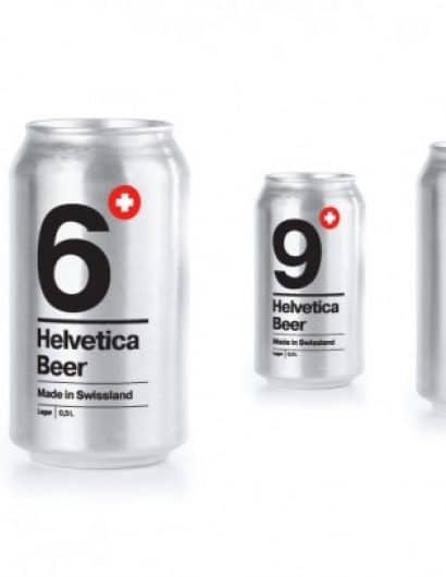
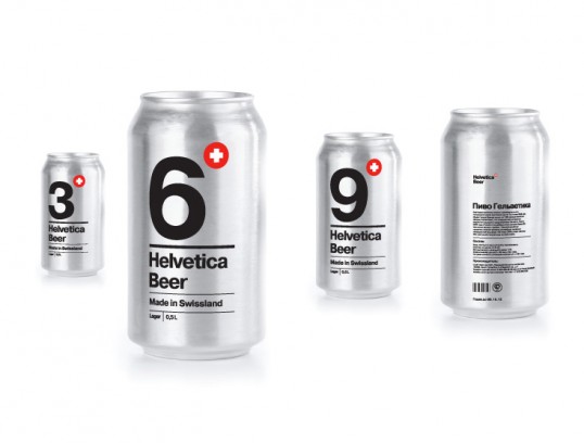
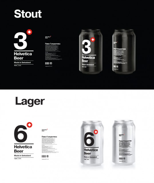
“The task was to create a package design using only typography. I decided to create a packaging for a Swiss beer from Helvetica province brewery. So the font choice was pretty obvious.

The large numeral identifies the alcohol percentage in the beer, and the can color tells about a beer type – lager or stout.”

Student Work - Alexander Kischenko

Student Work - Alexander Kischenko

Get the latest packaging design inspiration in your inbox:

Popular designs

Pure Persian Honey

When we look closely at honey packaging, they are almost all in the usual format, and the ultimate in creativity is that

The Bra Guru

Most women are wearing the wrong size bra and that is a fact. The Bra Guru® is the first and only professional

Over the wave

This Kombucha originates in Lombok, Indonesia, where its paradise beaches attract hundreds of surfers eager to ride the waves. When you surf,

Designed by: PepsiCo Design & Innovation
Country: United States

Student Work – Alexander Kischenko

lovely-package-helvetica-beer-1

Student Work - Alexander Kischenko

Designed by Alexander Kischenko | Country: Russia

“The task was to create a package design using only typography. I decided to create a packaging for a Swiss beer from Helvetica province brewery. So the font choice was pretty obvious.

The large numeral identifies the alcohol percentage in the beer, and the can color tells about a beer type – lager or stout.”
Student Work - Alexander Kischenko

Student Work - Alexander Kischenko

Previous slide
Next slide

Explore more great package design

Get the latest on packaging design in your inbox: