Designed by: PepsiCo Design & Innovation
Country: United States

F. Ménard

F. Ménard

Designed by lg2boutique | Country: Canada

“F. Ménard is a family hog breeding and processing business. The company, which was founded 50 years ago by Fulgence Ménard, is managed today by his children and grandchildren. F. Ménard has more than 1,000 employees and produces 20,000 pigs/hogs per week which makes the company one of the largest pork suppliers in Quebec.  The company exports the majority (65%) of its production to countries around the world including Australia, Japan, Mexico, Russia, South Africa and the United States.”

F. Ménard

F. Ménard

“The mandate given the agency was, first and foremost, to clarify the company brand which until then had had a distinct name for each of the organization’s three specialties: F. Ménard for the breeding unit, Agromex for the processing unit and Boucherie 235 for the sales unit/site. A Brand Positioning exercise was carried out to find which specific brand could rally all of these units to become a single company – a single brand.”

F. Ménard

“The brand positioning that emerged following weeks of company analysis was `Innovating for Quality – A Family Tradition`”, said Penelope Fournier, Partner and Director of Design Strategy with the company. This positioning brought together the company’s two great strengths: its innovation to provide the marketplace with the best-quality products, while adhering to the founder’s greatest value which was honesty. “It was only natural that the name F. Ménard became the official signature that covered breeding, processing and the butcher shop,” continued Ms. Fournier.”

F. Ménard

F. Ménard

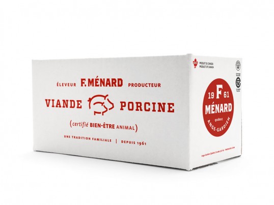
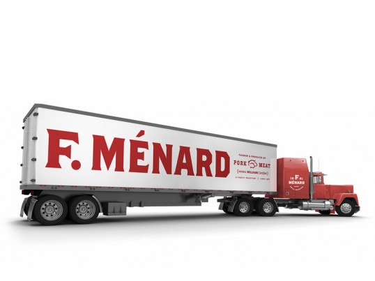
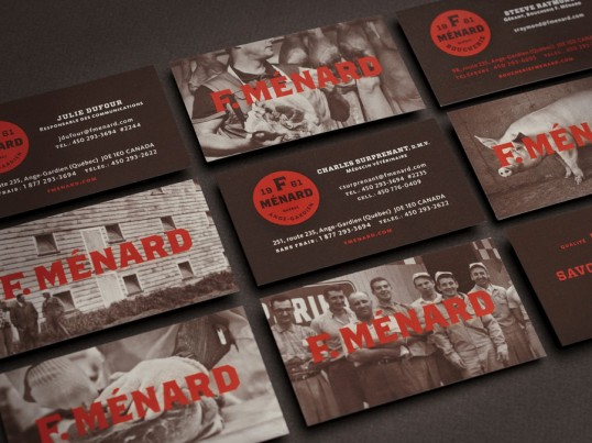
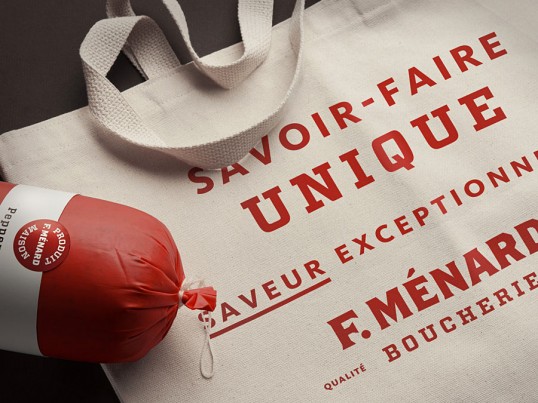
“A complete brand platform was then created including the main company logo, that of the butcher unit, as well as the full range of company contact points with its numerous target clienteles, whose brand experience has been with the butcher’s unit.”

F. Ménard

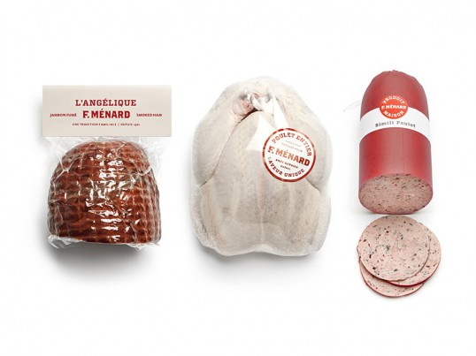
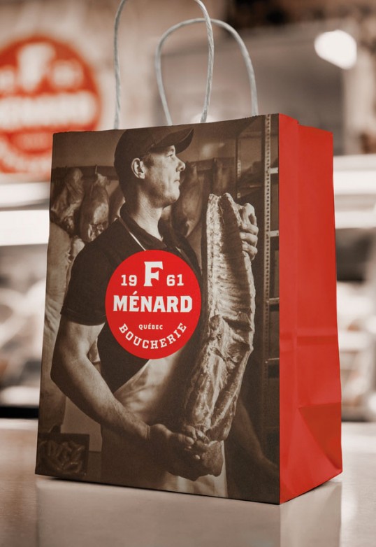
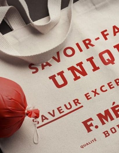
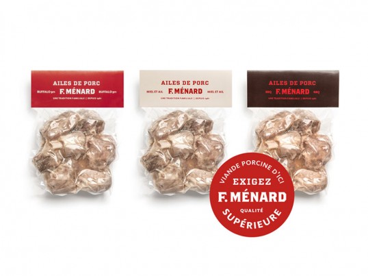
“In line with the selected positioning, the brand platform makes use of images dating from the 60s, red colouring that links the old and the new brand images, current photos that demonstrate at a single glance the innovation that is a key company priority and ensures the best possible quality.”

F. Ménard

F. Ménard

F. Ménard

Get the latest packaging design inspiration in your inbox:

Popular designs

Over the wave

This Kombucha originates in Lombok, Indonesia, where its paradise beaches attract hundreds of surfers eager to ride the waves. When you surf,

The Port Vodka Lemon Water

Overview: In response to my client’s vision for a Cape Cod themed beverage brand, I embarked on the journey to create The Port

Designed by: PepsiCo Design & Innovation
Country: United States

F. Ménard

lovely-package-f-menard-1

F. Ménard

Designed by lg2boutique | Country: Canada

“F. Ménard is a family hog breeding and processing business. The company, which was founded 50 years ago by Fulgence Ménard, is managed today by his children and grandchildren. F. Ménard has more than 1,000 employees and produces 20,000 pigs/hogs per week which makes the company one of the largest pork suppliers in Quebec.  The company exports the majority (65%) of its production to countries around the world including Australia, Japan, Mexico, Russia, South Africa and the United States.”

F. Ménard

F. Ménard

“The mandate given the agency was, first and foremost, to clarify the company brand which until then had had a distinct name for each of the organization’s three specialties: F. Ménard for the breeding unit, Agromex for the processing unit and Boucherie 235 for the sales unit/site. A Brand Positioning exercise was carried out to find which specific brand could rally all of these units to become a single company – a single brand.”

F. Ménard

“The brand positioning that emerged following weeks of company analysis was `Innovating for Quality – A Family Tradition`”, said Penelope Fournier, Partner and Director of Design Strategy with the company. This positioning brought together the company’s two great strengths: its innovation to provide the marketplace with the best-quality products, while adhering to the founder’s greatest value which was honesty. “It was only natural that the name F. Ménard became the official signature that covered breeding, processing and the butcher shop,” continued Ms. Fournier.”

F. Ménard

F. Ménard

“A complete brand platform was then created including the main company logo, that of the butcher unit, as well as the full range of company contact points with its numerous target clienteles, whose brand experience has been with the butcher’s unit.”

F. Ménard

“In line with the selected positioning, the brand platform makes use of images dating from the 60s, red colouring that links the old and the new brand images, current photos that demonstrate at a single glance the innovation that is a key company priority and ensures the best possible quality.”
F. Ménard

F. Ménard

F. Ménard

Previous slide
Next slide

Explore more great package design

Get the latest on packaging design in your inbox: