Designed by Kakoii | Country: Germany/Japan
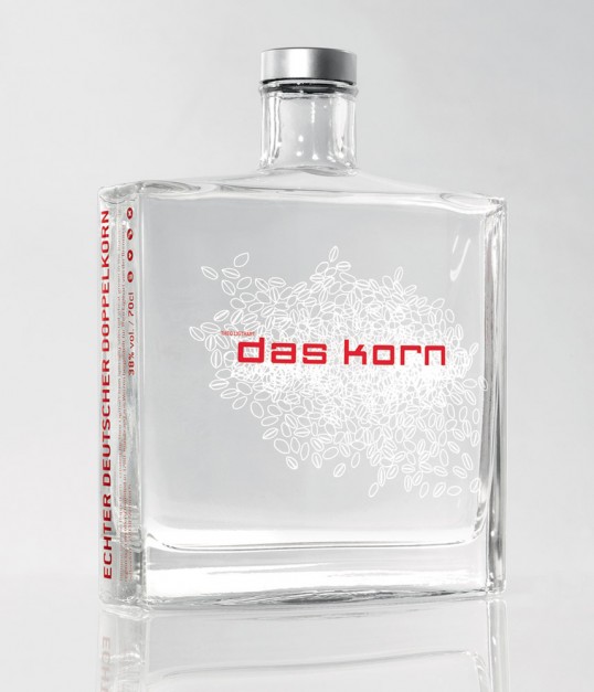
“DAS KORN (“The grain”) was designed by kakoii Berlin for the German Artist Theo Ligthart. The idea was to re-brand the typical German liquor made of wheat grain with its perception of cheap alcohol as a super premium brand. This was done by creating a packaging which uses the design language of the perfume industry. A heavy glass flacon bottle stating in a simplistic and pure way what’s inside: in typo (“Das Korn” = “The Grain”) and illustration (wheat grains). The product was introduced at one of the most important German art fairs (Artforum, Berlin) and became an acclaimed product for bars because of the combined art- and premium-image. Today DAS KORN sells as a commercial product in bars like the Soho-Club and selected retail stores as well as limited editions in art galleries.”