Designed by: PepsiCo Design & Innovation
Country: United States

Popfish

popfish1

Designed by Daniel Neves & João Simi | Country: Brazil | Fonts used: VAG Rounded

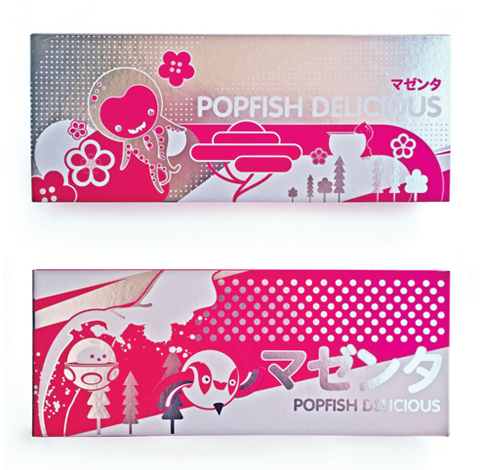
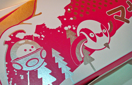
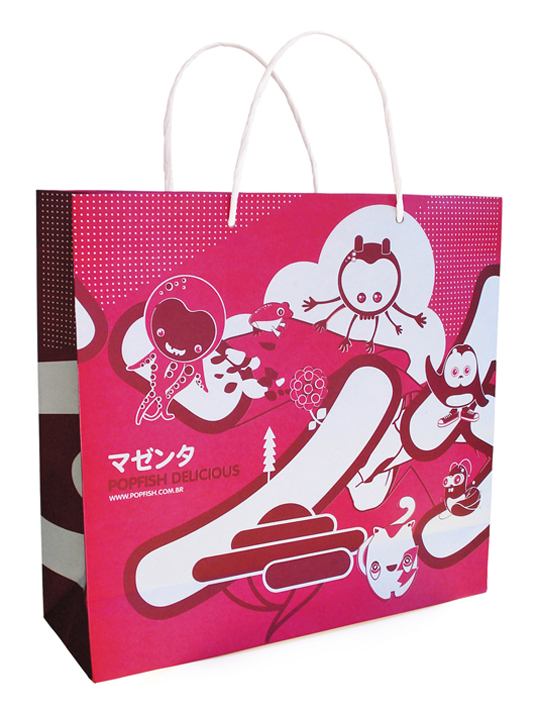
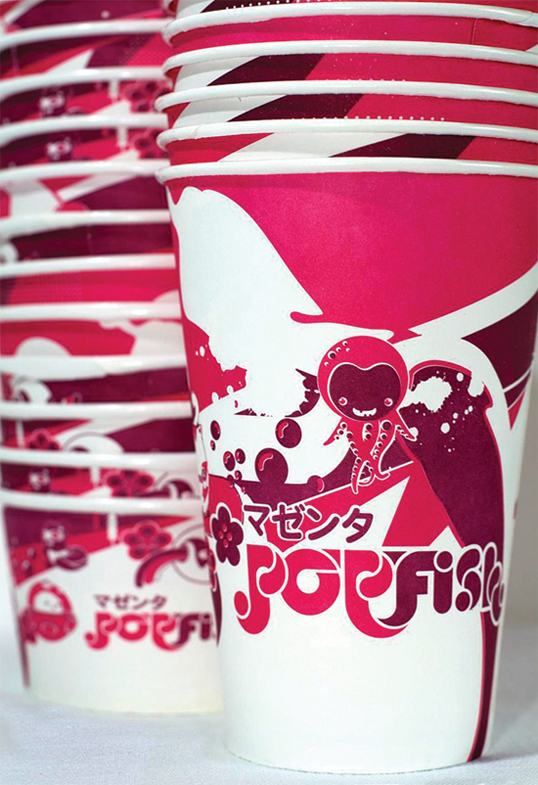
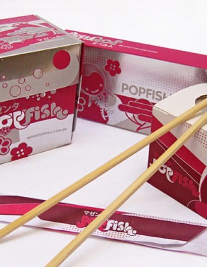
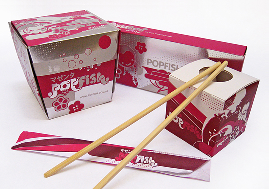
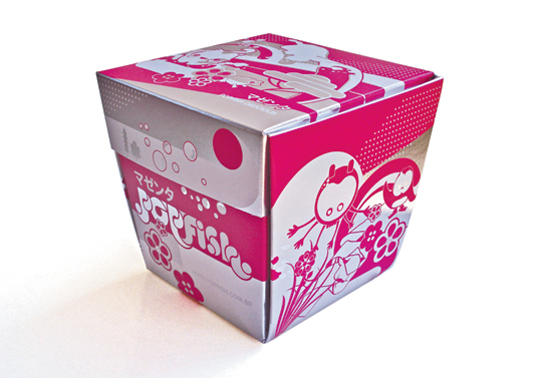
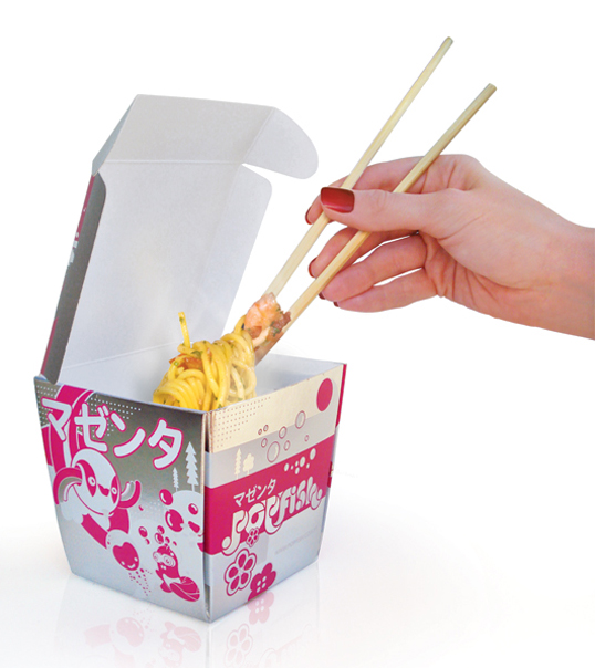
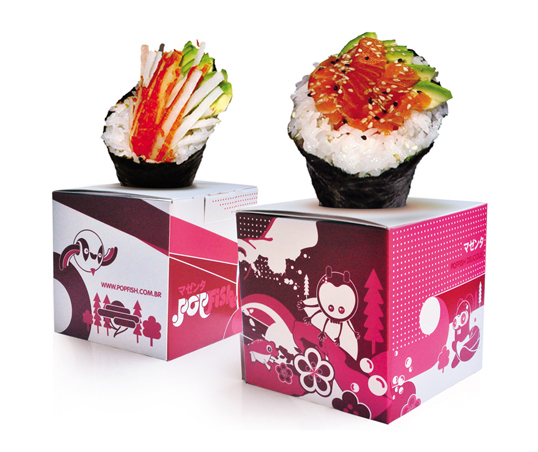
“Popfish is a restaurant/shop located in Rio de Janeiro. The Design was inspired by Japanese and Tokyo imagery, using illustrations and characters to enhance its visual identity. A highlight in the visual identity is that each Popfish shop has a theme colour added to the shop’s name. The first one called Popfish Magenta. More than a restaurant, Popfish is an attempt to join gastronomy and design at the same spot.”
popfish2

popfish3

popfish4

popfish5

popfish6

popfish7

popfish8

Get the latest packaging design inspiration in your inbox:

Popular designs

Burma Love Rebrand

Love at First BiteAs an extension of the Burma Superstar restaurant in San Francisco, Burma Love Foods gives diners an opportunity to

Pure Persian Honey

When we look closely at honey packaging, they are almost all in the usual format, and the ultimate in creativity is that

Far Out Bar

Description: Far Out Bar is a cutting-edge packaging design project created for High Life Farms’ macrodose THC chocolate bars. This project involved

Designed by: PepsiCo Design & Innovation
Country: United States

Popfish

popfish1

popfish1

Designed by Daniel Neves & João Simi | Country: Brazil | Fonts used: VAG Rounded

“Popfish is a restaurant/shop located in Rio de Janeiro. The Design was inspired by Japanese and Tokyo imagery, using illustrations and characters to enhance its visual identity. A highlight in the visual identity is that each Popfish shop has a theme colour added to the shop’s name. The first one called Popfish Magenta. More than a restaurant, Popfish is an attempt to join gastronomy and design at the same spot.”
popfish2

popfish3

popfish4

popfish5

popfish6

popfish7

popfish8

Previous slide
Next slide

Explore more great package design

Get the latest on packaging design in your inbox: