Designed by: PepsiCo Design & Innovation
Country: United States

Fyne Ales Sanda IPA

Fyne Ales Sanda IPA

Designed by Matt Burns | Country: United Kingdom

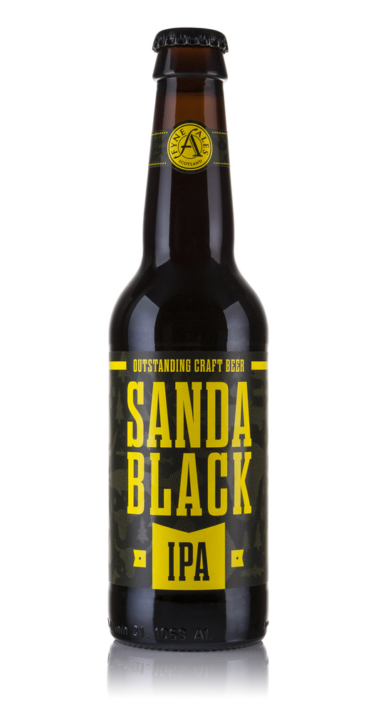
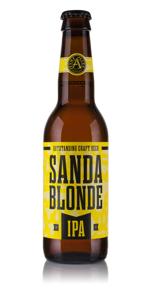
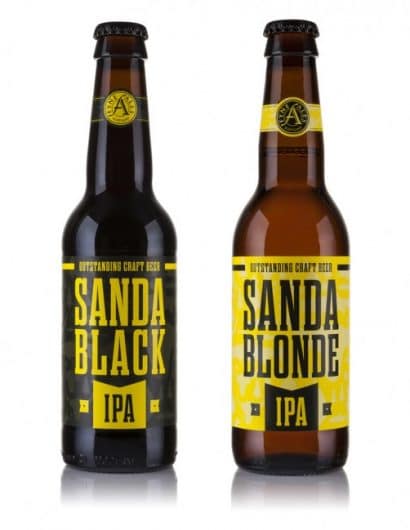
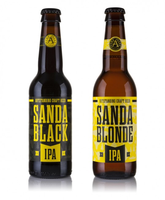
“The Fyne Ales Sanda IPA packaging brief was to capture a sense of the brewery’s provenance, with a true representation of the beer style, that being an American IPA.

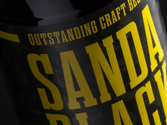
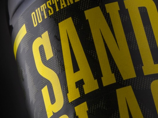
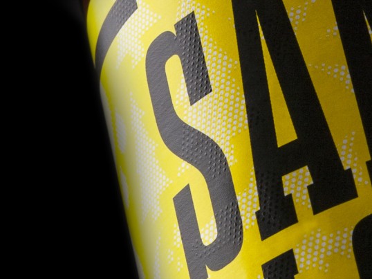
Up front, a wood type (Dharma) and bold colour selection enforces the American characterises of the product, although it’s the finer detail which plays homage to the location of Fyne Ales. Fyne Ales is located in Argyll Scotland, right in the heart of Loch Fyne. The detail on the label references the area with illustrations of the Highland Cow, the iconic tree farms, the salmon, the rain and the stag.

There may be a sense of repetition in the placement of these illustrations, however the placement is purposely irregular. This is a subtle feature, but it is to demonstrate the diverseness and also the unpredictable nature of the land; There is always a surprise around the corner, whether it would be a pack of stag or an impromptu snow storm.

This detail is brought to life with a Tactile Varnish applied to a semi gloss coated stock.”

Fyne Ales Sanda IPA

Fyne Ales Sanda IPA

Fyne Ales Sanda IPA

Fyne Ales Sanda IPA

Fyne Ales Sanda IPA

Get the latest packaging design inspiration in your inbox:

Popular designs

The Port Vodka Lemon Water

Overview: In response to my client’s vision for a Cape Cod themed beverage brand, I embarked on the journey to create The Port

Over the wave

This Kombucha originates in Lombok, Indonesia, where its paradise beaches attract hundreds of surfers eager to ride the waves. When you surf,

Burma Love Rebrand

Love at First BiteAs an extension of the Burma Superstar restaurant in San Francisco, Burma Love Foods gives diners an opportunity to

Designed by: PepsiCo Design & Innovation
Country: United States

Fyne Ales Sanda IPA

lovely-package-fyne-ales-sanda-ipa-1

Fyne Ales Sanda IPA

Designed by Matt Burns | Country: United Kingdom

“The Fyne Ales Sanda IPA packaging brief was to capture a sense of the brewery’s provenance, with a true representation of the beer style, that being an American IPA.

Up front, a wood type (Dharma) and bold colour selection enforces the American characterises of the product, although it’s the finer detail which plays homage to the location of Fyne Ales. Fyne Ales is located in Argyll Scotland, right in the heart of Loch Fyne. The detail on the label references the area with illustrations of the Highland Cow, the iconic tree farms, the salmon, the rain and the stag.

There may be a sense of repetition in the placement of these illustrations, however the placement is purposely irregular. This is a subtle feature, but it is to demonstrate the diverseness and also the unpredictable nature of the land; There is always a surprise around the corner, whether it would be a pack of stag or an impromptu snow storm.

This detail is brought to life with a Tactile Varnish applied to a semi gloss coated stock.”
Fyne Ales Sanda IPA

Fyne Ales Sanda IPA

Fyne Ales Sanda IPA

Fyne Ales Sanda IPA

Fyne Ales Sanda IPA

Previous slide
Next slide

Explore more great package design

Get the latest on packaging design in your inbox: