Designed by Sake Group | Country: Mexico
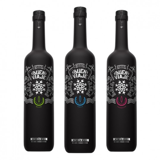
“The challenge with Mezcal Buen Viaje was to design a bottle that represented the artisanal, traditional and handmade aspects of Mexico and at the same time that contained the spirit of our ancestors reflected in it. To accomplish it, we got our inspiration from Huichol art. The huicholes are an old community that makes handcrafts based on their daily dreams. Recent discoveries say that this community was possibly one of the first ones in producing mezcal.
The choice of painting the bottles black was done as homage to the black clay of Oaxaca, Mexico, one of the biggest known crafts in that state. The hummingbirds placed in the top corners of the logo represent power-animals; they’re considered one the most important symbols in ancient Mexican culture because this animals were the representation of god Huitzilopochtli. The flower in the center of the logo symbolizes energy and the strongest part of the maguey plant before it dies. It’s the plants last breath.
And last but not least, every different type of agave was identified with a different color at the bottom of the logo in a shape that represented the third eye.”