Designed by: PepsiCo Design & Innovation
Country: United States

Bonnard

Bonnard

Designed by Anagrama | Country: Mexico

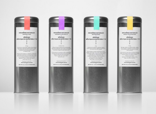
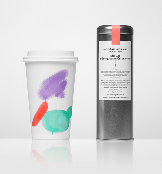
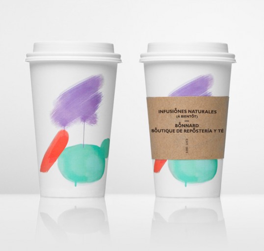
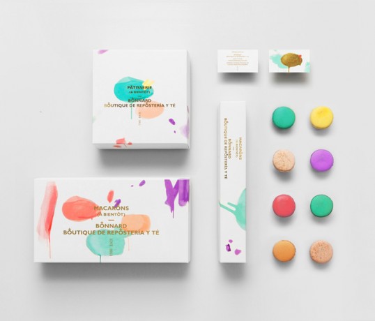
“Bonnard is a Mexican french-inspired tea and confectionary shop.

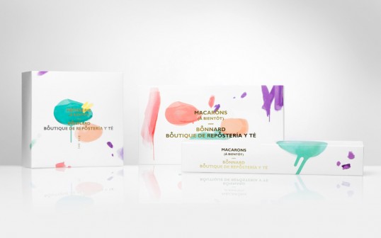
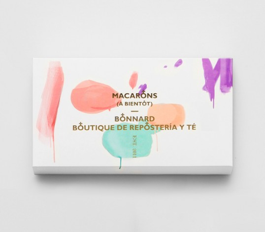
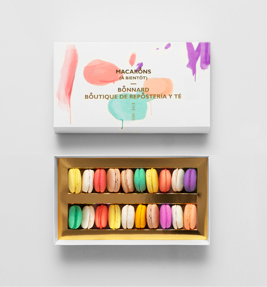
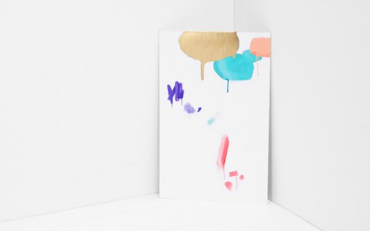
The brand’s distinct brush strokes and color selection are based on Pierre Bonnard’s postimpressionist paintings. The simple art direction, together with french words and phonetics round up the brand’s gallic concept effortlessly, spontaneously and efficiently.

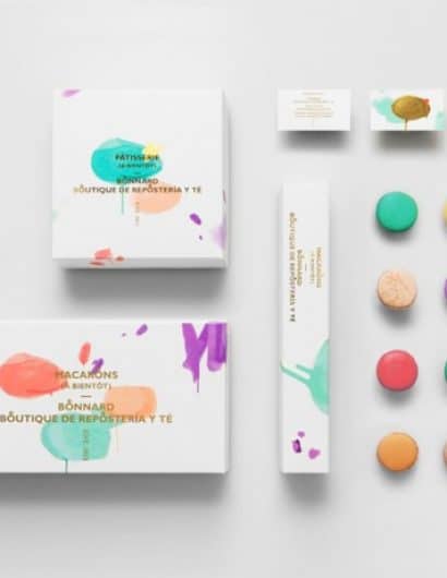
Our approach with clean, sans-serif typography gives Bonnard a luxurious feel mostly associated with high-end fashion brands.The gold foil stamp and clean type directly contrasts and at the same time elevates the would-be informal paint marks.

The rounded cross icon detail found in the wording relates to the shapes of macaroons, one of Bonnard’s prime delicacies.”

Bonnard

Bonnard

Bonnard

Bonnard

Bonnard

Bonnard

Bonnard

Get the latest packaging design inspiration in your inbox:

Popular designs

The Port Vodka Lemon Water

Overview: In response to my client’s vision for a Cape Cod themed beverage brand, I embarked on the journey to create The Port

The Bra Guru

Most women are wearing the wrong size bra and that is a fact. The Bra Guru® is the first and only professional

Burma Love Rebrand

Love at First BiteAs an extension of the Burma Superstar restaurant in San Francisco, Burma Love Foods gives diners an opportunity to

Far Out Bar

Description: Far Out Bar is a cutting-edge packaging design project created for High Life Farms’ macrodose THC chocolate bars. This project involved

Designed by: PepsiCo Design & Innovation
Country: United States

Bonnard

lovely-package-bonnard-1

Bonnard

Designed by Anagrama | Country: Mexico

“Bonnard is a Mexican french-inspired tea and confectionary shop.

The brand’s distinct brush strokes and color selection are based on Pierre Bonnard’s postimpressionist paintings. The simple art direction, together with french words and phonetics round up the brand’s gallic concept effortlessly, spontaneously and efficiently.

Our approach with clean, sans-serif typography gives Bonnard a luxurious feel mostly associated with high-end fashion brands.The gold foil stamp and clean type directly contrasts and at the same time elevates the would-be informal paint marks.

The rounded cross icon detail found in the wording relates to the shapes of macaroons, one of Bonnard’s prime delicacies.”
Bonnard

Bonnard

Bonnard

Bonnard

Bonnard

Bonnard

Bonnard

Previous slide
Next slide

Explore more great package design

Get the latest on packaging design in your inbox: